Better Scrolling
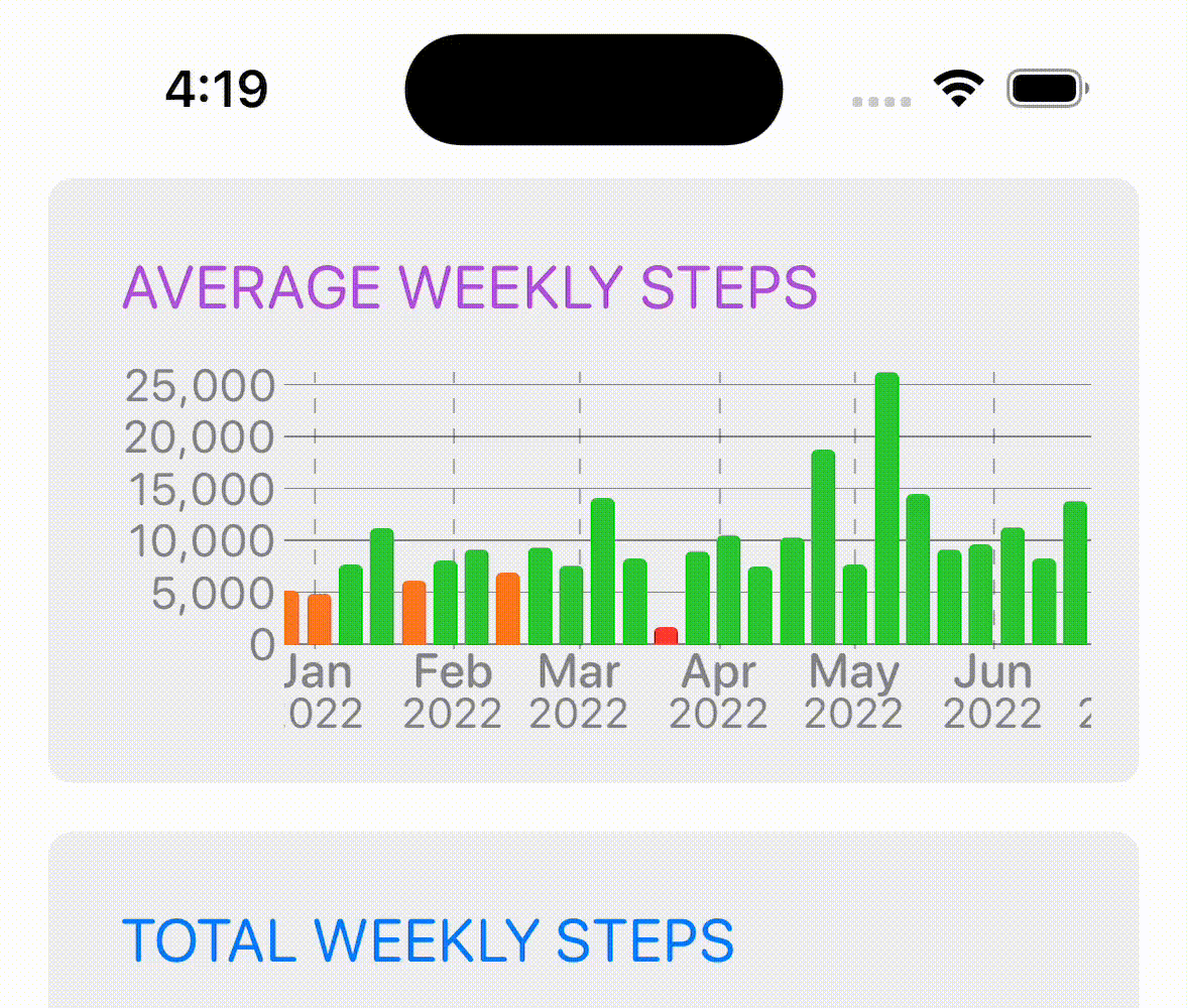
If you were following along from yesterday, I was experimenting with an animated method for dynamically scaling the main step graph’s y-axis. Yesterday I finished off with a version where the graph scale was recalculated constantly. After using that for the rest of the day, it was too busy. It was a bit overwhelming as an animation.
This morning instead I tried out just scaling the graph when the user finishes their scrolling (keeping the scale at the previously seen height during the scroll). This is much better.
It is still lively but not quite so busy.
Side Note: the above gif is generated directly by the iOS simulator and is way smaller and higher resolution than my previous QuickTime based method. To generate them, Alt-Click the Record button, then right click on the preview to generate a GIF
Colored Confetti
Whenever you reach your goal in Pedometer++ there is a shower of confetti. This is probably the most popular feature of the app (at least in terms of positive feedback I receive). People LOVE confetti.
Back in 2015(!), my then six year old son decided that when you double your goal there should extra special confetti that was blue. This was added to version 2.2.1.
My then three year daughter decided that she didn’t want to be left out and mandated the colors for 3X and 4X-ing your goal to be Pink and Purple respectively.
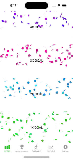
I’ve just got this built into the new update using SwiftUI. Previously, this was done using CAEmitterViews, but now it is natively done in SwiftUI using a dynamic set of rotating views that I animate moving about.
Unexpected iOS Changes
Inevitably when we target new features in iOS there will be changes in the underlying implementation as you go. Typically I’d say Apple is very good about not making too many non-backwards compatible, breaking changes, but subtle, minor changes are quite common.
I just ran into one of these.
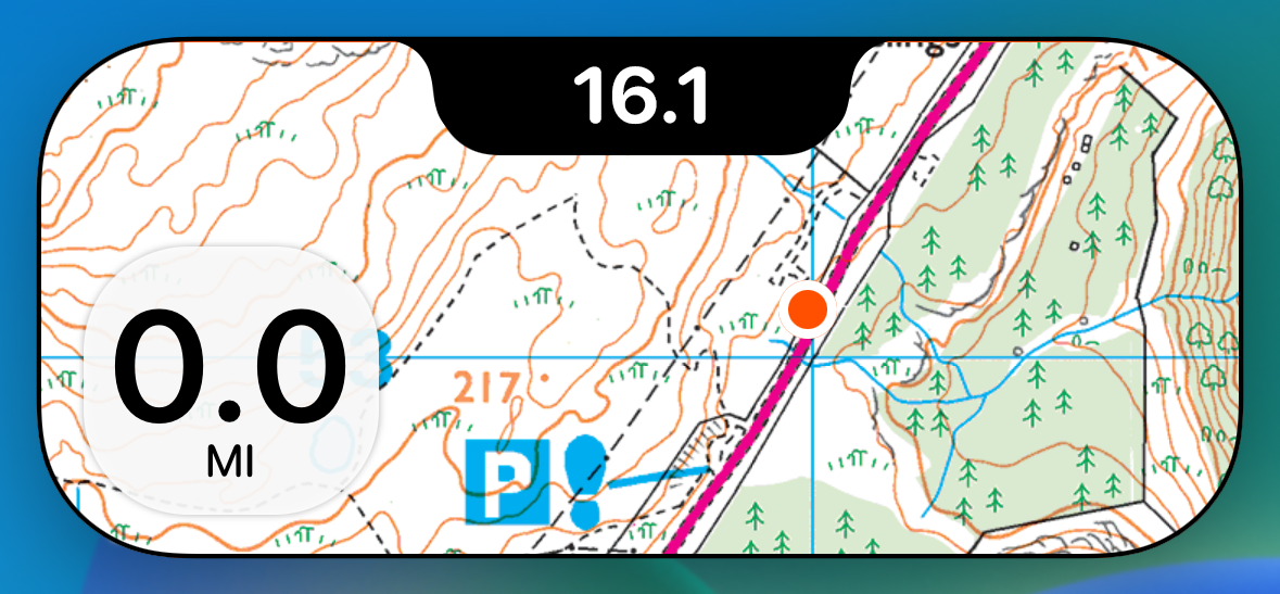
The Dynamic Island on iOS 16.1 looks like:
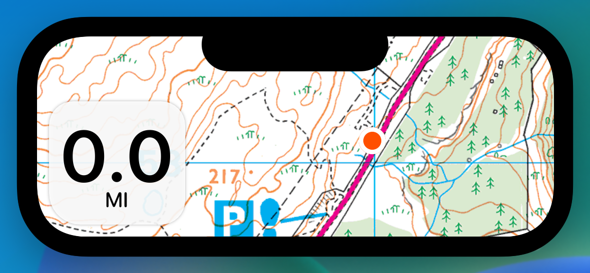
On 16.2 it looks like:
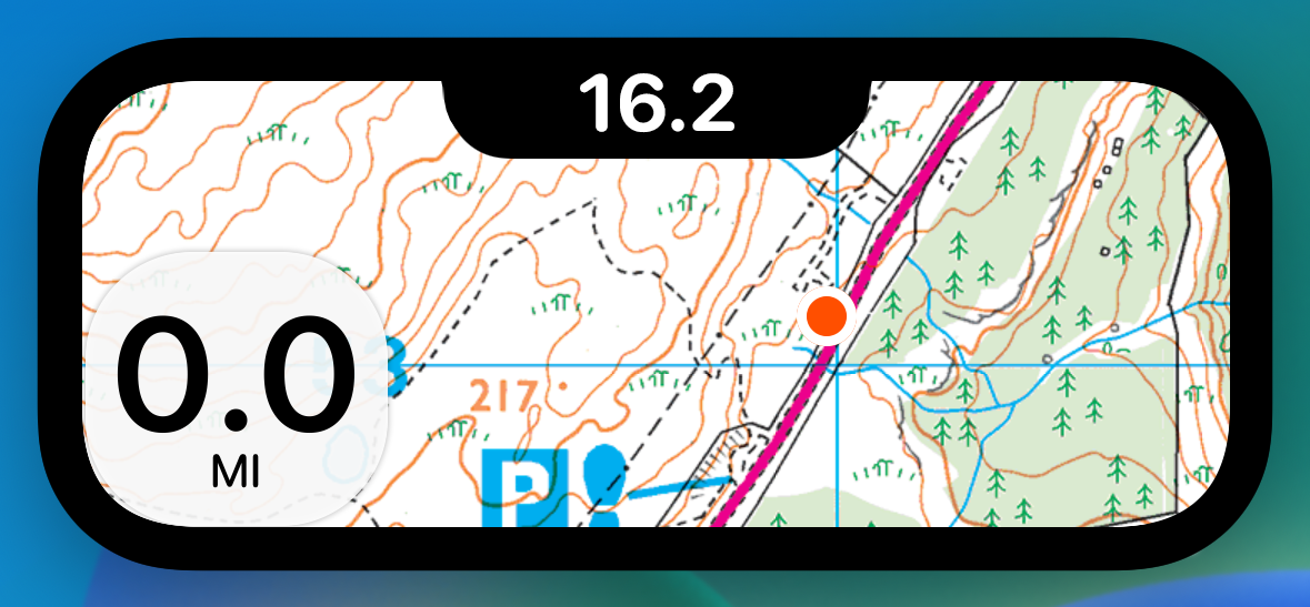
While I was playing a bit fast and loose with the way I was setting my maps bounds to get the edge-to-edge effect before it seems like it is impossible now. They are masking the whole island’s coastline.
Overall it is a relatively minor change, but it does change a bit what I’ll do with the top of my island. Before I had to contend with the entire height of the camera cutout. Now it is just the bottom half roughly.
Which means that perhaps doing nothing about the cutout actually works and looks pretty good:
Hopefully by the time this update is out the majority of my users will be on 16.2, but I’ll make sure it looks OK on 16.1…if not 100% optimized for.
Under the Radar 257
Because of my holiday earlier this week Marco and I recorded this fortnight’s Under the Radar today. We discussed what is is like to work in public. For me, working on this Design Notes diary. For him, working on Blackbird, his open source SQLite wrapper.
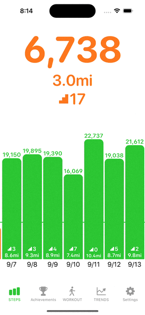
Dynamic y-Axis Trend Graphs
Learning from the experience of the main graph view I’m also thinking that I should do the same thing on the Trends graphs. So I’m experimenting with changing the y-axis to reflect the visible bars, but only make the change when the user stop scrolling.
It will take a bit of extra effort to make the y-axis marks scale smoothly. But where I got it to today is enough to know that this is a better path.