Catching Up
I was away on a short mini-break holiday for the last couple of days. One of the challenging things about being an independent developer is that taking vacations is quite tricky. There isn’t anyone else to cover for you when you are trying to not work, so you always have to be a little bit “on call”.
The compromise I typically find myself trying for is to only lightly check RSS and email while I’m away to make sure there isn’t something dramatic happening that I need to be aware of. Then on my return I’ll sit down for the first hour or so to actually respond/process whatever happened while I was on holiday.
In this case there were a few interesting things that happened while I was away:
- RevenueCat announced a new experiments system for A/B testing pricing options for subscriptions. This combined with the newly announced App Store price tiers could make for an interesting project early next year once I get this Pedometer++ update finished.
- Apple announced another round of the Ask Apple series. These are essentially mini-WWDC-labs that they have started to do periodically throughout the year, and are fantastic. Last week I was running into an issue with Live Activities that I would love to ask to the relevant engineering team and was kinda bummed that I thought we were all finished with them for the year. Delightfully, it turns out I was mistaken and I will get the opportunity to ask my question after all.
Starting a Punch List
One of the more exciting parts of a project is hitting the point where there is enough of the app actually made that I can begin to be critical of it and start identifying its problems.
In the early stages of development I’m 100% focused just on getting something working. I don’t get bogged down in too many details, what I want is something to react to.
It is a funny aspect of design that it is far easier to say what I don’t like about a design than to proactively describe what a good design would be.
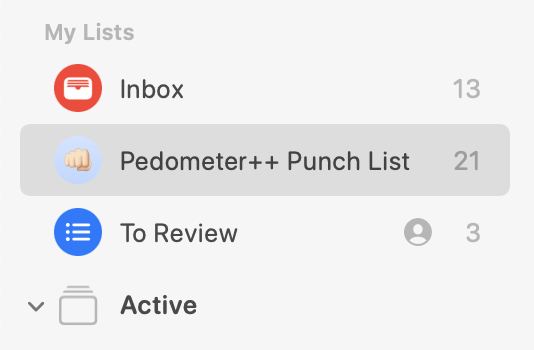
So once I have built enough of a project to start using it regularly (and let me say that if you aren’t using an app under development many times a day in actual use you will really struggle to get it right), I will start a list in Reminders that is an unfiltered inbox for all my thoughts, critiques and ideas.
My goal here is to capture every little thought I have while using the app or thinking about it subsequently. Then periodically I will start to go through this list and either fix, build or discard the contents.
Something that is super important here is to be very clear in what you say when adding the reminder item. I’ve so often gotten lazy here and add something like:
“Misaligned bar header”
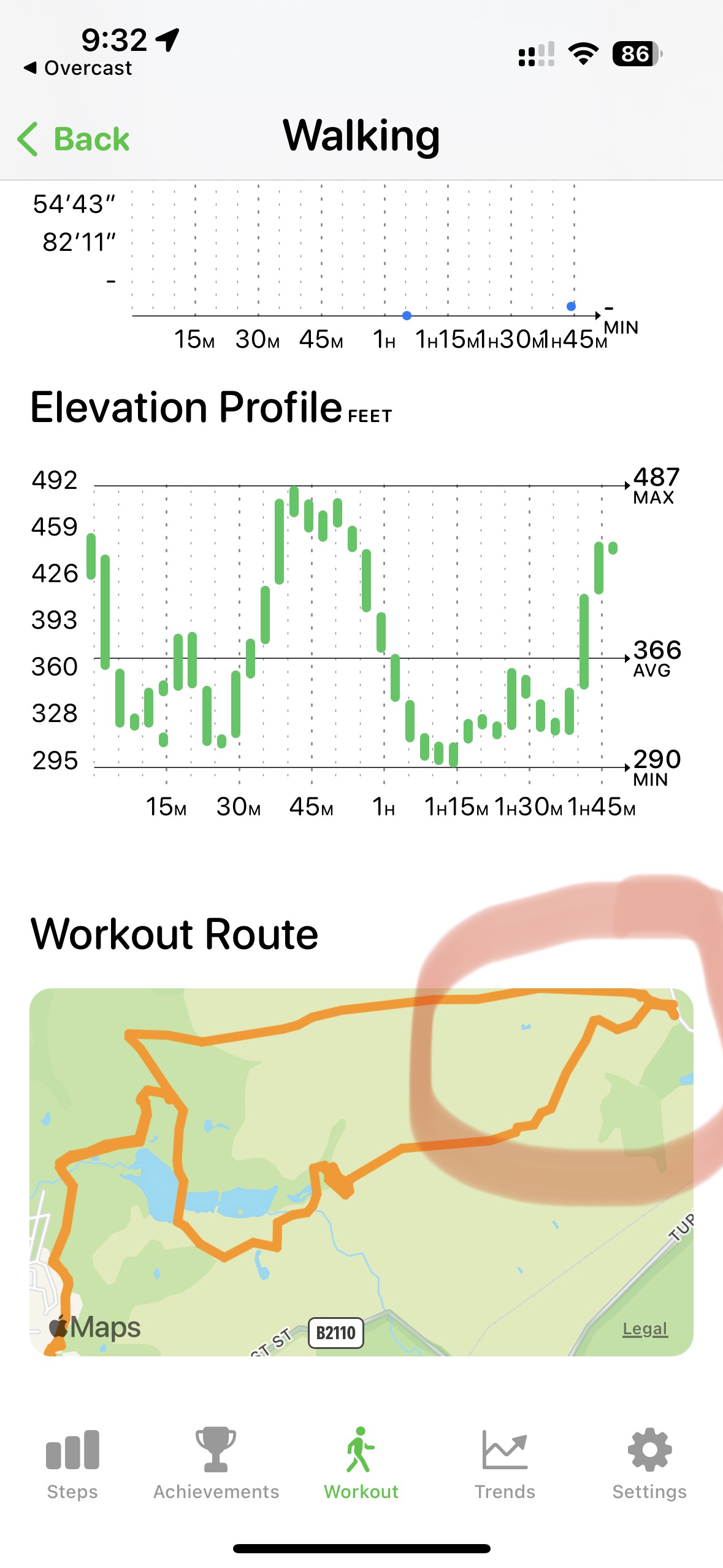
Which is completely useless if I then return a week later to the list and have no idea what I meant. Either I need to add a screenshot (which Reminders can easily pin directly from the iOS screenshot tool), or I need to be very specific, like:
“The top header in the settings tab looks too far to the right compared to the contents text”
But really screenshots are best for anything visual.
Also, ProTip. You can change the default list for Reminders in Settings to your punch list which makes this process way more efficient.
Dynamic Graph Heights
One of the trickiest design problems in the main display of Pedometer++’s graph view is what scale should I use for the bars. There can be wild swings between daily step counts, so there isn’t one right answer. Previously, what I have done is scale the graph to be “correct” for the current week’s steps (making the highest step count in the last 7 days the max value). Then for previous days if a step count exceeds this value I then would mark it with a slash through the graph, indicating that it wasn’t showing at full height.
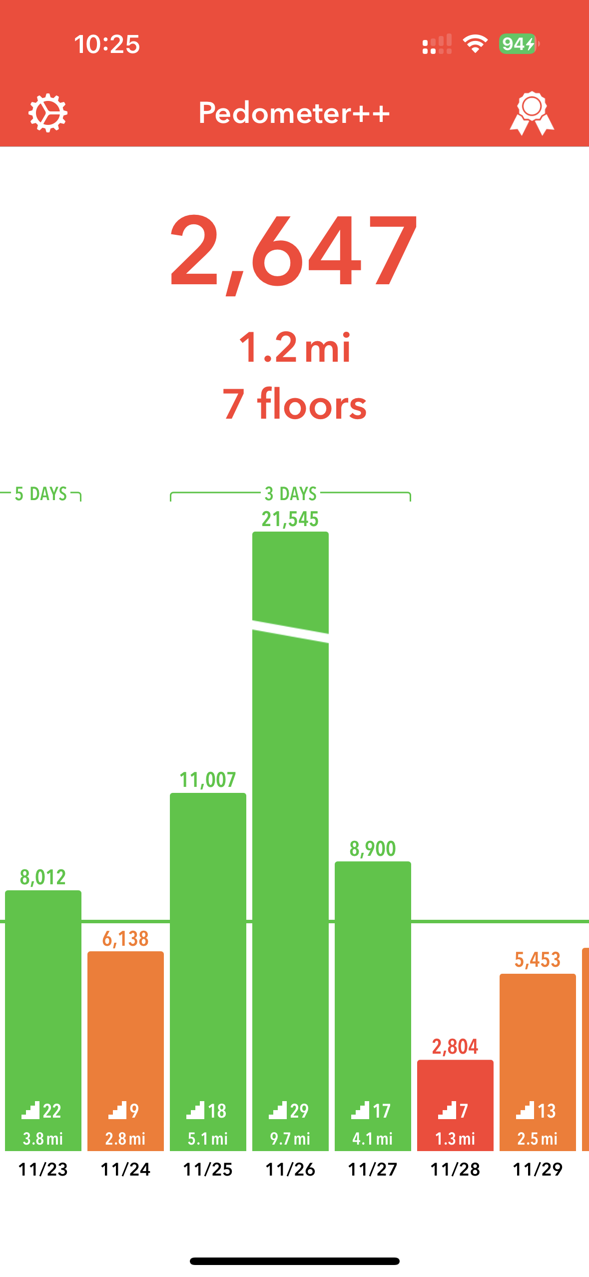
This has caused no end of confusion and customer support requests. I understand why, it isn’t immediately obvious what I’m doing.
A general good axiom for design is to make as many thing obvious to the user as possible, or more concisely “Don’t make users think”.
To that end I spent this morning building out a dynamic, animated graph scale. So that as the user scrolls around the graphs they will align themselves to make the currently visible bars scaled appropriately.
As you then scroll around the bars may shrink/grow depending on what the currently visible heights are.
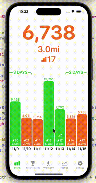
I think I like this approach better as it is pretty obvious what is happening and completely avoids the issue I was having before.
I’m just not convinced if the extra motion is too much visually. I’ll have to live with it a while to know for sure.