Simulated Locations
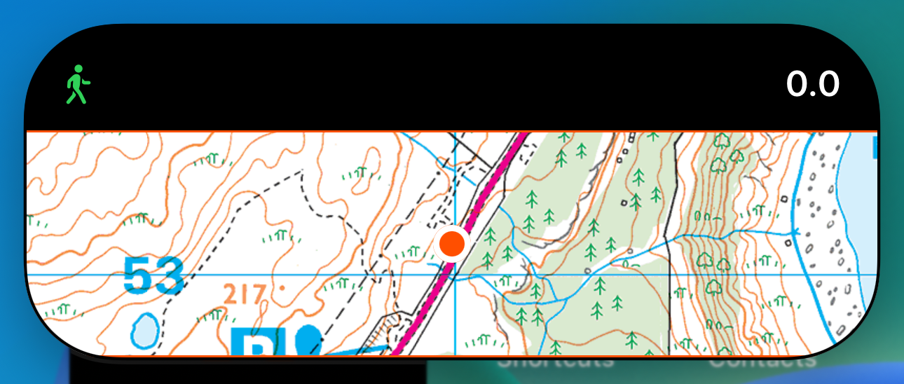
While Sim Genie is fantastic for simulating location on the Simulator, I realized that for the next phase of testing & development I’m going to need a way to simulate locations on device. While it is fun to “have” to go out for walks to test features (and it is a bit of a joke in my house that I’ll often go for hikes in the middle of the day “for work”), I really need a way to test on device while connected to Xcode. So I’m building out a little system that can read in a GPX file and then generate events just like Core Location does.
This will slot into my app wherever I currently use a CLLocationManager and let me mock out locations whenever I want.
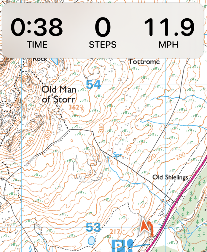
Now I can pretend to be in Scotland whenever I want.
Live Activity Payload Limit
I’m working on the Live Activity part of this update. Something I’m running into is the 4KB limit on the data I can pass to my Live Activity. Right now I’m passing in coordinates to be displayed on a map as a path of where you’ve recently been. It seems like periodically this fails when a certain number of points gets added. But I’m not really sure how the 4KB limit is calculated.
So I wrote a script to keep adding a GPS coordinate and try the update to find the limit.
I tried out a bunch of different Codable encoders, and it looks like it is using the JSON encoder to define the limit.
1 2 3 4 | |
When my activity state hit the point where the JSON encoded representation was over 4KB it starts to fail. So I guess that’ll be my limit.
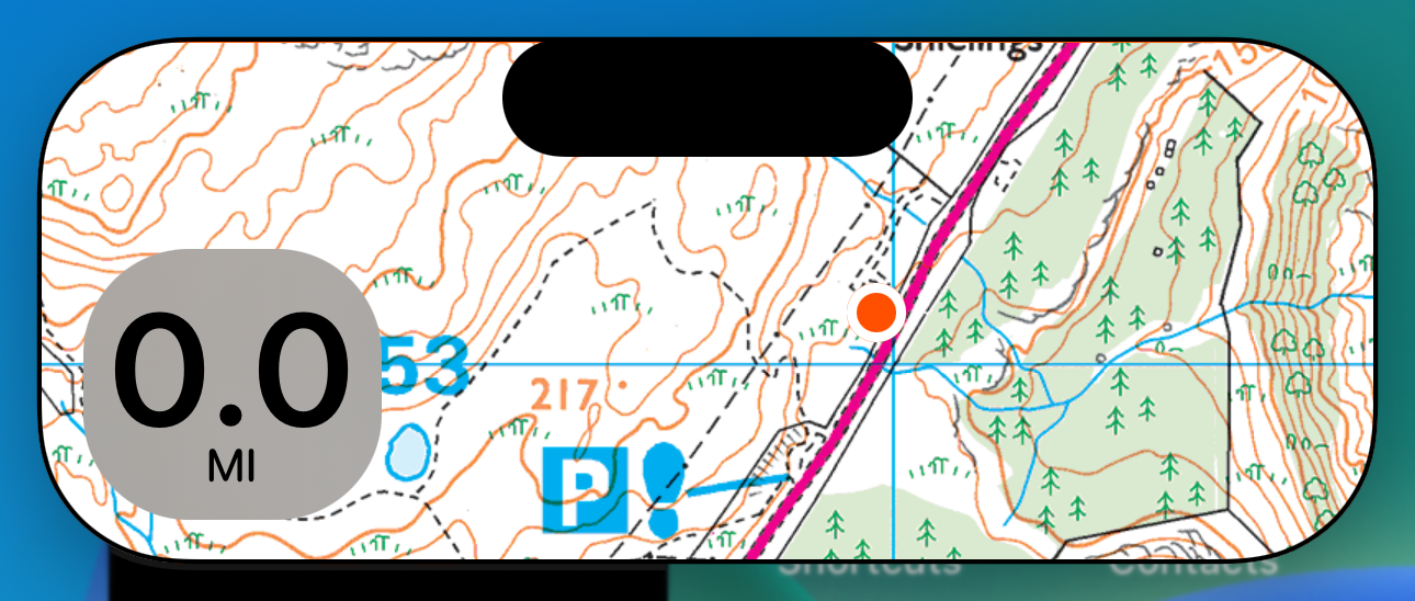
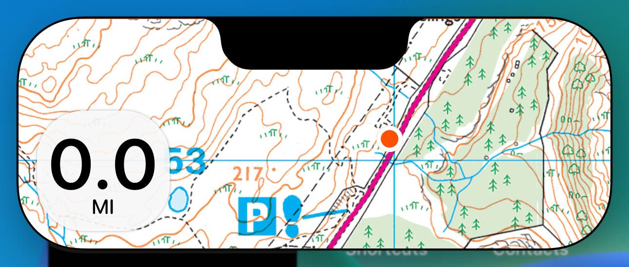
Redesign the Live Activity screens
I’m working through a number of designs for my Live Activity. Trying to find a good balance for the information and aesthetic.
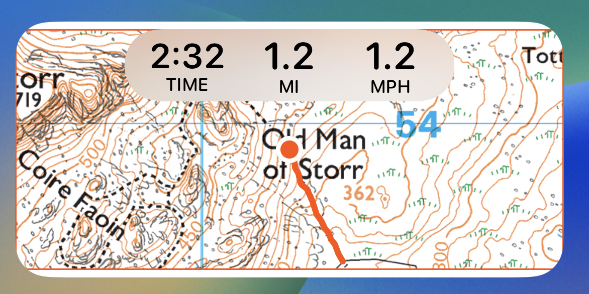
1. Information Dense
2. Corners
3. Top Data
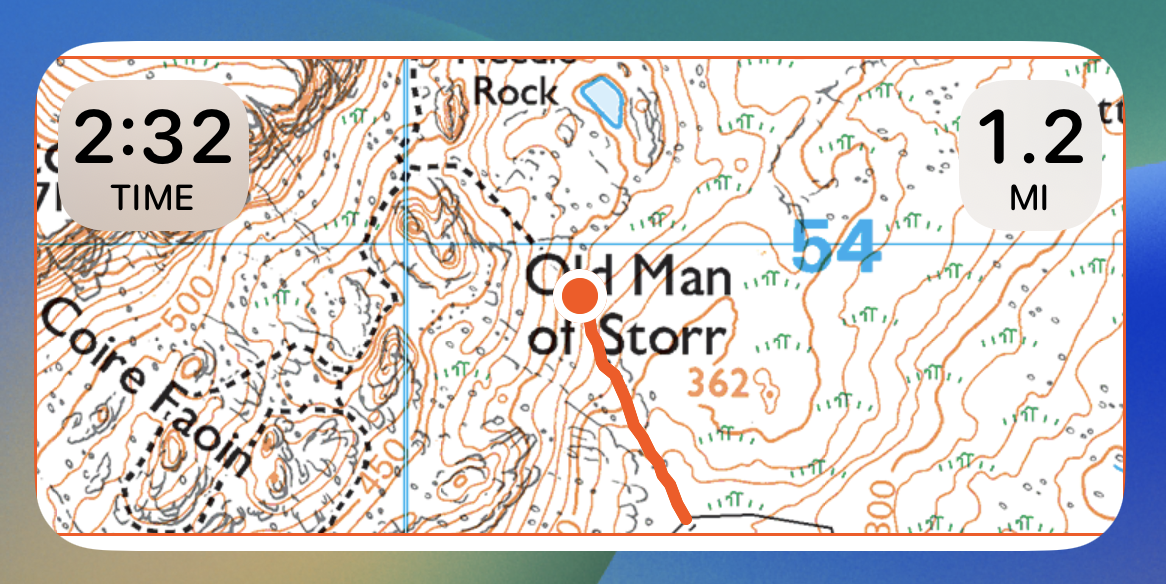
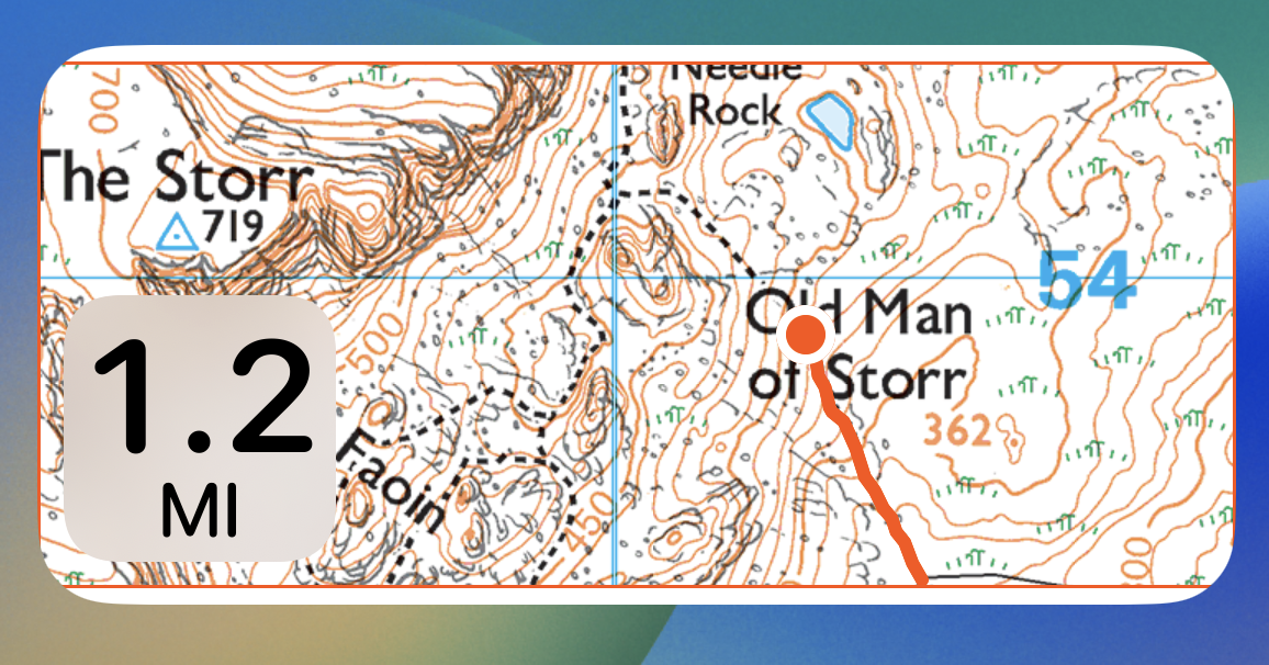
4. Just Distance in the Corner
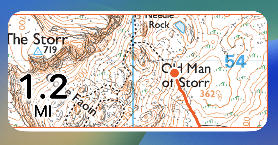
5. “Part of the Map”…YIKES!
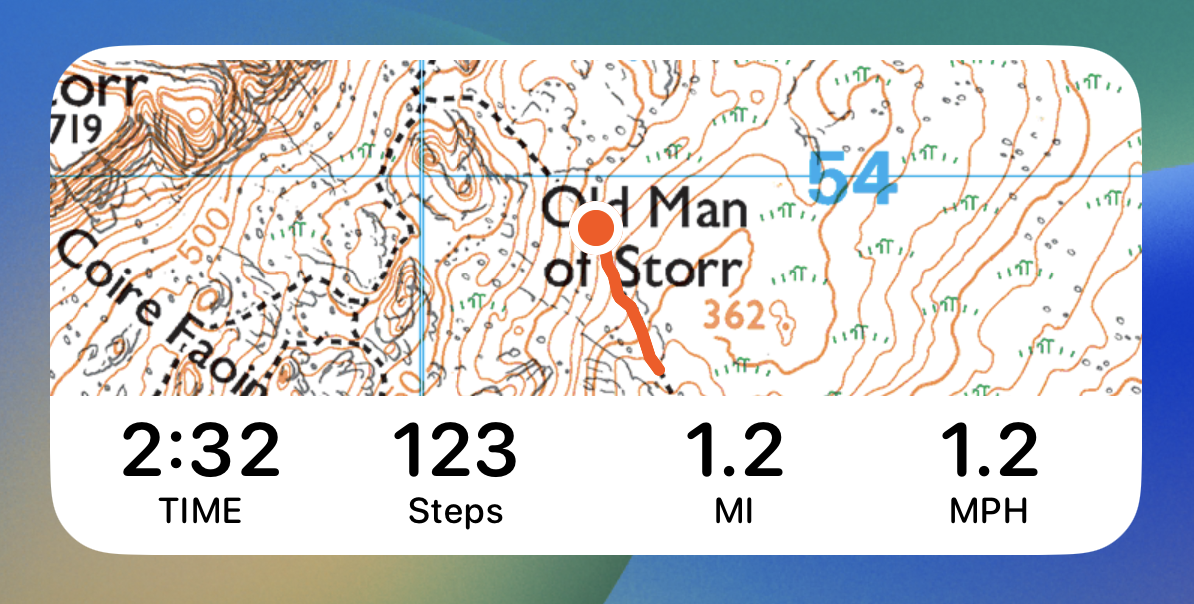
6. Just Distance, tidied up.
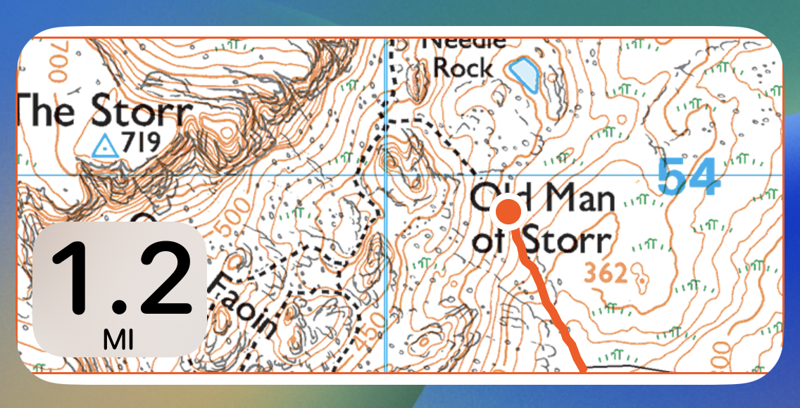
I think I’m leaning towards #6. While I have some interest in putting the time, distance, speed etc into the Live Activity. Given the constraints on updating it I’m starting to think that actually showing something that changes very rarely is actually better. While I can do things like shorten the time display to something like “2m” rather than “2:01” I’m wondering if all that does is set the wrong expectation. This display is more glanceable and simple…or at least it likely should be.
[Note those screenshots look a bit funny on the top and bottom edges because I have to preview them pretending that they are Medium widgets, as far as I can tell there isn’t yet a way to do a SwiftUI preview of Live Activities]
As is so often my approach when I get stuck on questions like this, my first port of call is the Human Interface Guidelines, specifically the section on Live Activities.
This section seems to settle the matter pretty well.
Present only the most essential content. People appreciate getting a summary and key bits of information about an ongoing task or event; they don’t expect to receive a lot of details or to perform actions in a Live Activity. Let people tap your Live Activity to access additional details and functionality within your app.
I’m only going to show the distance in the Live Activity/Dynamic Island. If the walker wants to see more details then they can just tap it.
Next up is the Dynamic Island Treatment.
1. Something “Traditional” where I put the distance in the corners of the island.
2. Bold, map oriented layout.
Option #1 feels like the safe option, but I often subscribe to the “If you’re gonna be a bear, be a Grizzly” school of design. So I’d rather not just do the safe thing. But I’m not sure about the way the cut-out looks…maybe Notch redux?
That’s either genius or horrible…and honestly I can’t tell the difference yet. I’ll have to live with it for a while. It feels like matching the old way is actually quite natural and fits with the rational why the original iPhone X had a notch. It avoids the weird trapped corner above the pill.
I may eventually offer an alternative layout for other workout types. For example, this map-centric layout is very appropriate for a hiking workout, but perhaps less so for running. But that is a problem for another day.
Daily Math Expedition
The mapping system I built is based on the XYZ/”Slippy” system. This involves a mountain of math converting between lat/lon coordinates into tile coordinates and projections. I just discovered that deep in my framework I was miss calculating the extent of the visible map, and thus was requesting way more mapping tiles than I needed to. Which would have been a rather expensive mistake to make if that had gotten through to production. Phew.
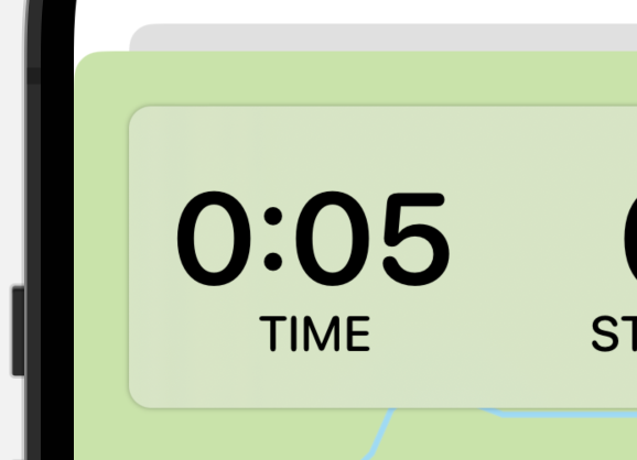
Corner Radius
I noticed something wrong with the top metric view. The workout view is displayed in a modal presentation. This has its corner rounded by the system to a 10pt corner. I was insetting my view from this by 16 points. Which leads to a little issue, visually speaking.
Typically the rule for perfectly matching interior corners is to decrease the inner radius by the padding amount between them. This means that the corners will match perfectly as they will share a center. However, in this case I’m padding by so much this would lead to an inner radius of -6pts. So instead the best I can do make the inner one smaller, in my case I went with 8pt. This visually makes it “nest” better, I think.