One of the most challenging questions I find myself facing when doing visual design work is: “What is good enough?”
Design is an exercise in constantly balancing tradeoffs between simplicity and complexity. Seeking to find that elusive, but satisfying, point where the two balance each other out and you end up with something that is both beautiful and functional.
I recently ran into this in a very concrete way when I was working with what is perhaps the most common visual element in the modern iOS design language…the rounded corner.
You could easily think that the rounded corner is a pretty straight forward thing. Just take a rectangle and then smooth off its edges, how hard could that be? Well the answer is tremendously hard and has taken me on a bit of a journey both in terms of my own tolerance for settling for “good enough” and exploring some mathematical topics which go well over my head.
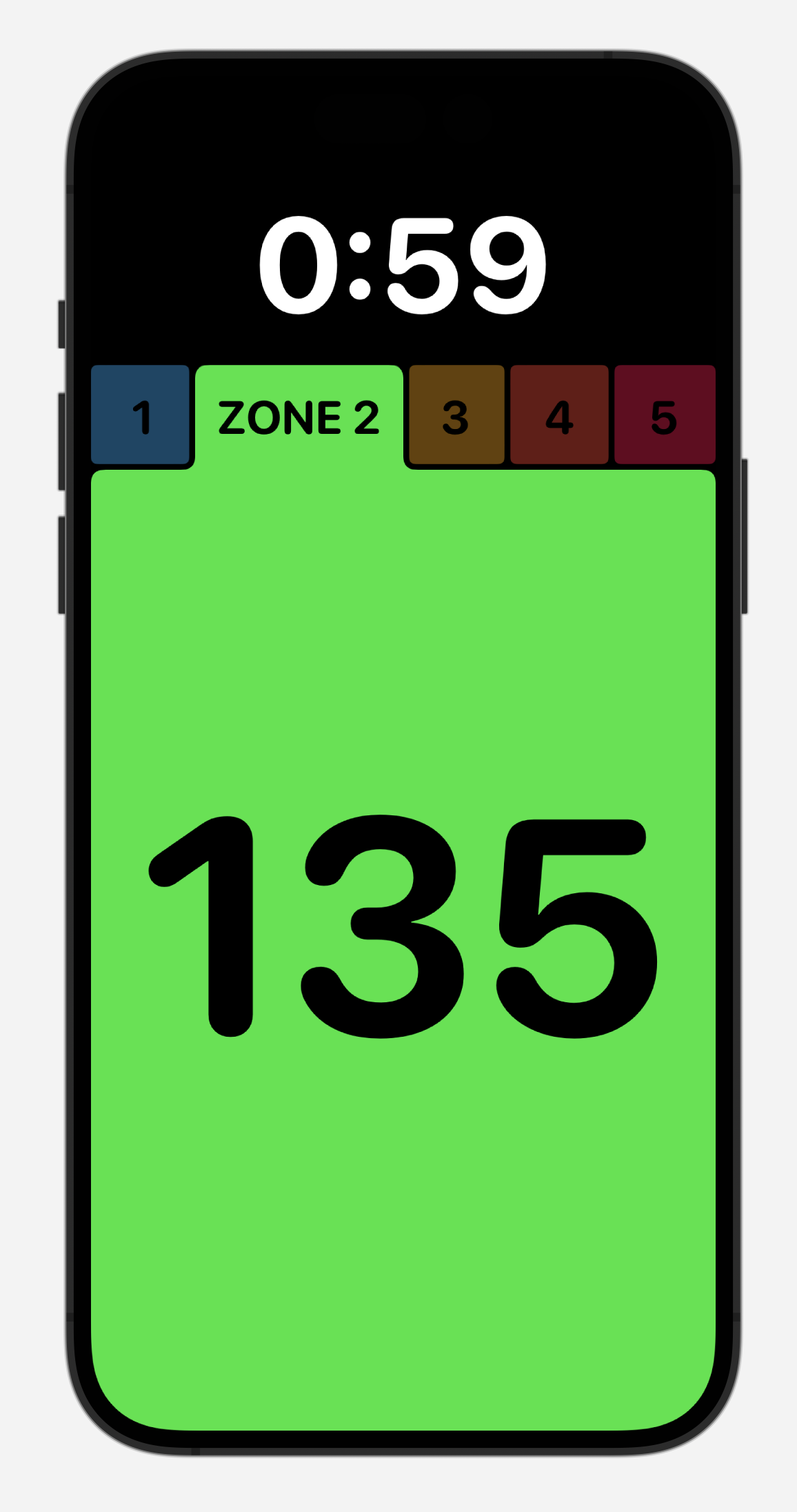
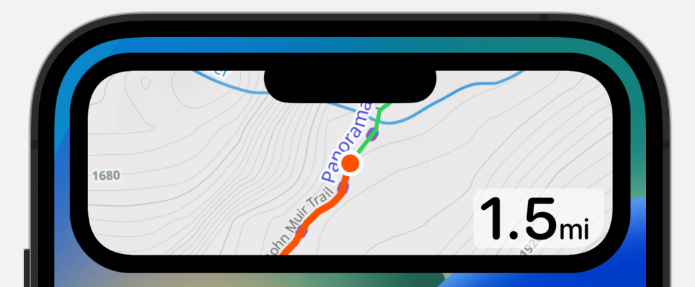
This design rabbit hole got started when I was working on an app for displaying your current heart rate as broadcast from your Apple Watch.
The visual design I settled on for this looks like this:
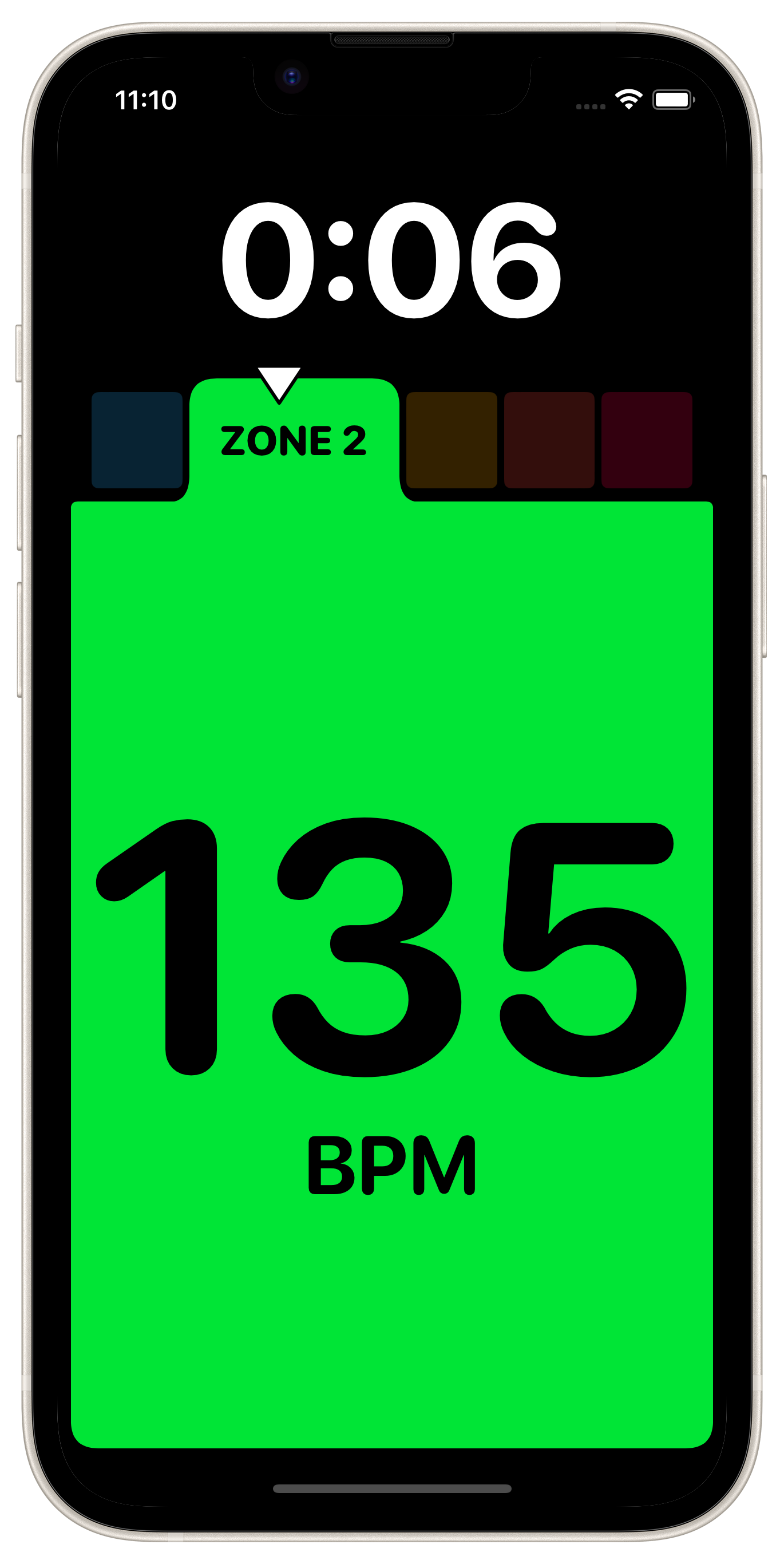
As you can see there are several rounded corners that I have incorporated into this design. If I didn’t I’d have a UI that looks like this:
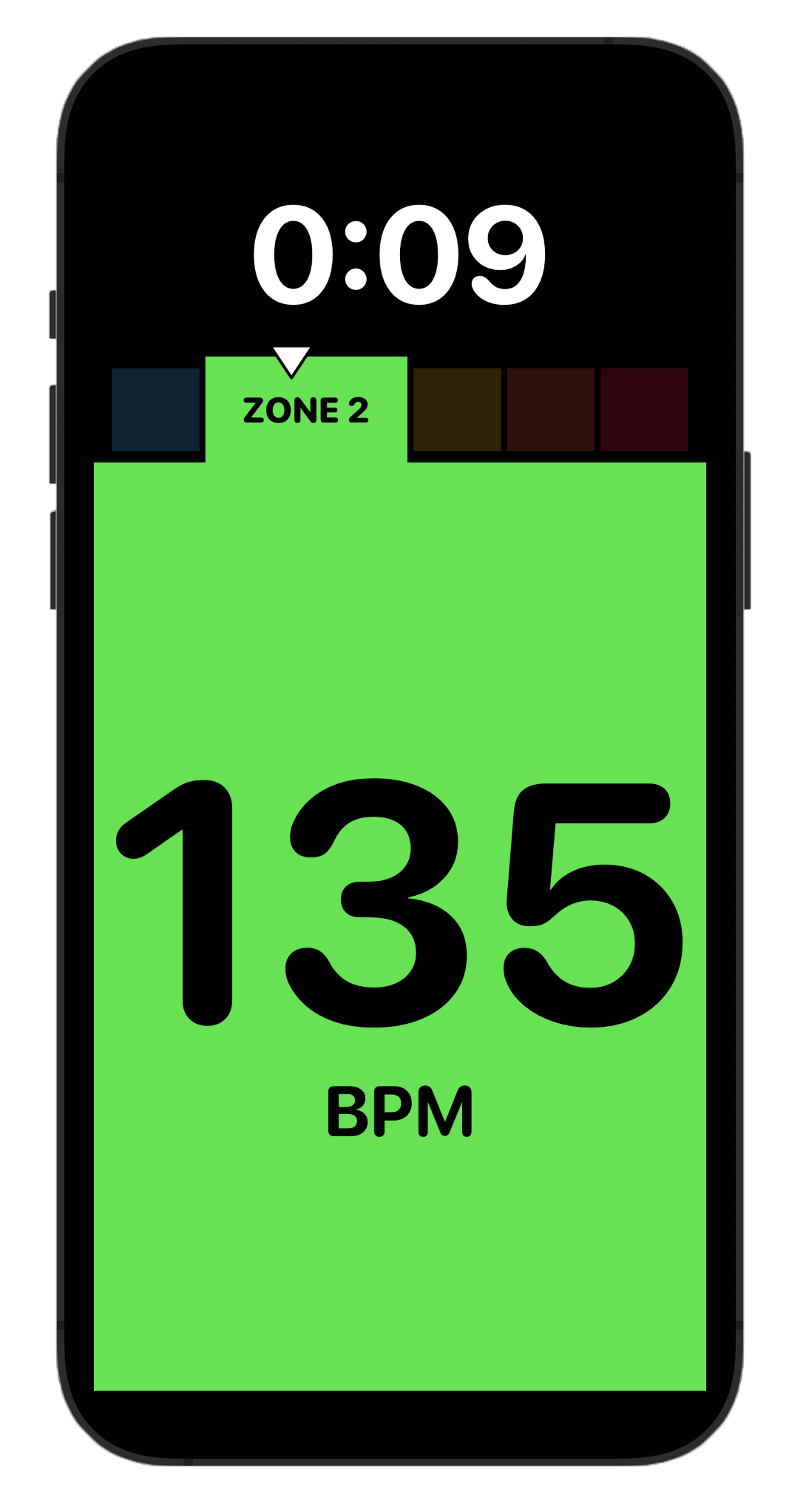
Which isn’t ‘bad’ but just doesn’t quite fit in with the round all the things aesthetic which is popular on iOS these days (and I’m not a good enough designer to try and start my own new trend).
So I’m left to work out how to round the corners of this large green shape.
When you are just making regular old rounded rectangles this is very straightforward. SwiftUI includes a function for RoundedRectangle(cornerRadius: 16, style:.continuous) drawing beautifully smooth corners if you use the .continuous style option.
These continuous style corners are what you want to use if you want to fit in on iOS. They are used all over the place within iOS’ UI and system element, and really are just beautiful.
If you used the .circular option (in red) you’d end up with a quite serviceable look but one that just isn’t quite “as good”.
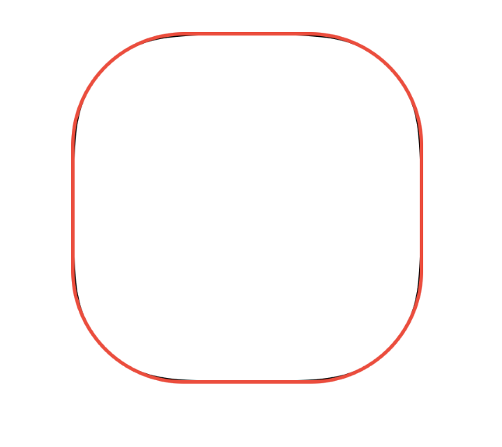
The corners have a small discontinuity in them which is super subtle but once you’ve trained your eye to see it you can’t unsee it.
Non Rectangular Corners
This is all well and good and works fantastically for 90% of your corners needs, but what do you do when you don’t want a rectangle? For example, in my above case I need to have variable corner radii and a shape which grows out of the top of another rectangle with a smoothly curving join.
Or alternatively, what if you just want a rectangle with different corner radii on each corner? For example, in my legibility background I use in Pedometer++’s Live Activity:
Over the years I have accumulated a number of tricks for creating smooth corners, which range from “kinda good enough” to “Chef’s Kiss”.
Kinda Good Enough
By far the easiest method I know of to create rounded corners is to use the addQuadCurve method on Path which lets you very easily draw a curve between two points.
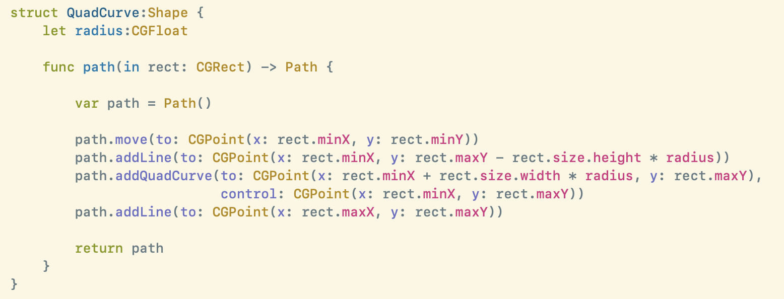
In this case you draw your rectangle as you would normally but stop one “radius” distance from the corner, then draw a quad curve to a point one “radius” away from the corner along the next edge, using the corner itself as the control point.
This works shockingly well, and is super easy to think about. Minimal math is involved and it can easily be adapted to a variety of corner needs.
But if you look closely it has a discontinuity at the join and won’t match the corners of system . continuous shapes. The latter problem you can sort of fudge by increasing the “radius” of the corner a bit (around 8% usually does the trick).
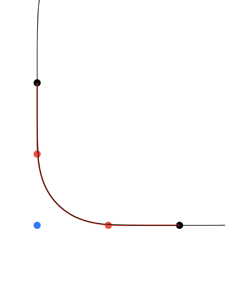
As you can see this is super close to the corner of the system control (in black.). This is really quite good, and honestly if you stopped reading here only your most eagle eyed users would ever notice a difference.
But in the darkest watches of the night you’ll awake with the lurking suspicion that you could have done better.
Pretty Good
The obvious next place to try is to follow the example of the system controls and draw the corners using a circular approach.
Here we again draw our rectangle as usual but when we get to a corner we stop exactly one radius away from the corner and join the edges with a circle.
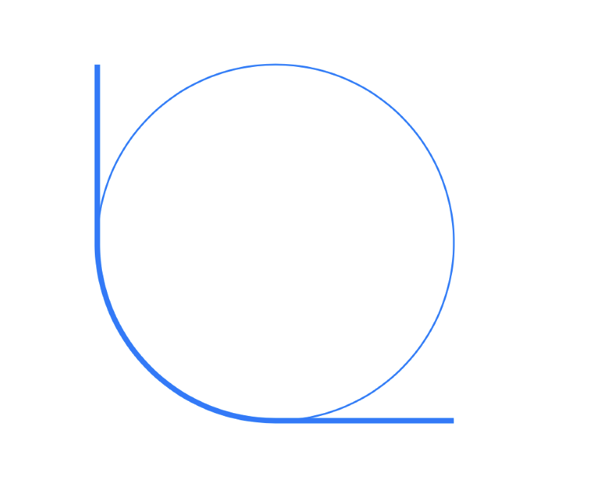
This results in a corner which is extremely close to the system shape, without the need to fudge the radius.
But the result actually has an even worse discontinuity from the Quad Curve approach, and personally I find that getting angles involved always leads to complexity and challenge.
Chef’s Kiss
Alright, this is part where things get well over my head.
Let me make a little confession, I don’t really understand Bézier curves. I understand the principle of them, but they always feel like this mystical black box where you input magic numbers and output beautiful curves. They are not intuitive at all, and if you get a value even slightly wrong then wild things can happen.
However, sadly if we want our curves to match the system ones then, as far as I know, we have to use them(😱). Which is suitably terrifying and something I avoided for a long time.
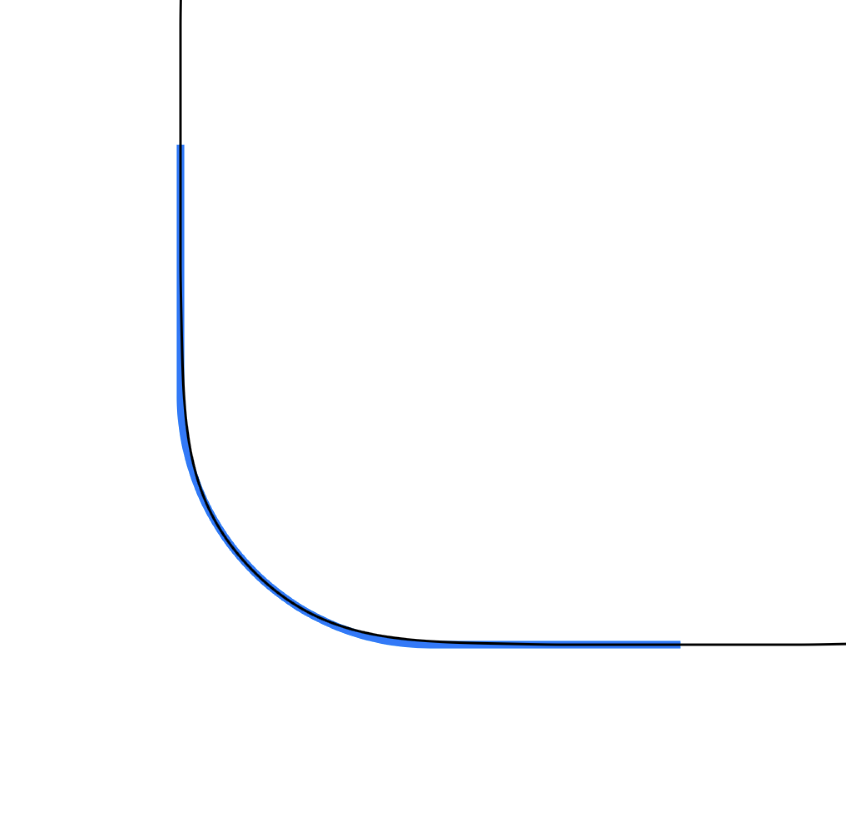
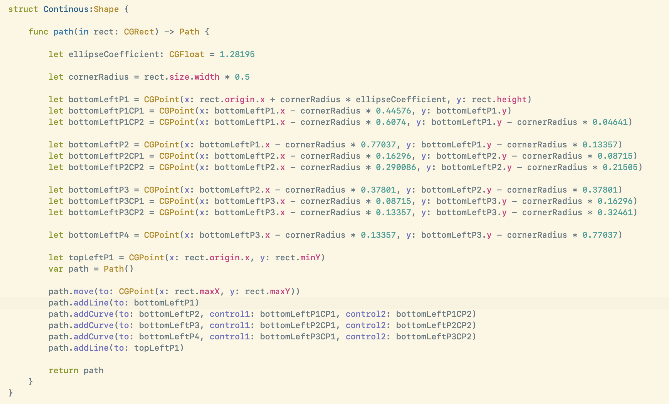
The best implementation of smooth corners that I could find was in this React Native project by Everdrone. It involves some serious magic values, and also this fascinating visualization of the curvature of corners based on this analysis.
All very cool, but way over my head. But I understand enough of what is happening here to follow that there are some magic values to determine a handful of Bézier curves which when combined together lead to the smooth, system corner I’m after.
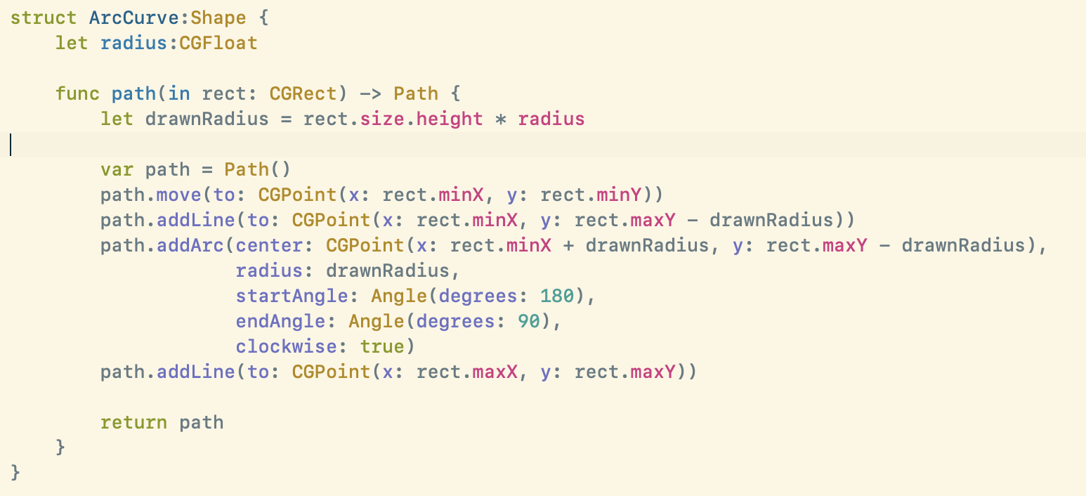
The code is complete gobbledygook…
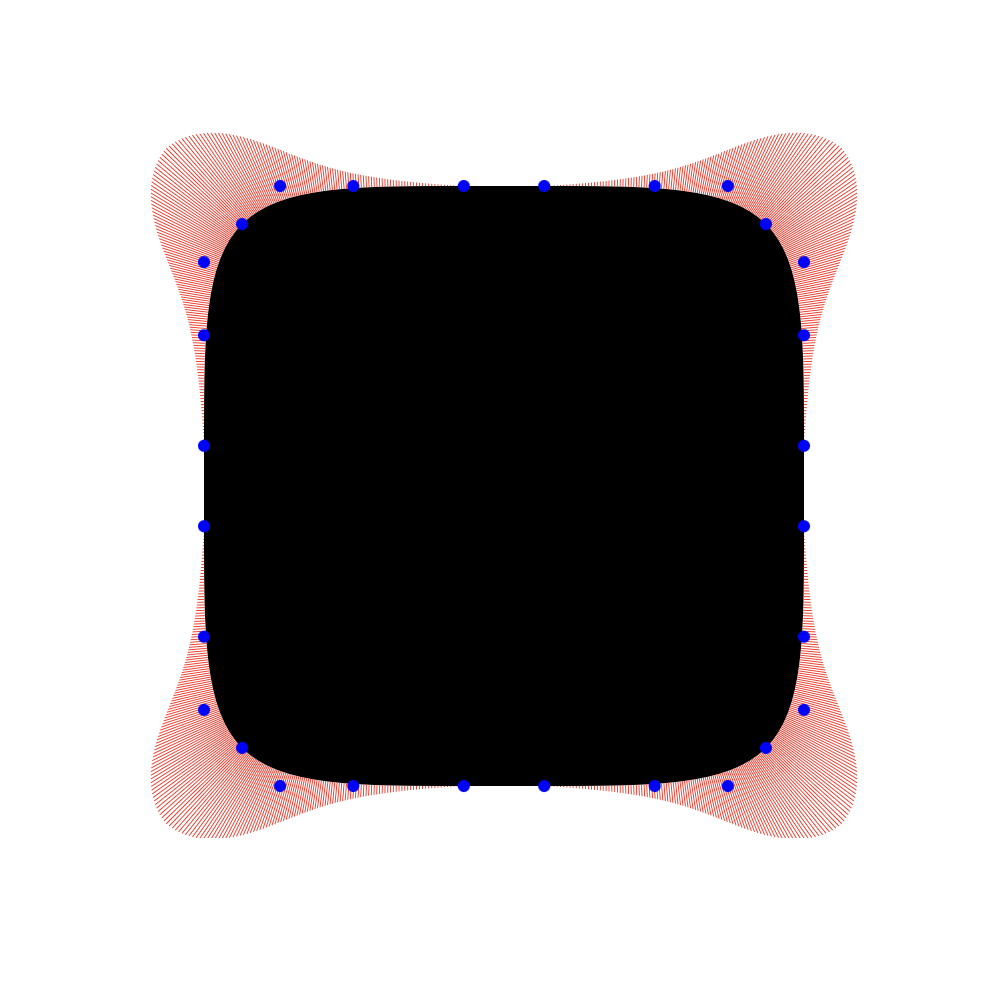
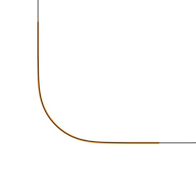
But the result is virtually identical, and without any discontinuities:
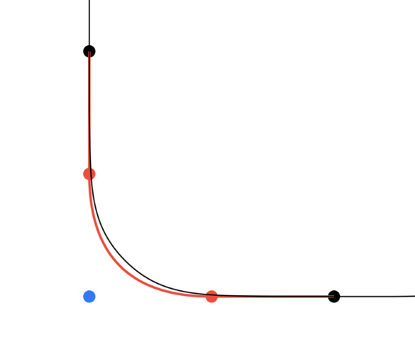
Visualizing the control points doesn’t really help me either:
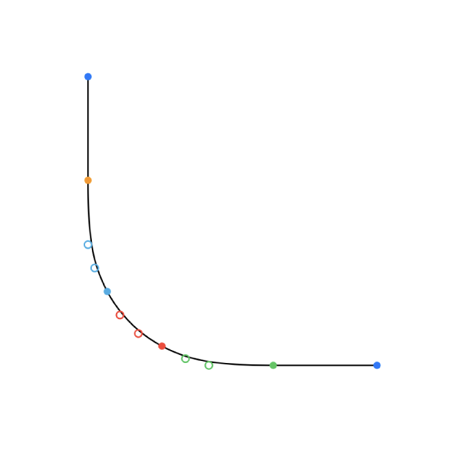
I can sort of see what is happening, but not really how it is working. Though the reality with a situation like this is I’m not really sure how much that matters. Math is math, and so long as I can safely use the math which is behind this form it seems safe to use.
Conclusions
In my own design work I find myself shifting away from the simple to the ‘correct’ more and more. I’m not really sure if this change has a tangible impact on my users, but I do know that it has a tangible impact on me. I feel better about my work when it is ‘correct’ even if it is a bit slower to create. Though I also know very well that this is a trap into which I am placing my foot. I don’t want to get bogged down chasing perfection, but I also shouldn’t give up too quickly when facing difficult problems. The real skill in design is being able to consistently find that line.
In this case by putting in the effort to perfect my corners, I can now nest the top tabs against system rounded rectangles and the result is a perfect fit.