One of the major focuses of my recent Pedometer++ v5 update was improving how well the app adapted to differing user preferences, specifically with regards to VoiceOver and Dynamic Type. This had previously had been really challenging to do because the app was written using ancient UIKit tools…many of which even pre-date the invention of Dynamic Type (which was added in iOS 7).
By rewriting the app in SwiftUI it was much easier to now properly modernize the accessibility experience to better suit a wide array of users.
This process is always a bit tricky for me as someone who doesn’t yet need to use these accommodation features myself. So I’m always slightly projecting myself into my user’s situation and imagining what they would prefer. I do a bit of user testing and benefited from several users in my beta group who do make use of these accommodations, but I have found there is no replacement for exposure to a wide audience to show you where you can make improvements.
Also, it is probably worth noting that every user’s specific preferences, abilities and experience is unique. There is no one “best” approach, there are a constellation of approaches some which would be better for one user, but potentially worse for another. My goal is find the best overall experience, for as wide a user base as I can.
This leads me to what has emerged as my accessibility philosophy:
Try, then Listen.
It is essential to not let the feeling of being unsure about the best approach to mean that you don’t take any approach at all. Rather I just get started and try. Get something built that users can react to and use. Then, the second step is to not be complacent and feel like you have “checked the box”. Instead, you open up avenues for feedback and when folks take the time to reach out, then listen.
Seek to understand the ‘why’ of what they are experiencing not just the ‘what’. Is there a fundamental disconnect between your own mental model of how something is being used? Can you find a way to accommodate for a wider audience? Did you just plain miss something that you can straightforwardly fix? Excellent…then start the cycle again and try to fix it.
Case Study with Dynamic Type
My experience of the first few days of having launched this Pedometer++ update was a perfect case study of how this can work in practice.
I did a lot of work in the update trying to make the Dynamic Type experience for the app really robust. I do the straight forward things like shrink and grow the text, but I also did things like change the number of graph bars shown on the root graph.
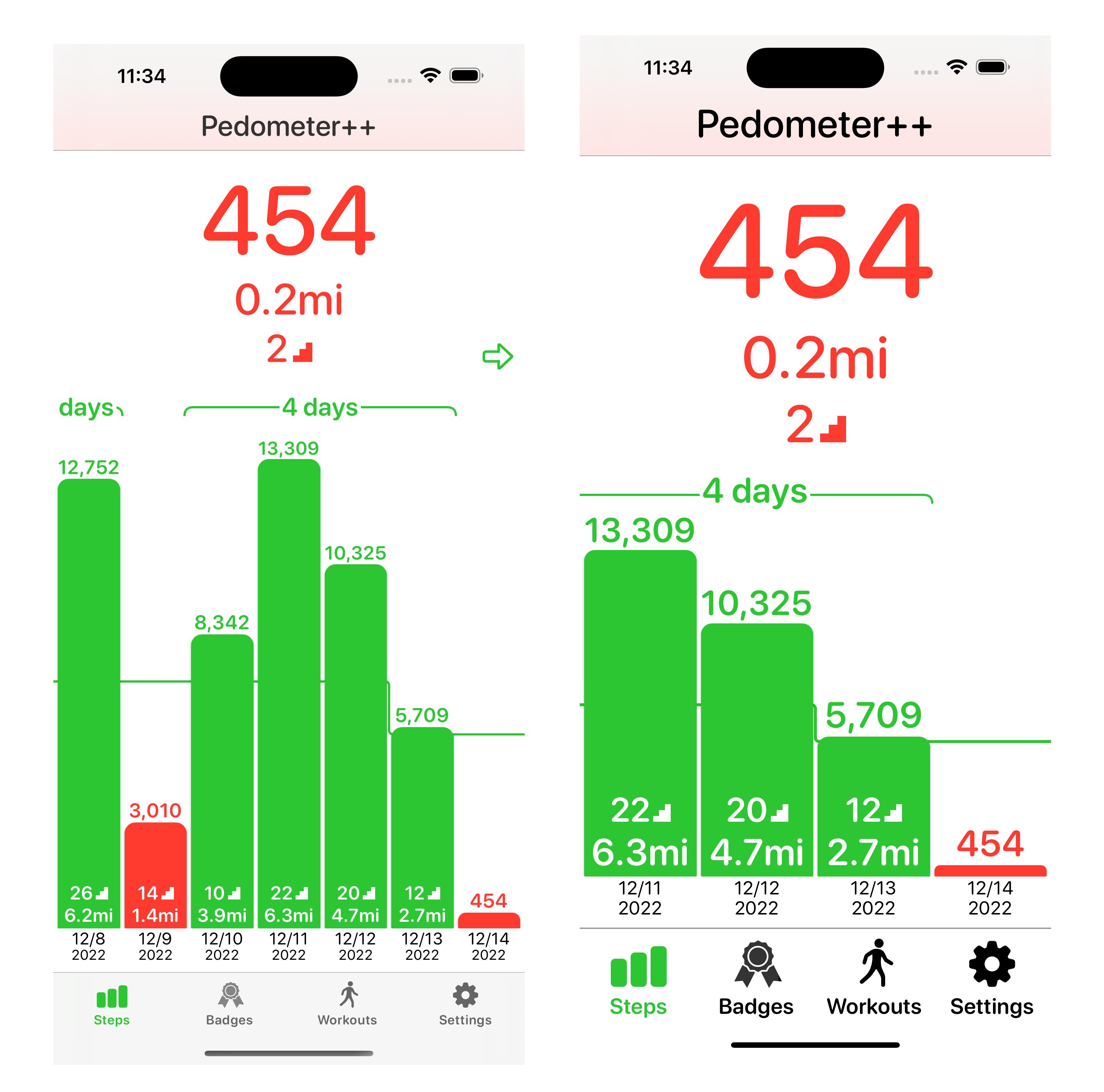
In doing this I was operating from a mental model where the users who would have turned up their Text Size were doing so because they found it difficult to view the screen otherwise, so making things as big as I could would be best. I was thinking that dramatic accommodations would be best because you wouldn’t have this turned on unless you really need it.
This thinking was informed by my measurements that in Widgetsmith where around 12% of users use a larger text size (and only 3% the very large sizes), which made it feel like it was an expression of a more specific need.
In reality, it turns out that the Dynamic Type size distribution between Widgetsmith and Pedometer++ is wildly different.
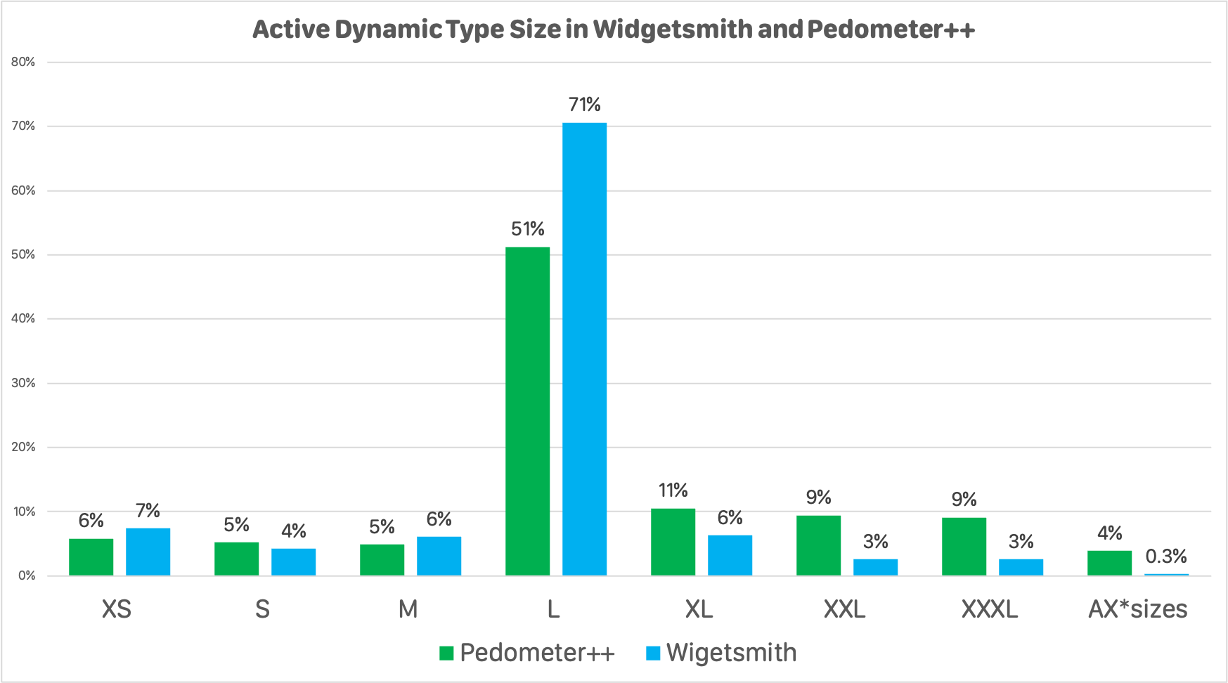
In Pedometer++ fully a third of users use the larger size, nearly double the number who use a smaller size. Rather than being an accommodation for a narrow segment of my users with specific needs, it is a preference expressed by a much wider group.
I heard from several folks about why they had their Text Size setting elevated. There were certainly some with the needs I was expecting, but many of them didn’t have much to do with a visual acuity challenge at all. It was often just a straightforward preference for larger text in some situations.
As a result, the dramatic visual changes I had made turned out to be an obstacle rather than a benefit for many users. They just wanted the text a bit bigger, but I was turning the UI around in major ways. I had overshot the mark in my desire to better accommodate for their preference.
So I’ve listened to this feedback and scaled back some of accommodations. I still scale the text, but I’m much less dramatic in my other changes. They are still there, but happen more gradually between size classes changes. I did get the countervailing feedback that the big, wide bars were a delight and really helpful for some users so I didn’t want to eliminate them, just tone them down.
Some feedback I also got from many users was a desire to have the text size in Pedometer++ be different than how they have it set in the rest of their phone. They preferred the narrow bars and generally small UI, even when they have the rest of their phone set for larger sizes. While initially I found this feedback difficult to understand, once I heard it from enough folks it became clear it was a wide spread preference.
While it is possible for them to set the Text Size for Pedometer++ separately from their other apps using a trick in Control Center. It felt like having to explain this to them and make it depend on a system feature didn’t make a ton of sense, so I also added an option in the theming section of the app to disable Dynamic Type in the app and always use the default size.
These changes shipped this morning in v5.0.2, and so now I begin another cycle of listening. I’ll be keen to hear from folks about how these adjustments now fit with their preferred experience. Inevitably I’ll then make another set of (hopefully smaller) tweaks and try again, and again, and again until I reach that sweet spot of widest possible benefit to the widest possible user base.