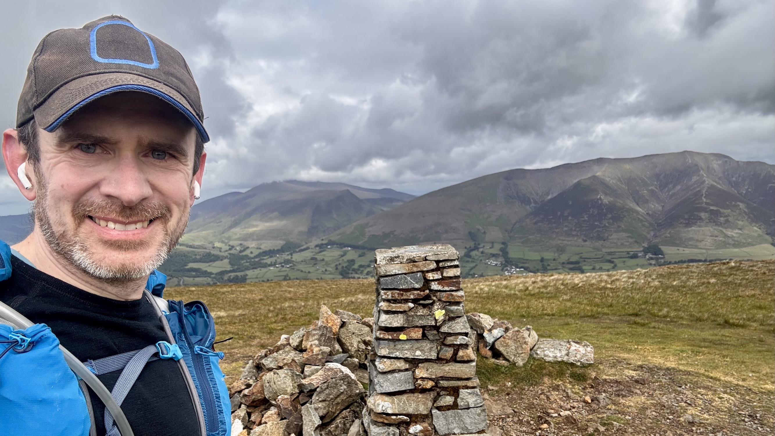
I love going on wilderness adventures. I am rarely happier than when I am far off into the mountains without a soul in sight. As a result, I have spent a lot of time learning how to safely explore and navigate when I’m away from civilization. The most important habit I’ve found for not getting lost is to be very regular in checking your location as you go, and the best way I’ve found to do that is to have a map on my wrist.
For more than six years I’ve been working towards creating the best possible mapping experience on the Apple Watch. With yesterday’s launch of Pedometer++ 8, I feel like this design journey has reached a meaningful destination. I would contend that Pedometer++’s watchOS mapping support is the absolute best available on the App Store.
So I wanted to walk through the journey it took to get here.
Early Efforts
I have wanted a good map on my wrist since the Apple Watch launched. This wasn’t realistically possible until watchOS 6, which brought SwiftUI to the platform and, for the first time, made “real” apps possible. But in those early days, the screens were tiny, and the processors slow. I couldn’t quite get to where I wanted.
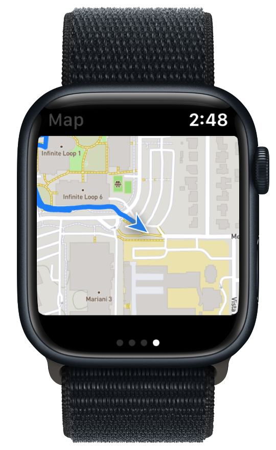
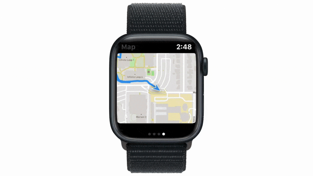
This was my very first attempt that shipped in Pedometer++. These maps were generated completely on the server, which involved sending the relevant workout data roundtrip every time I wanted to refresh the display. This system let me validate the idea, but it was never going to be practically useful for navigation or regular use, and could never work offline.
Custom Mapping Engine
I knew that if I wanted to make progress towards this goal, I’d need to work at a lower level, so I got to work building a fully SwiftUI-native map rendering engine. SwiftUI was the only choice because it’s all that watchOS supported, and proved to be helpful for putting maps into widgets, which also only support SwiftUI.
In 2021, I got this engine to a place where I could reliably and performantly render a map on watchOS. With it, I can render any tile-based maps and overlay location information on top.
Map Designs
Next came the question of how best to surface data to users. App design on watchOS is a really fun — but frustrating — challenge. You are designing for a relatively tiny screen, which must be operated one-handed. In this case, I want the user to be able to read the map and use it to navigate, while also having access to other workout-related information.
This began a long series of design attempts, most of which (if I’m being honest) were kinda awful.

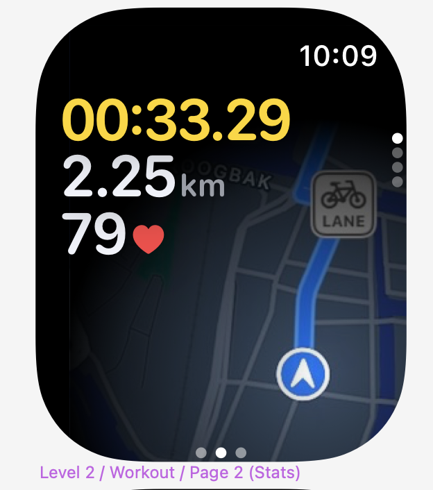
In the end, I settled on a “modal” approach where the user can switch between a map screen and a metrics screen using a button on the top-left corner.
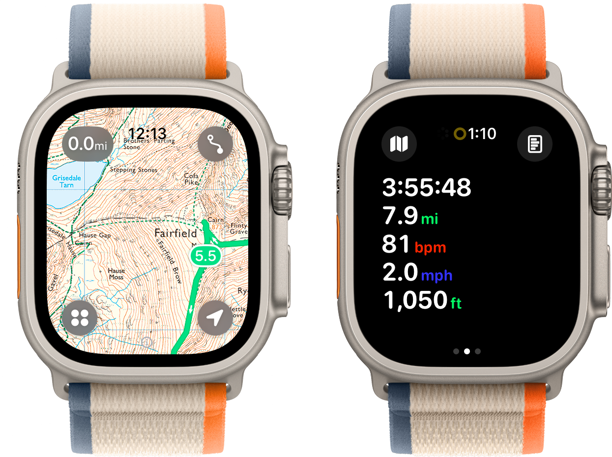
This interface provides one context where the user can freely pan/zoom around the map and another where I can use the more standard watchOS tabbed page interface for metrics and controls. I shipped this to Pedometer++, but there was always something that didn’t quite sit right with me about it.
This design felt like a compromise, and not in a good way. I felt that in order to achieve the goal of making the map interactive, I couldn’t have the map be part of any UI structure that involved swipes. As the screens on Apple Watches got larger, it felt less needed in order to give the map enough space to be useful.
So I set about trying alternative designs. SO many designs.
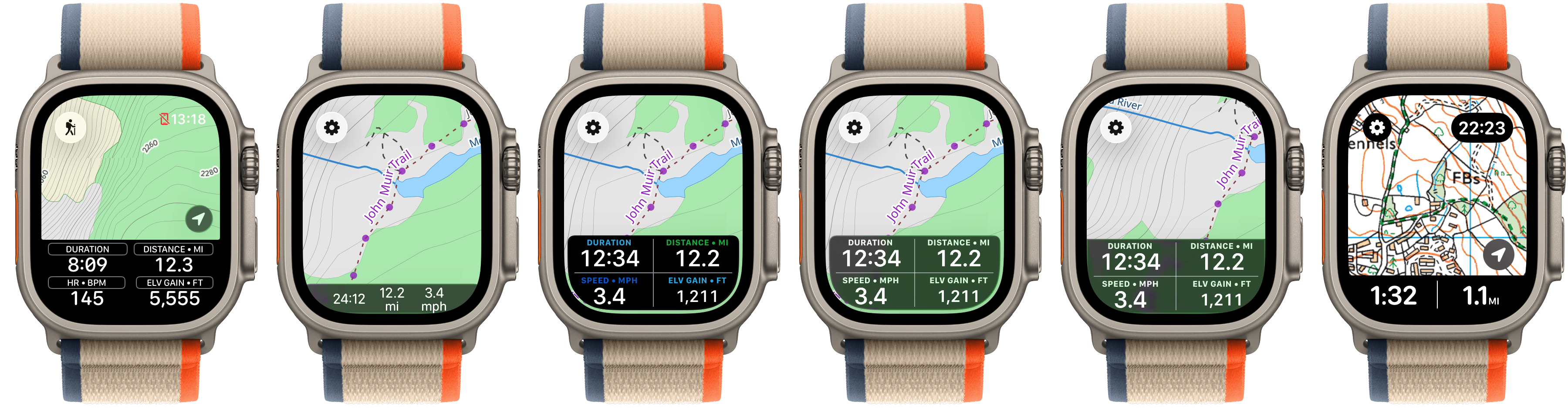
For a while, I thought that I needed to find a way to put the metrics at the bottom of the screen. However, that would lead to other problems on longer outings or for workouts that aren’t navigation-focused. So I kept iterating and came up with even more designs.
All of these designs suffered from the same fundamental issue: they required the app to display only a fixed set of fields at a time.
I could make the interface configurable, but one of the fundamental rules of watchOS design is that you should avoid any interaction that takes more than a few seconds on the watch. Any user-configurable setup is inherently fiddly, so I didn’t like this approach.
Dark Mode, Liquid Glass, & Cartography
Around the same time I was still wrestling with the design challenges of how best to structure the app, Apple announced watchOS 26, and the arrival of Liquid Glass. One of the core design aspects of Liquid Glass is layering stacking elements on top of each other, but another is the types of colors that work best with each other.
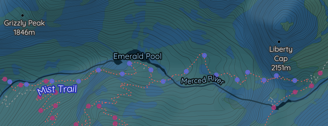
I was previously using Thunderforest Outdoors as my basemap for the app. I love the content this map includes, but when I started overlaying glassy elements over it I found that it wasn’t well-suited for Liquid Glass.
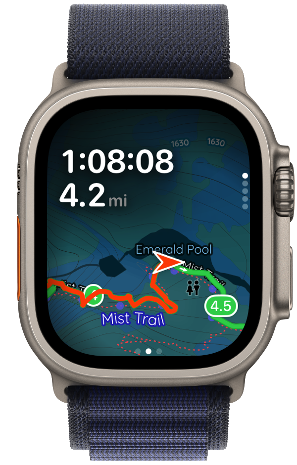
So… I commissioned a custom map. Working with the incredible cartographer Andy Allan, we created a completely new basemap that would look fantastic with Liquid Glass.1
We simplified the map visually, increased the contrast of the elements, and made the map elements more saturated to prevent them from becoming a muddy mess when shown below glass.
With this work done, I had another opportunity: I could finally have a dark mode variant of the map tiles. While helpful on iOS, this really shines on watchOS. Andy and I really worked toward something which would be incredibly legible at arm’s length.
The result of these efforts is that now I have a great map for watchOS… but a design that didn’t match that greatness.
Striving for Great
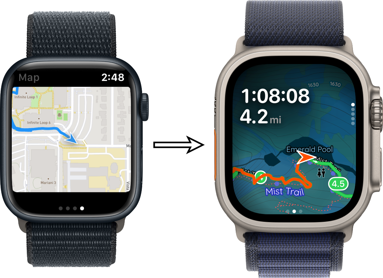
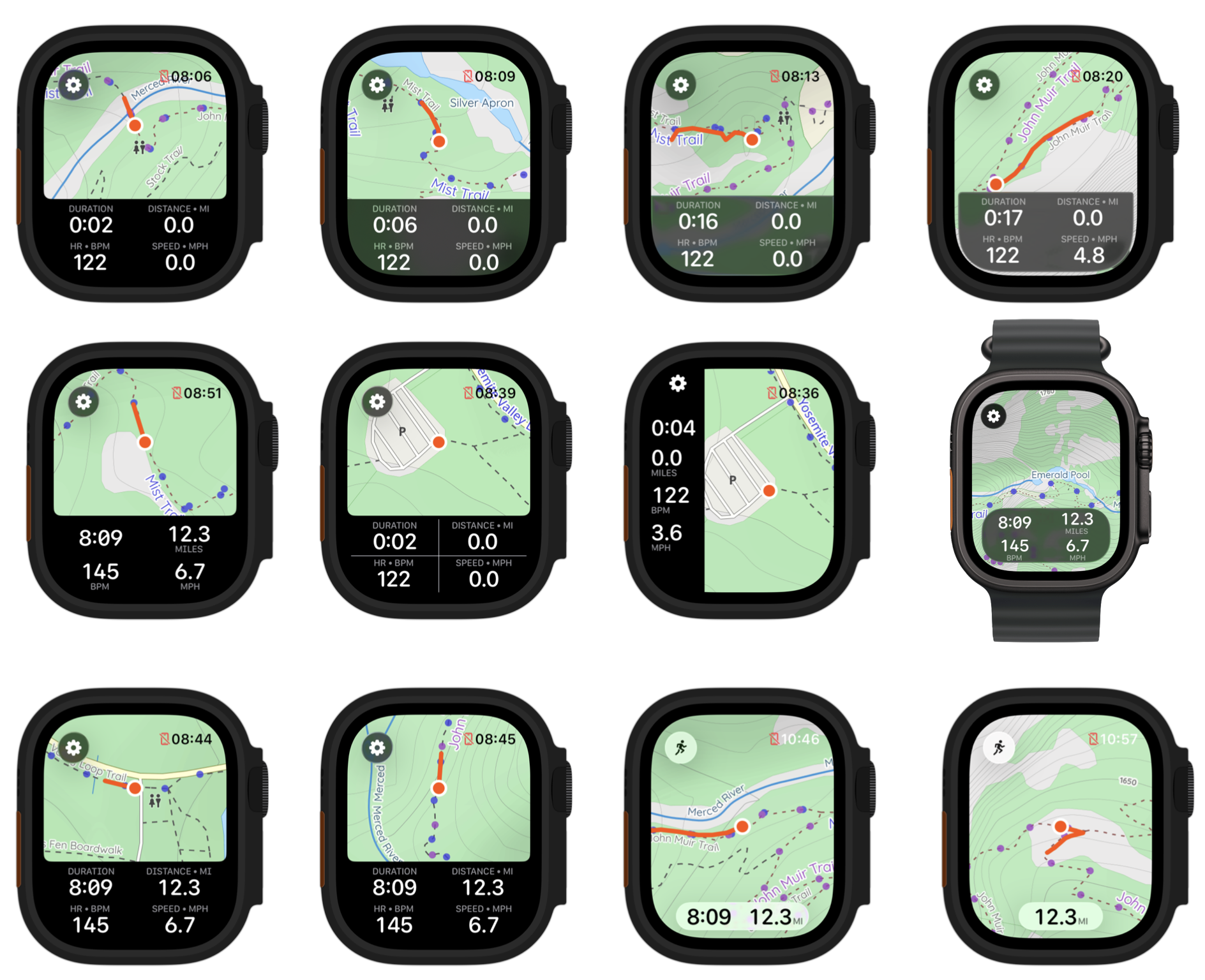
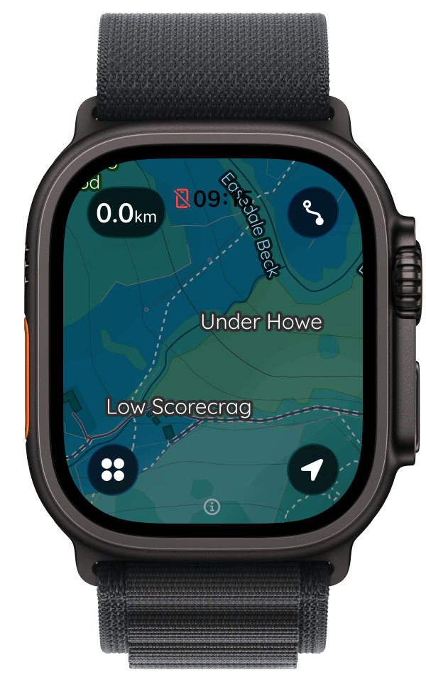
I kept trying. To get me out of my design rut, I enlisted the help of the fantastic designer Rafa Conde. I needed a fresh set of eyes on this and very quickly, this partnership paid off. They proposed a variety of alternative layouts, but when I saw this one I knew it was the one.
The layering of the metrics on the top-left corner, with the map being the top page of a vertical stack, was the correct answer. This design handles interactivity by requiring a tap on the map first to enter “browse mode”.
Tweaking and Polishing
Now that I had the overall concept locked in, the real fun began, actually building the app and dialing in all the details. I fairly quickly took Rafa’s concept and turned it into a working prototype. This let me validate the idea in the field… literally. After walking a few hundred miles with it, I was confident it was the correct approach.
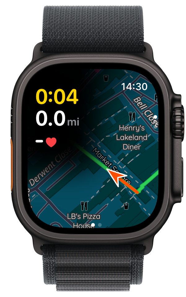
Next, I needed to dial in the font and make more subtle design choices.
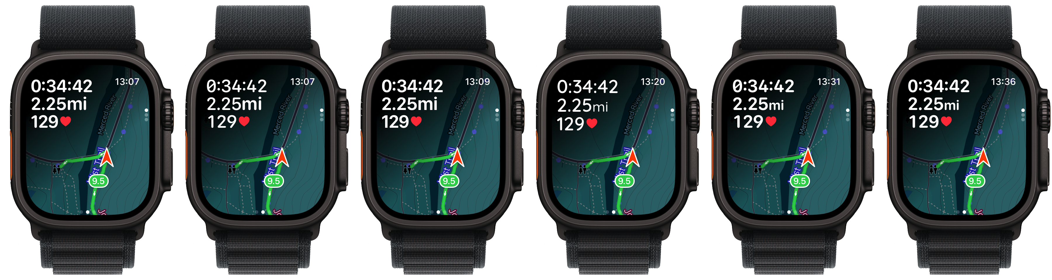
After a bit more iteration, I arrived at the design that shipped yesterday. It is legible, useful, and (in my humble opinion) beautiful.
It feels really good to be able to cap off this six-year journey with a design I couldn’t be more proud of. This screen represents so much accumulated effort and learning. It finally gives me a design which feels native on the platform, but also novel and unique.
Here is the evolution of this design over the last six years:
Postscript: Considering MapKit
While my work on watchOS mapping massively predates the arrival of Apple’s MapKit onto the platform, it is probably worth explaining why I decided to do all of this custom work to avoid using it.
Fundamentally, I find that MapKit is great for basic uses, but doesn’t provide nearly the level of configurability and utility which I want Pedometer++ to offer. For example:
- MapKit on watchOS always shows in dark mode, which generally is a good default, but closes the door on some accessibility and user choice reasons. I needed it to be a user-selectable option.
- While MapKit on watchOS has gotten better over time in terms of what you can do with it, I still find it a bit limiting in terms of animations and overlays.
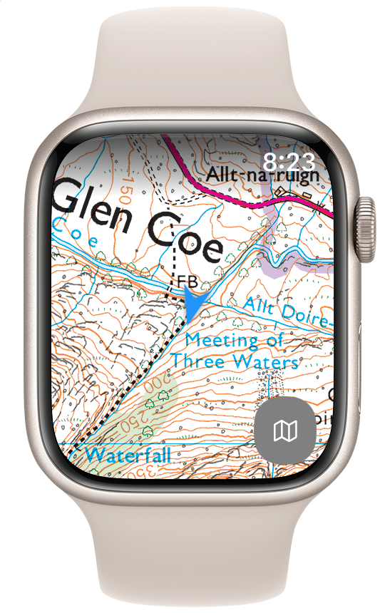
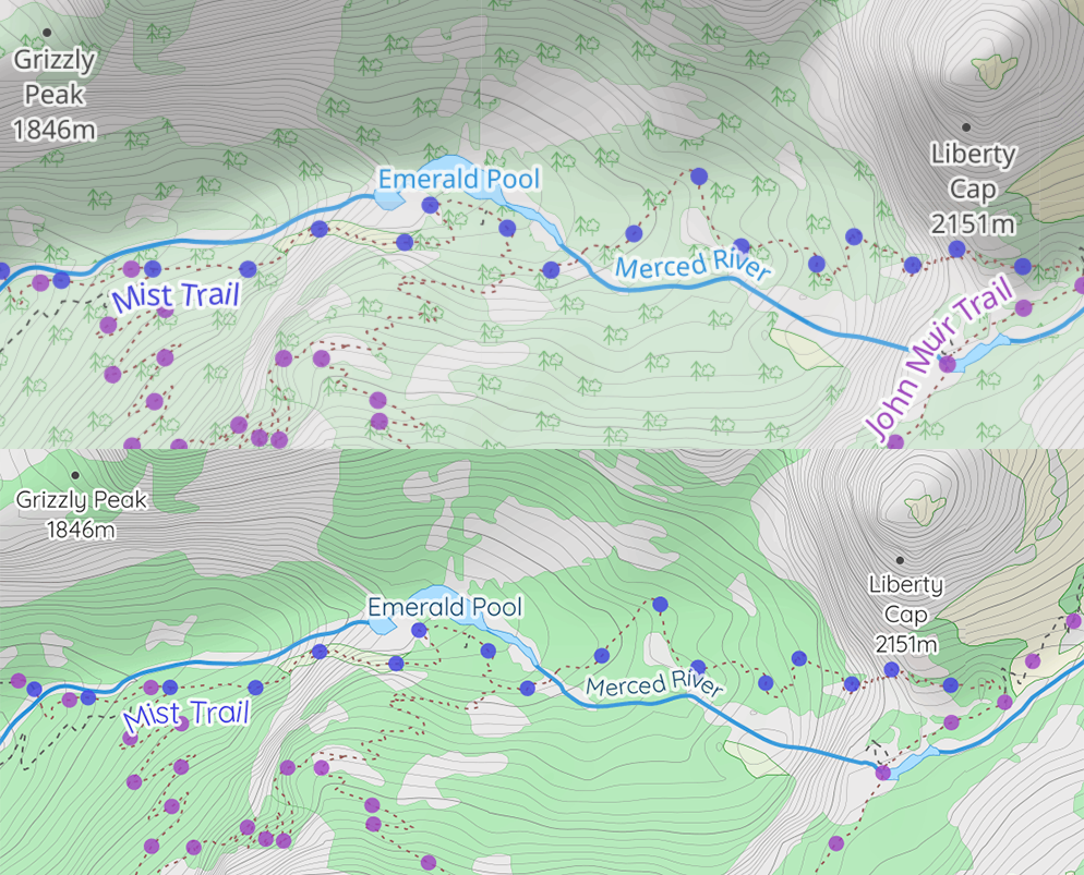
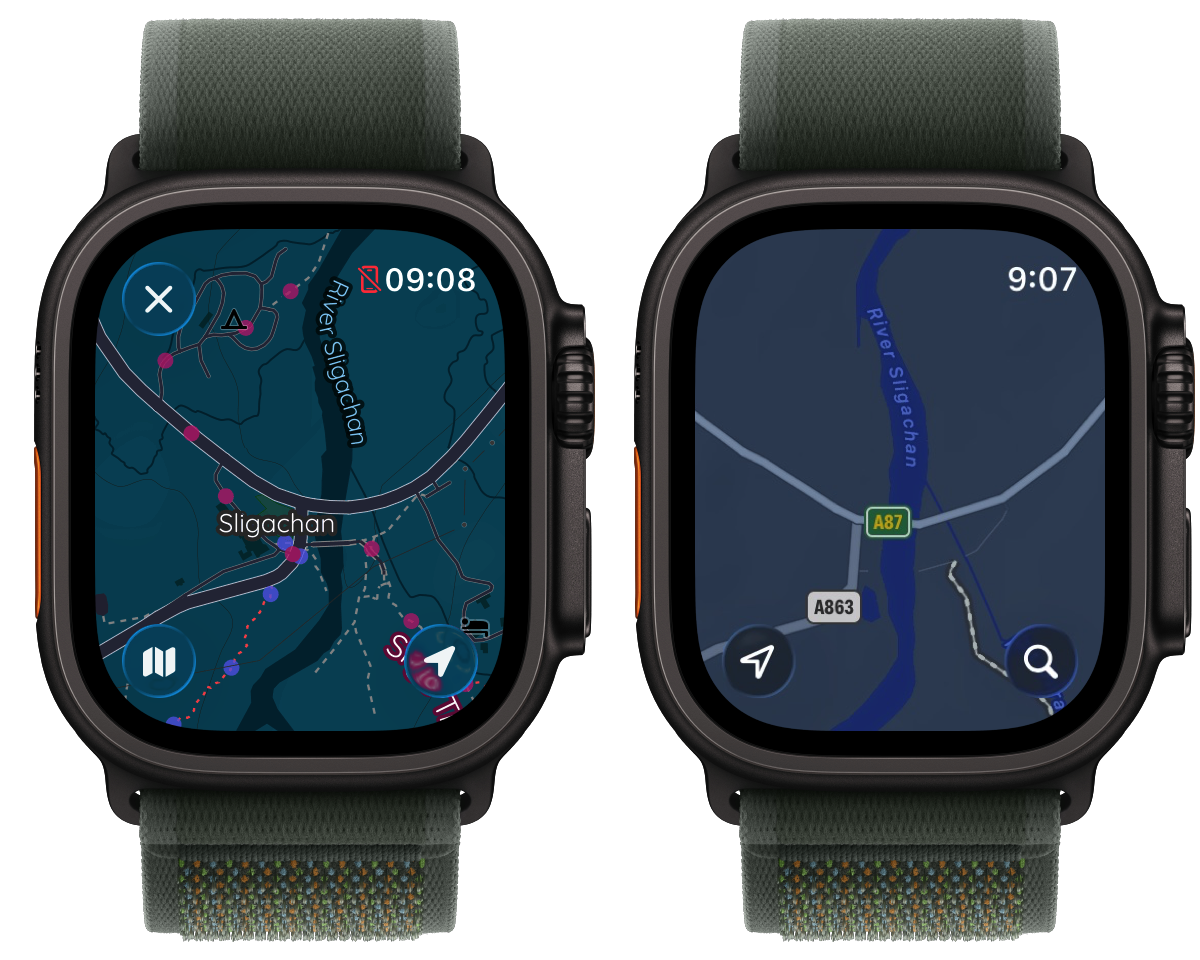
- MapKit’s coverage is improving with regards to topographic contours and trail marking, but there are far too many places where the MapKit map is essentially blank, but I know there should be more rich details available. For example, here is my map vs MapKit at the trailhead of one of my favorite hikes in Scotland.
-
I still find it so cool that my work on this allows me to say that I “commissioned a cartographer” to work on something for me. 😁 ↩