Yesterday afternoon I submitted my last major pre-iOS 26 update (which feels very good to be out the door). So I am now able to turn my attention more fully to iOS 26 updates.
I’m starting by focusing exclusively on the design update portion of my iOS 26 work. While there are a variety of other functional changes I need to make, what is most important right now is to build a basic design so that I can start living with it and see how it feels in practice.
Finding Inspirations
The overall complexity of the design changes are much simpler in Pedometer++, and so that’s where I’m going to start (rather than Widgetsmith). Then within Pedometer++ I need to decide where am I going to begin work.
I need to establish the visual language that I’m going to carry through the app. The new Design Language of iOS 26 is not wholly prescriptive, it leaves large room for individual interpretation and places for me to put my own spin on things.
So I took a look at Pedometer++’s screens and picked out a handful of “core” screens which I think if I get right will serve as a strong foundation to then apply to all the other parts of the app.
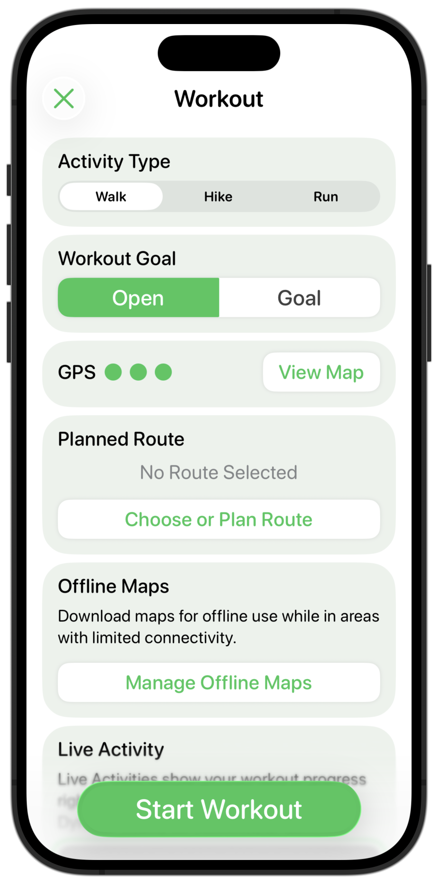
The first of these core screens is the “Start Workout” screen:
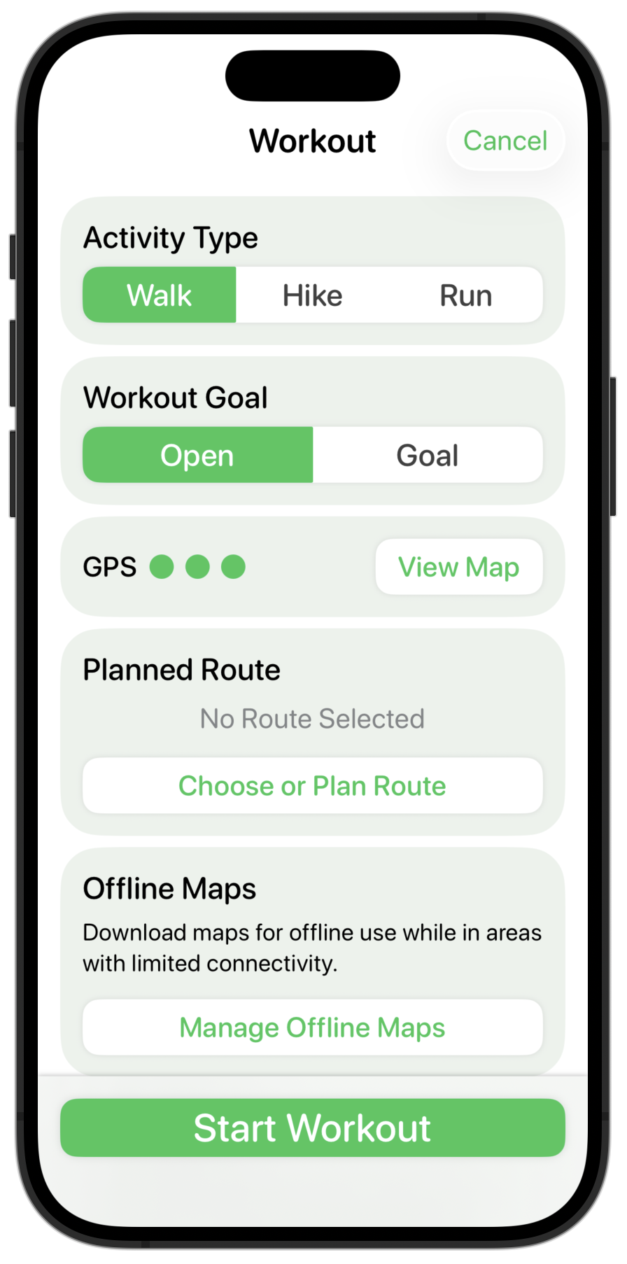
I’m starting here because it includes a number of the custom controls I’ve built for Pedometer++ and also because it is a good example of a “configurator” screen.
My design process while still trying to learn the new design language is that once I pick the screen I want to work on then I will scour the Apple provided apps for examples of things which hold similar components. I’m looking for inspiration and examples of the numerous small details which make up a consistent design. Apple has a clear head-start on my own understanding and so I’m trying to shortcut as many pitfalls as possible.
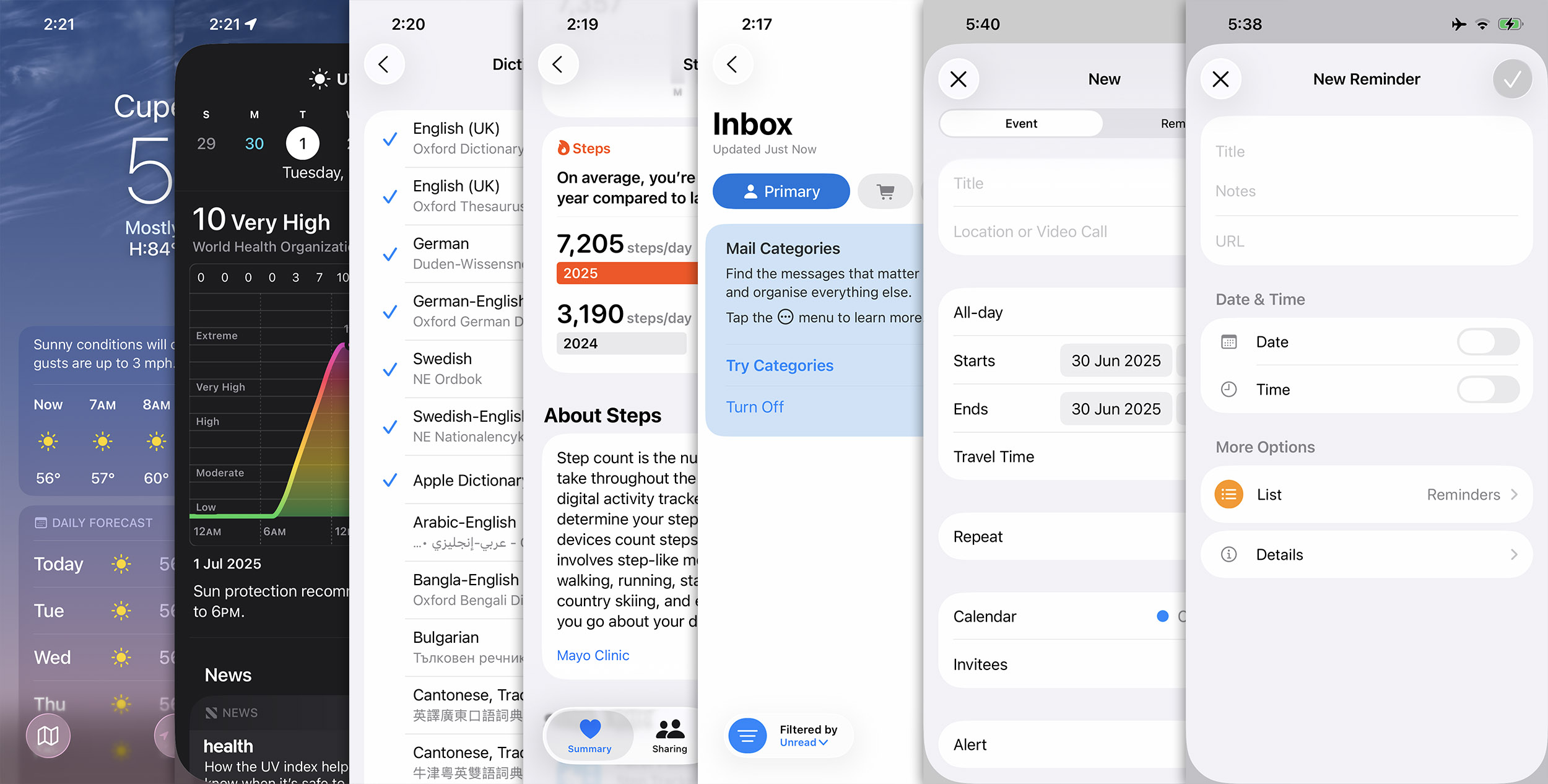
I put all these screenshots into an “Inspo” folder and regularly scan through them while I’m mulling over a design detail to see if there are components I can draw from. In this case I found that the “Create Reminder” screen is probably the closest thing to my “Start Workout” screen, with the “New Event” screen a close second.
Iteration
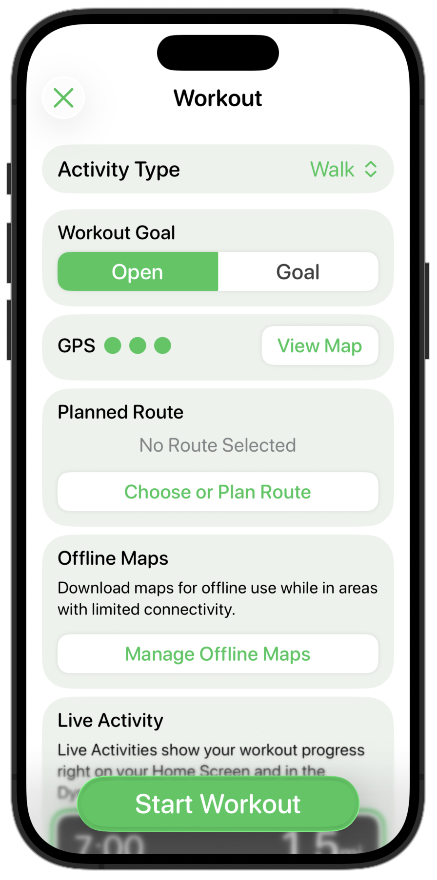
The first things I need to do is to change the bottom “Start Workout” button from a translucent sheet to a glassy button with an edge blur along the bottom. I think this fits well with the general ideas of placing important controls along the bottom edge and using glass to indicate a navigation/structural control.
Next the headers in the sections are way too big and heavy, so these are toned down.
My custom segmented control looks out of place now. I could either change it to being a capsule shape (which generally seems to be the default control shape now), or I could try using the default system segmented control picker.
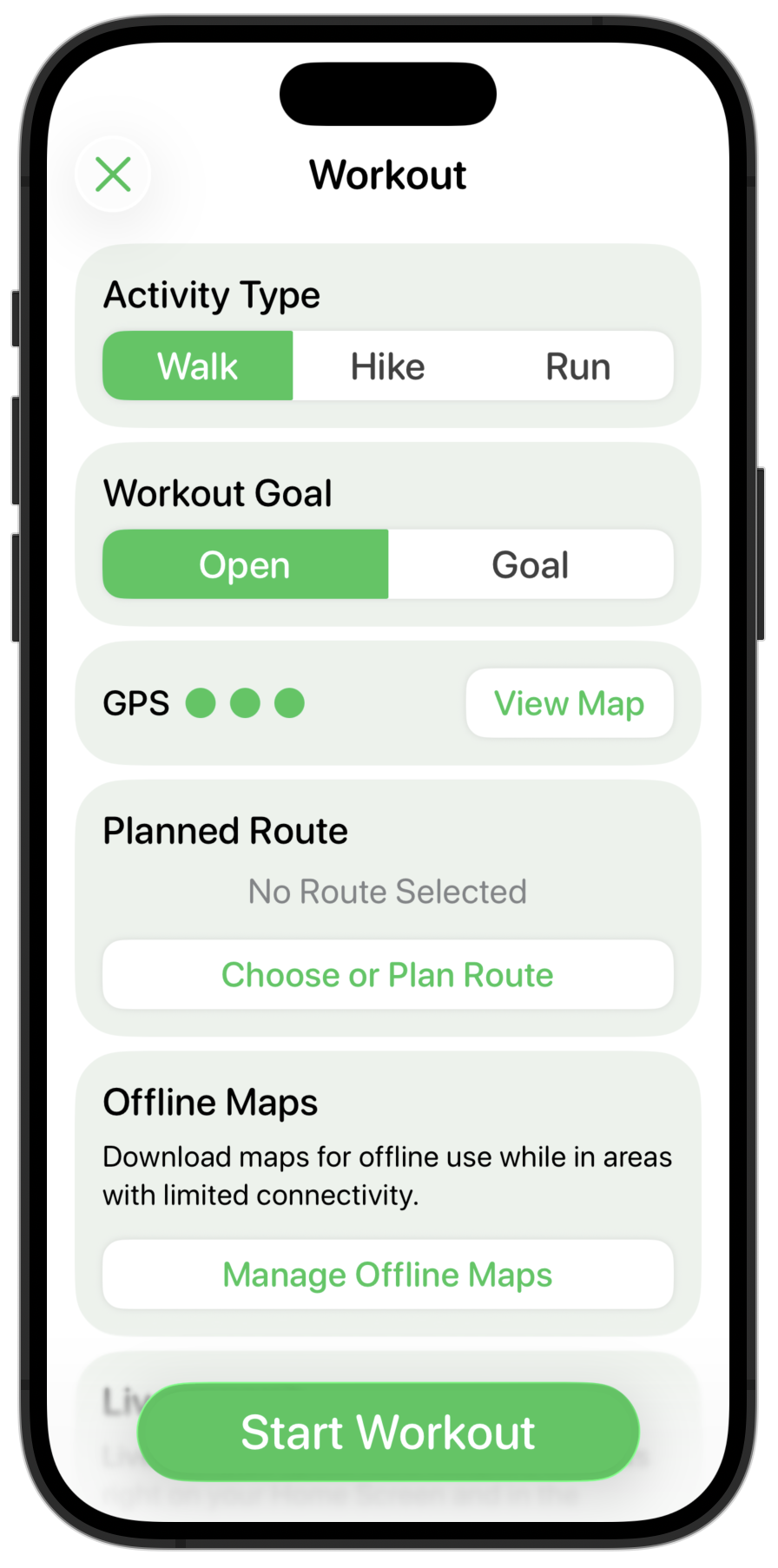
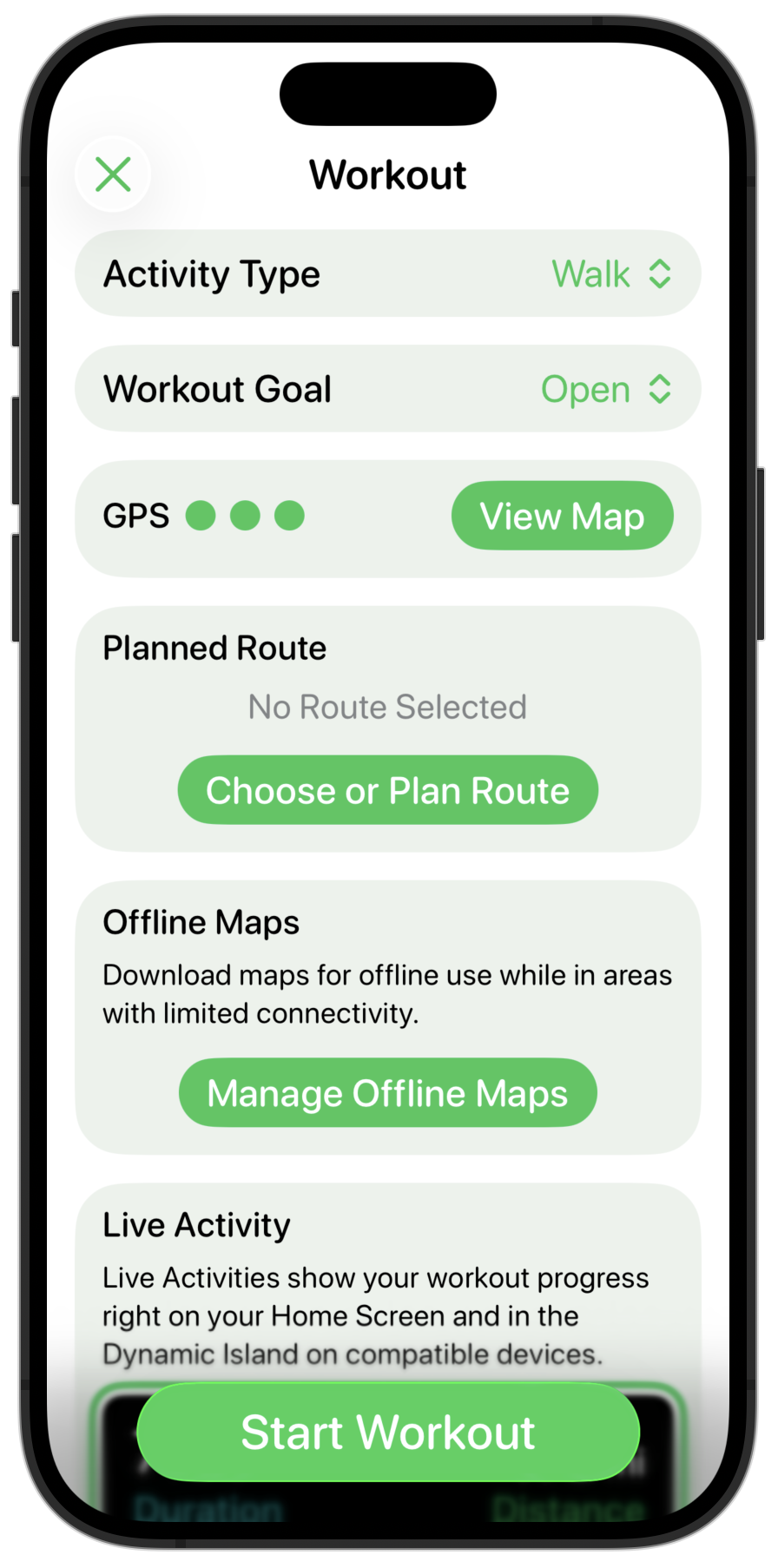
That feels more at home in the design, but I also find having several of these next to each other visually very busy. So instead I’m gonna try using the menu based picker instead.
For a user choice which likely doesn’t change very often this feels much cleaner and clearer. This control will default to your most recently used option so most users will likely only change it once. I like that much better, so will also apply that to the Workout Goal setting.
Next up are the shadowed, round-rect buttons I was using before. I start off by making them capsule shapes and giving them a flat appearance.
I think the sections being colored and the background being white doesn’t look quite right so let’s flip that around.
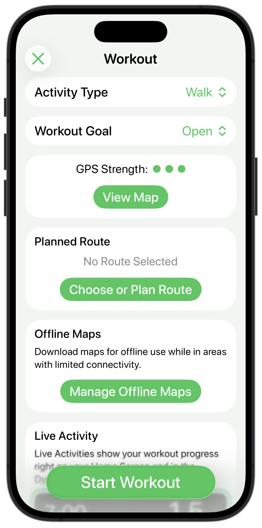
Much cleaner, but now the inline buttons look way too strong and have the same visual prominence of the main “Start Workout” button. So let’s tone those down by making them use the secondary color for their background, keeping the color in the text instead.
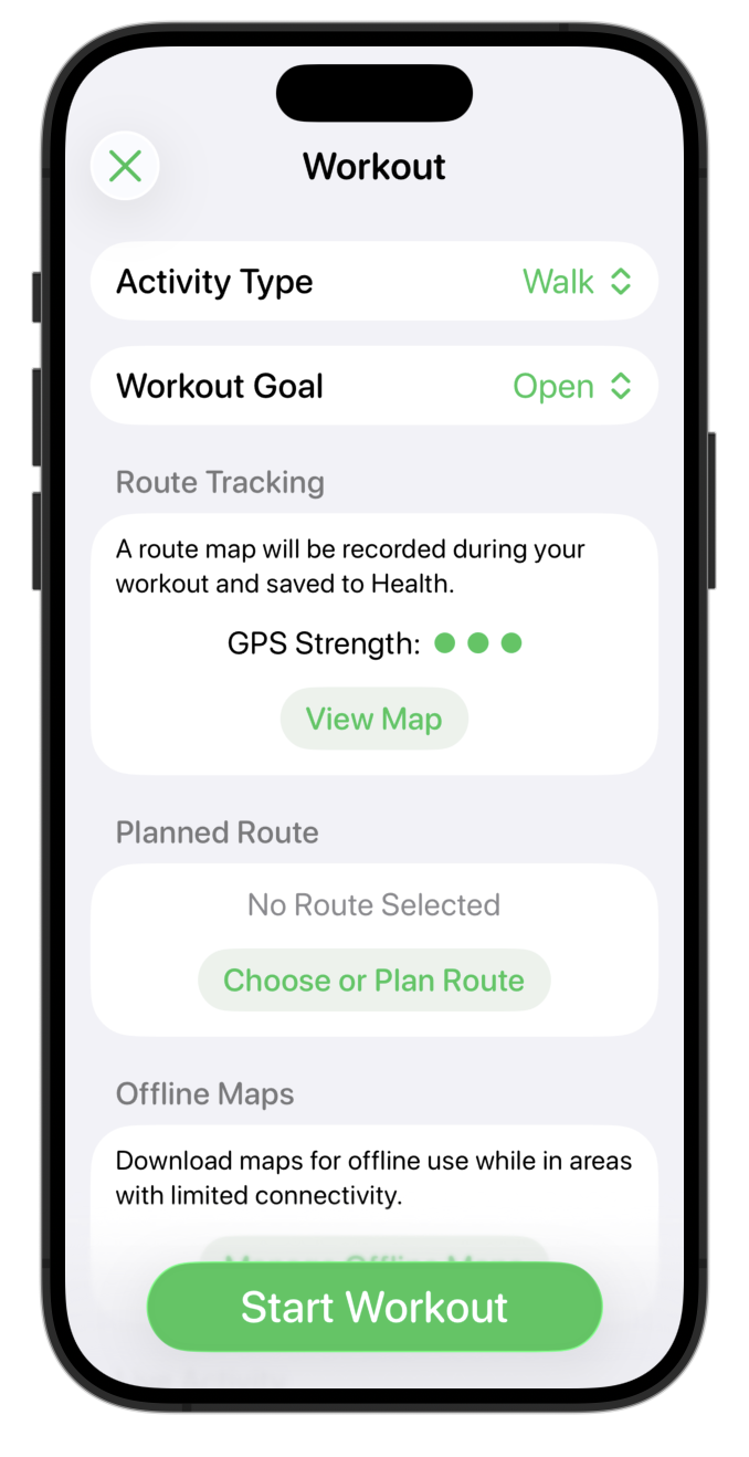
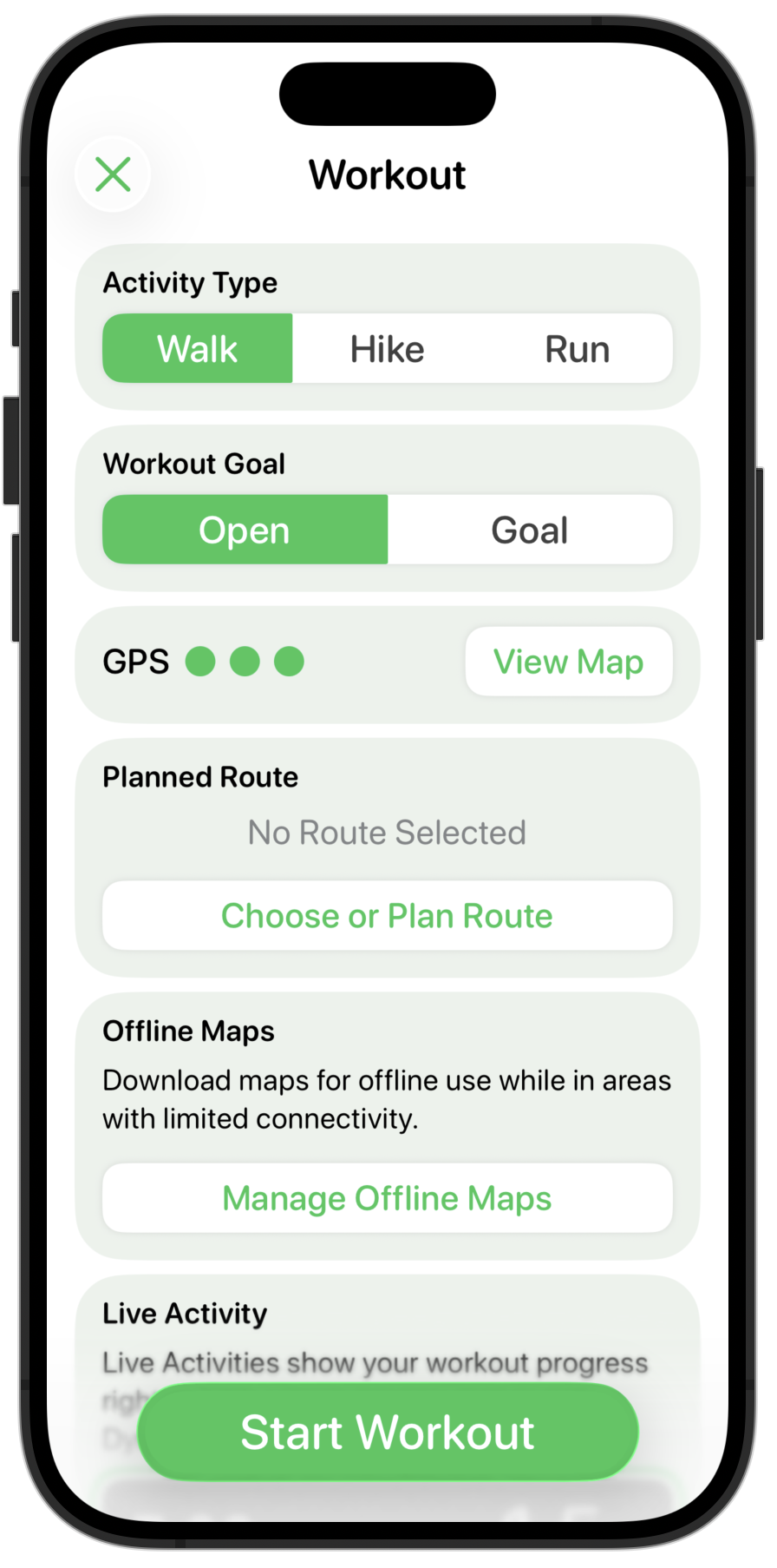
Much better. The contrast in the buttons still needs some work, but overall the structure and general “feel” seems pretty good now.
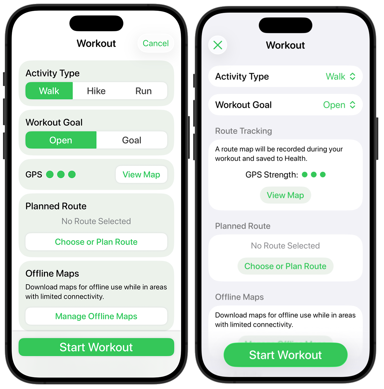
Here is the before and after for comparison.
This picks up a lot of the general design cues of the “Add Reminder” page but in a way which (hopefully) feels familiar to someone who was coming from the iOS 18 version.
Next up…maps.