I was fortunate enough to get one of the Design Labs late last week, which meant that I spent Friday morning frantically doing as many first-pass updates to the new design as I could. I then was able to discuss many of them during the lab and learned a bunch.
Something in particular which I heard a few times was that I was overusing Liquid Glass. Which I suppose makes sense, it is the literally shiny new thing. Looking back at these early redesigns, I was mostly just rounding everything and adding Liquid Glass to all interactive elements.
Here is a basic example of this in action:
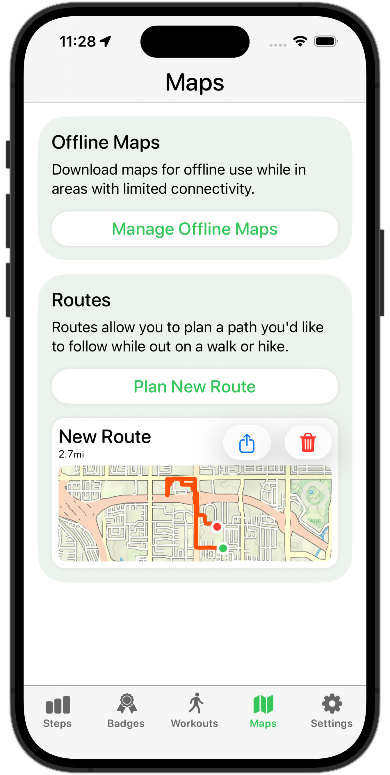
For the Route list, I just added the .glass button style to the share and delete buttons. When you’d tap on them, they’d then get the cool lift-up fluid effect.
Something my design lab consultant said, which was really clarifying for me, was that Liquid Glass should generally be used to highlight content underneath the button. So if that content is plain/flat, then it is likely not appropriate. In this case, if the button was over the map preview, then it might be appropriate, but since the whole section is tappable, then I’d have two levels of interactivity, which is generally not great.
In this case after the lab I took another attempt at redesigning the route chooser rows and ended up with this:
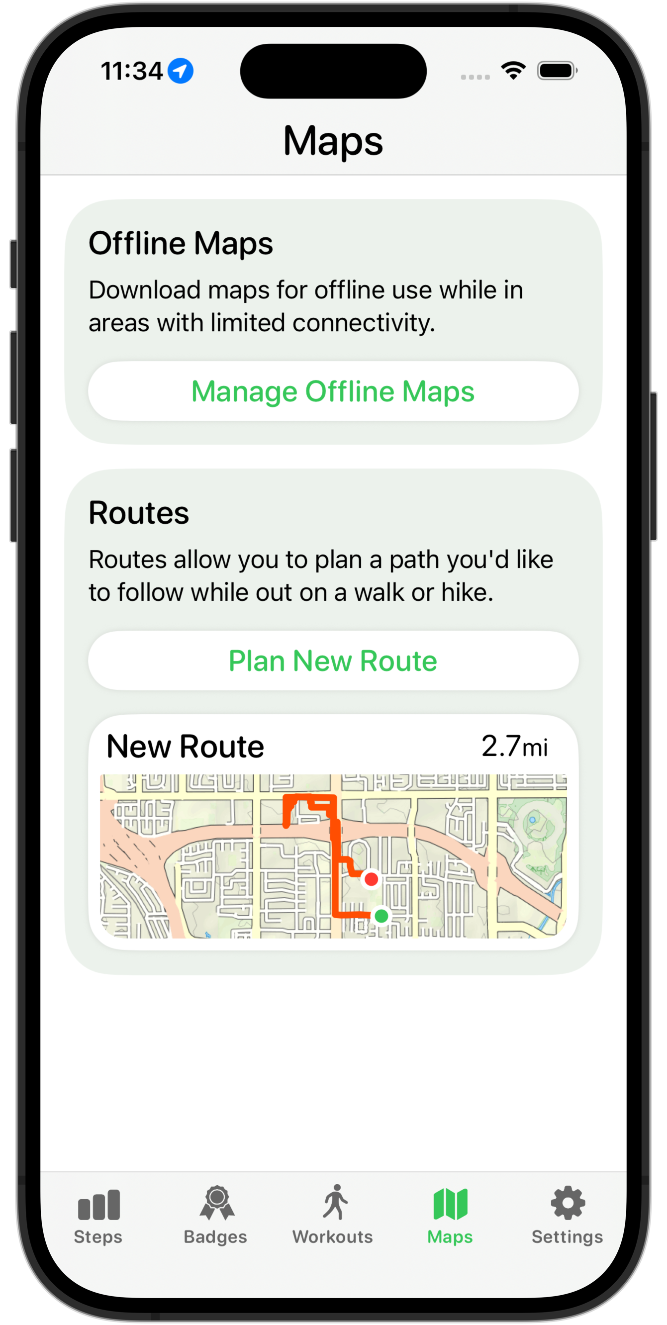
This isn’t definitely done yet but feels much better, and more in keeping with the general look of the new design language. I still need to do work on the overall layout here, but moving the buttons into the row’s selection sheet feels much better and gives me much more flexibility about how I layout this page.
As will likely often be the case for posts like this, I can finish with the relevant page in the HIG.
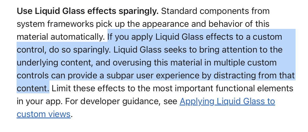
Be careful how much you use the new shiny new Liquid Glass effect. A good new design isn’t one which uses that everywhere; it is one which uses it to great effect.