Given how young of a platform visionOS is I thought it might be a good idea to err on the side of overly documenting the processing of making Vision Pro apps. There is a whole new set of gotchas and pro-tips to learn.
Also, if I’m being completely honest I really don’t know if I’m doing things the right way so by sharing my learnings (no matter how small), if I’m on a bad path someone else could correct me and we can all learn as a result.
To that end today I’m going to walk through my experience trying to tint a “glassy” component. A relatively small design component but nevertheless useful for understanding the visionOS rendering system better.
The visionOS design language is full of instances where we UI elements are given a frosted glass look, typically with a corresponding specular highlight. These are added to views using the .glassBackgroundEffect() modifier.
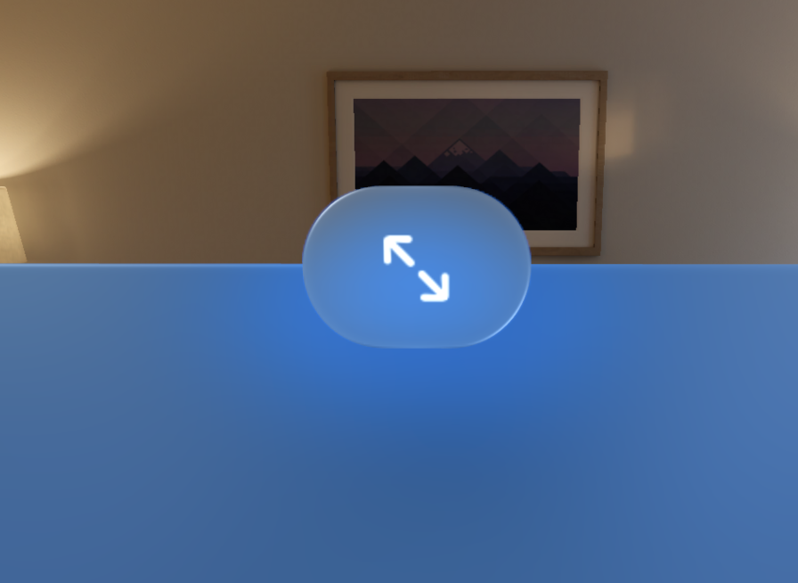
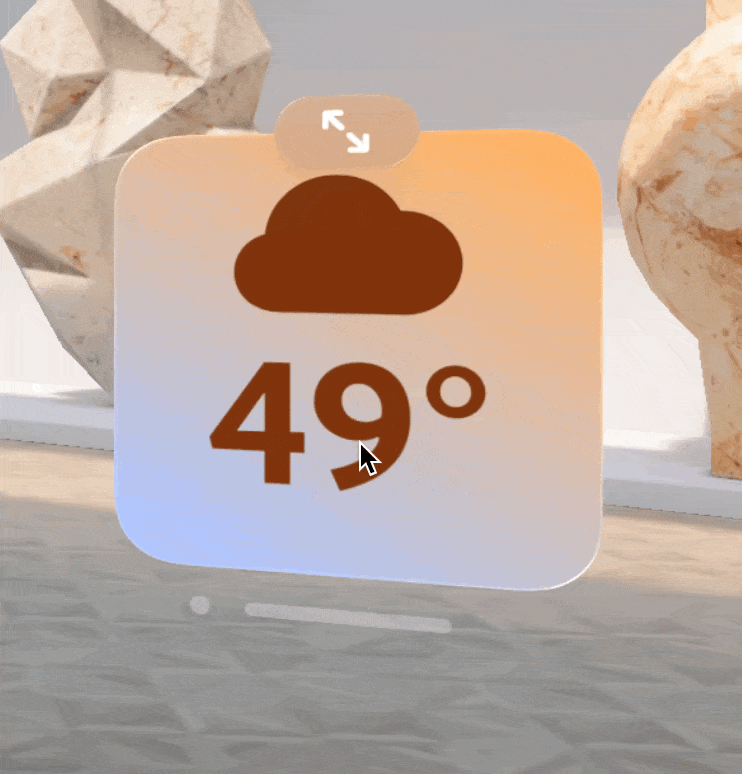
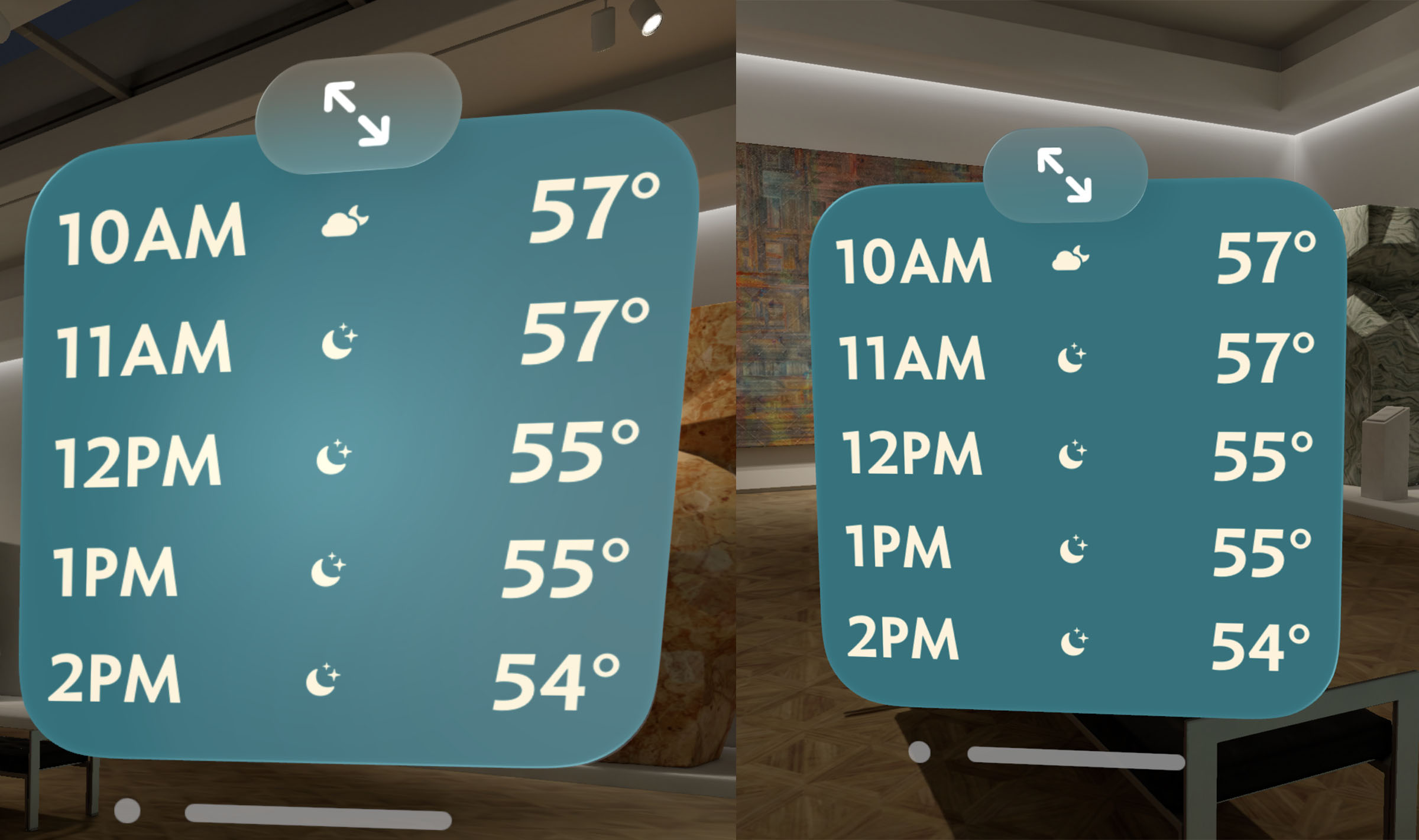
This generally looks great as-in, but I ran into something where I wanted to slightly extend the default appearance. My design includes a top ornament on all my widget views which is used to toggle between the expanded and compact views of the widget. It looks like this:
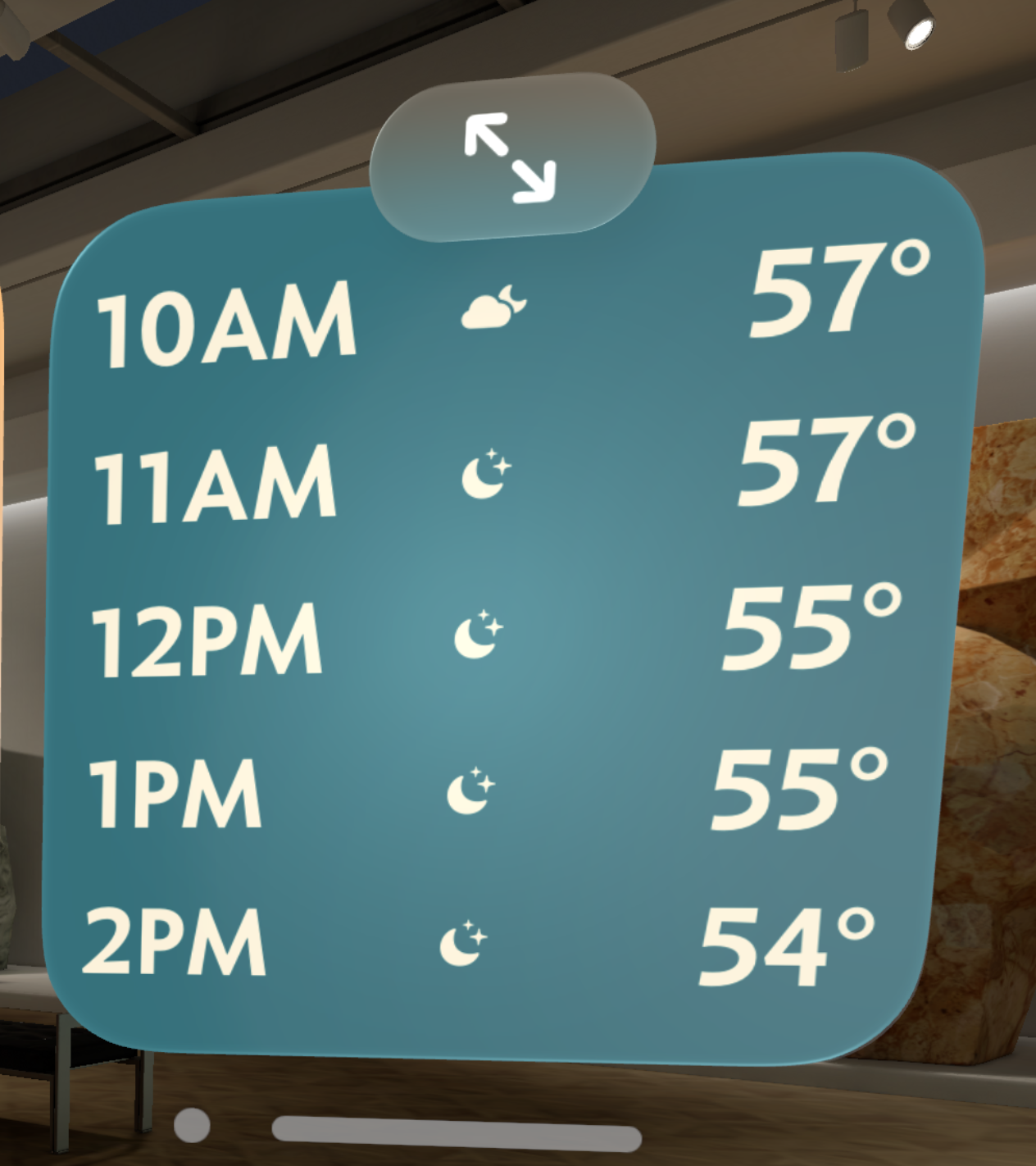
As you can see the topmost ornament does pick up a bit of the color from the underlying view, but the top of it is the standard system flat grey color. I don’t really like the way that looks, it isn’t harmonious with the rest of the view. So I want to add a little bit of tint to the ornament, while still retaining the frosted, semi-transparent look.
UPDATE: Since posting this it was suggested to me that I should instead try using the .tint(color) modifier on the button itself. This works a treat and is probably the better way to go. So use that…though I would still suggest reading through the process I used to find my not quite as good solution. At times like this it is often the journey which is more helpful than the final conclusion. I learned a ton about how visionOS handles layer rendering through this experimentation.
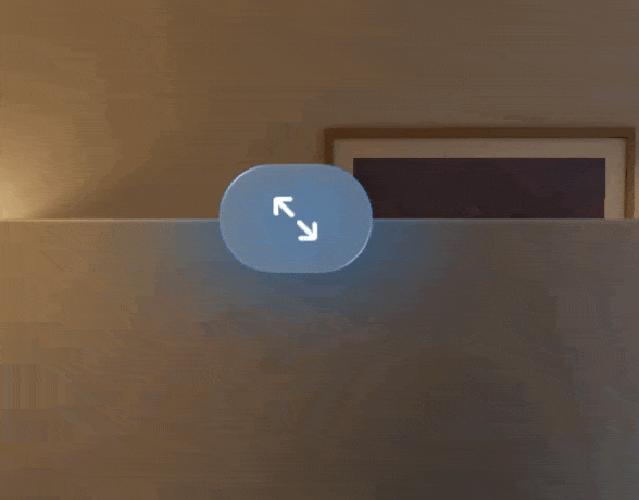
The first step was to create a little isolated test view to work on.
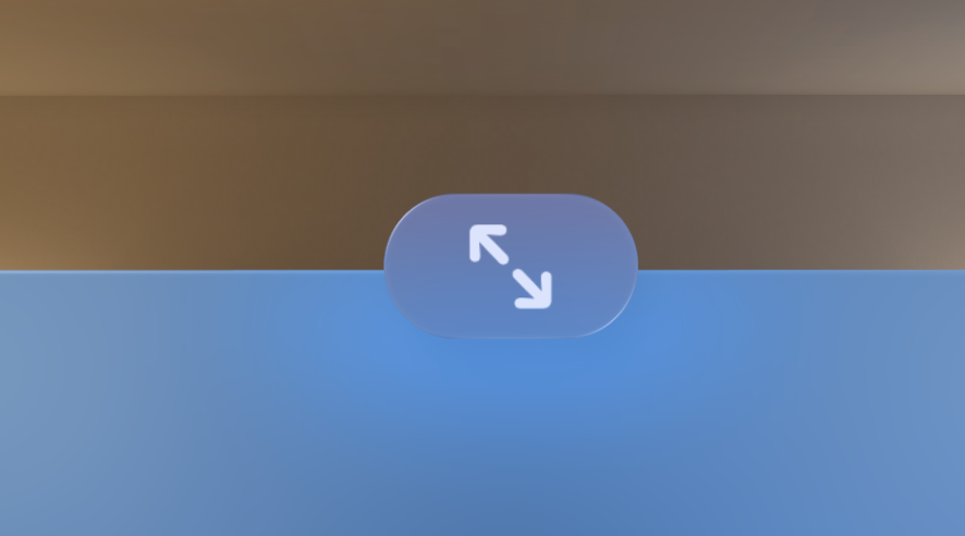
My first thought was to add the tint color as the background of the button.
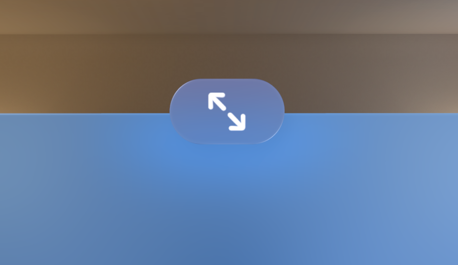
That retains the specular highlights around the view but looses the frosted glass look. So next let’s try putting the colored view all the way behind the .glassBackgroundEffect too.
That is getting somewhere, now have a blue tint but retain the frosted look. I can tweak the opacity of the background color to make this effect more or less dramatic:
However, this was where I learned an important lesson when working on visionOS rather than iOS. DEPTH MATTERS! By putting this background behind the glassy effect this now has all kinds of knock on effects as you move your head around.
You can see this more clearly if I remove the color from the content view.
There is now a ghostly tinted shadow which will emanate from the button. That is definitely not what I want, but I must confess I was a bit surprised to see this. I have to think carefully about Z-Hierarchy now.
So now my next idea is to instead of putting the color behind the contents, let’s try overlaying a semi-transparent color on top.
This is actually looking pretty nice. One advantage of the overlay approach is that the color is evenly tinting the entire view and so it feels more “part” of the button itself.
The only issue now is that the button symbol is now also being tinted. So I need to now overlay the symbol on top to make it actually white again.
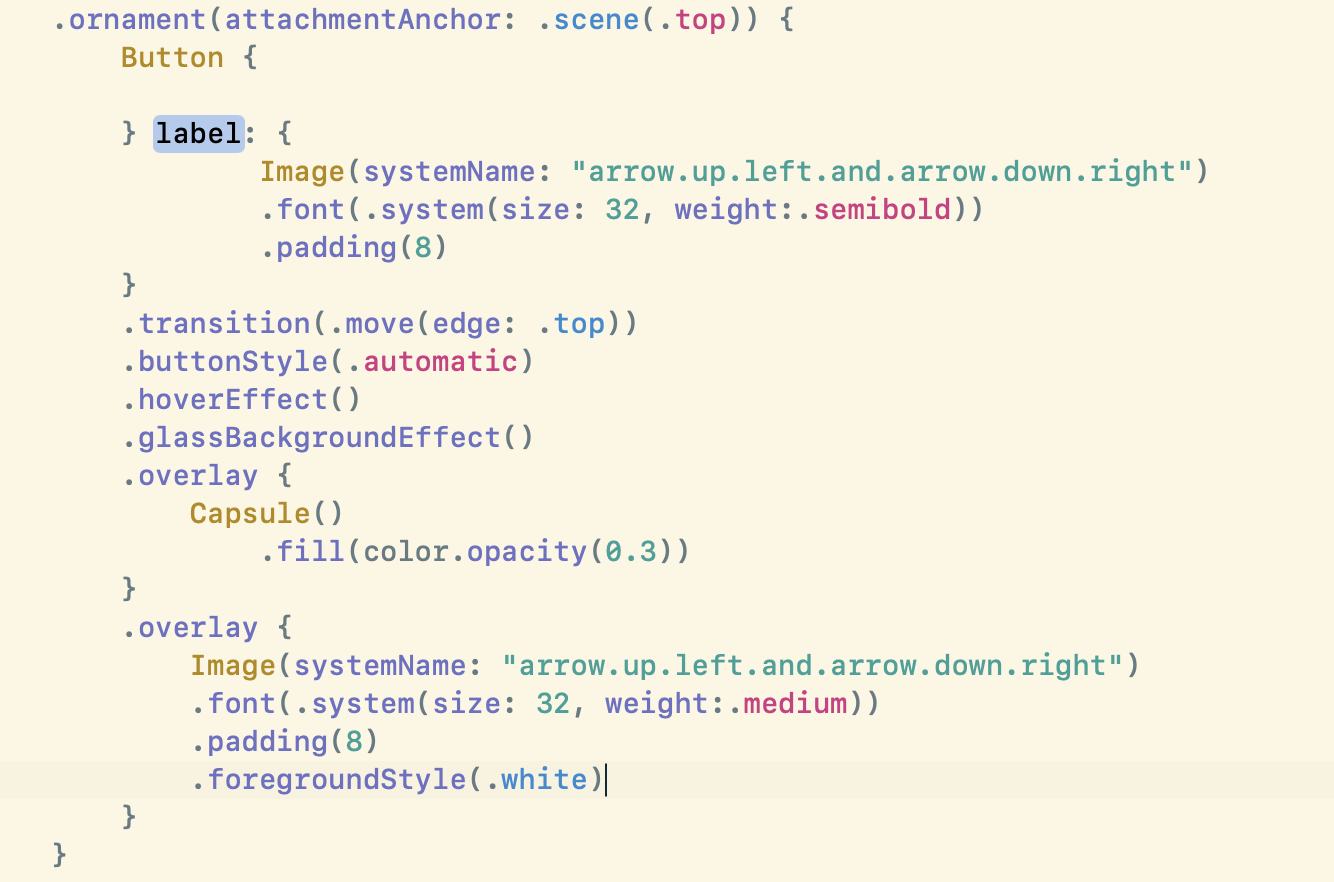
The code to accomplish this looks like this:
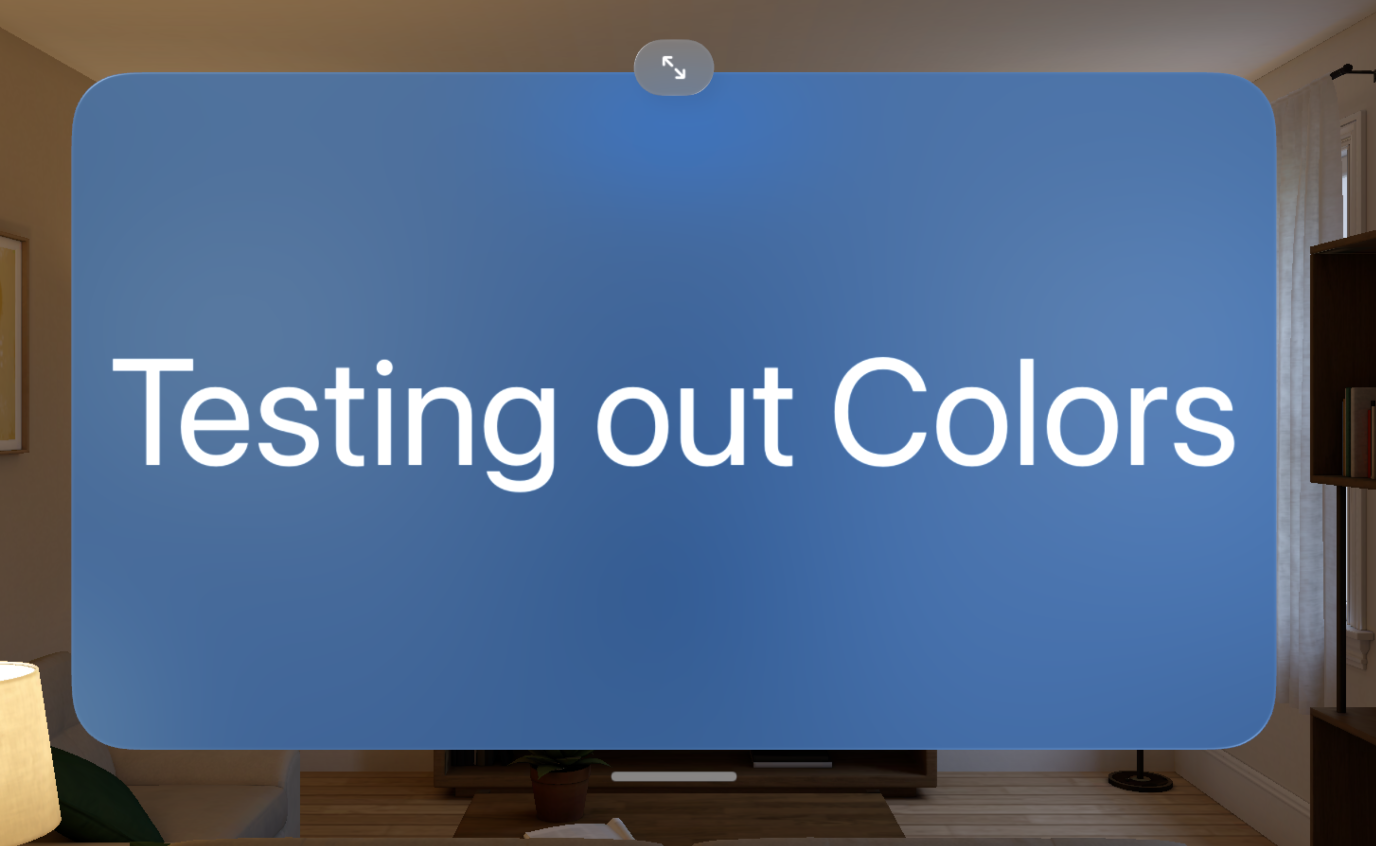
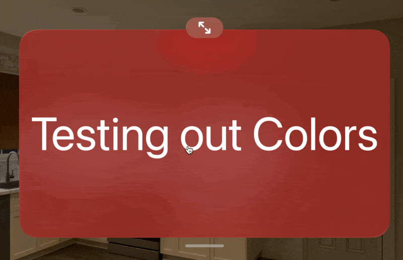
And here is what it looks like in a variety of colors (to make sure it wasn’t a color dependent solution).
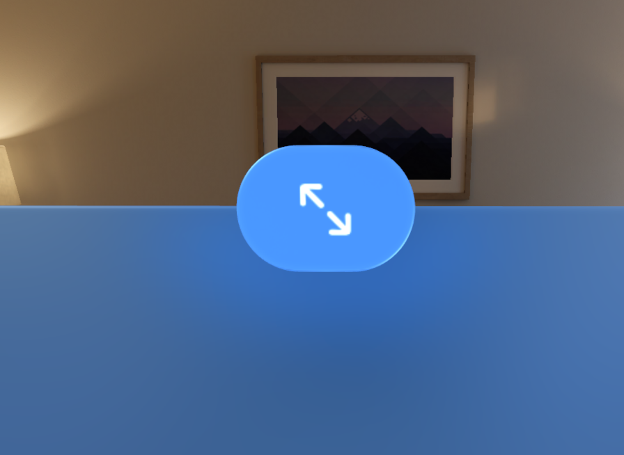
Alright, the visual appearance of this is looking good, but then I ran into another issue. When you go to “hover” over the button the highlight effect is incredibly weak.
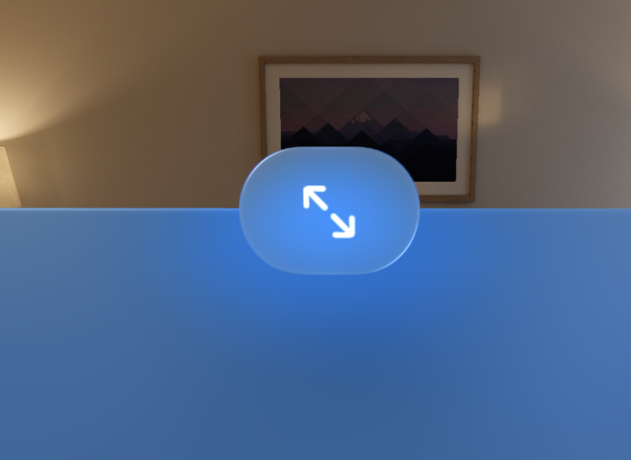
This turned out to be because my call to .hoverEffect() was up towards the top of the view tree with the Button itself, it turns out that .hoverEffect really needs to be put on the top most element you want to gain the effect. So in this case I move it to the last overlaid view.
Much better, now the button correctly responds to the user looking at it.
Here is that first button I referenced at the beginning of the article compared to its appearance with the tint applied.
It is subtle, but I really like the difference. The new button now has a look which is visually harmonious with the content and feels more connected to it.