Today’s Design Diary entry walks through a design evolution, which is superficially super minor and a bit silly. But so often the best designed products are an accumulation of countless tiny details, so I felt that nevertheless it was worthwhile.
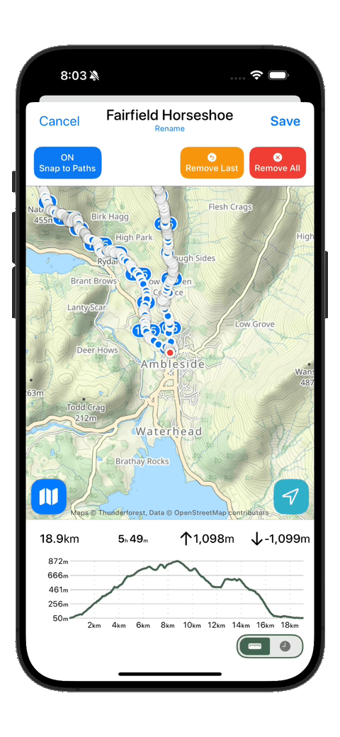
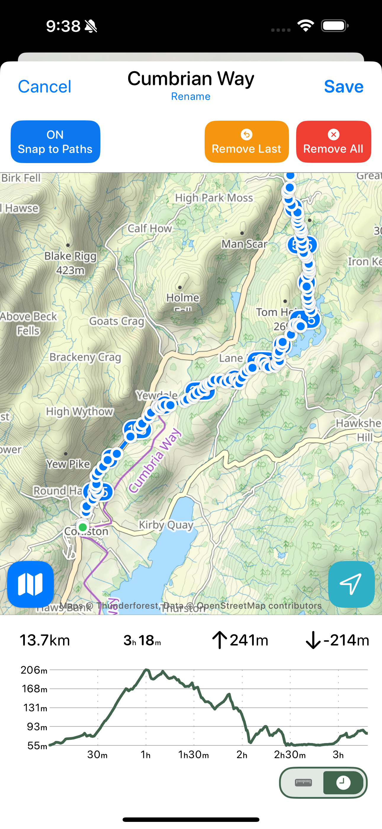
It relates to the graphs shown at the bottom of my route planner. As you adding waypoints to your planned route it will update to show you the metrics of your trip and a graph indicating the elevation profile of your route.
It is super helpful when planning a hike to know the general terrain you are facing. The elevation heavily dictates the difficulty of a route and thus it is important to know what you are getting into.
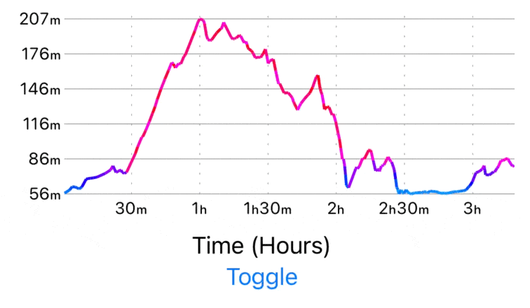
In this case I want to show this elevation plot in one of two ways: either as a graph of elevation versus time, or as elevation versus distance. The time value shown here is based on Naismith’s rule which is a good rule of thumb for roughly estimating how long a given route will take taking into account elevation changes. The rule is “Allow one hour for every 5 km, plus an additional hour for every 600 m of ascent”. While the actual hiking time will vary based on fitness, weather, and breaks, I’ve found this to be still useful to get a sense of the ‘best case’ time.
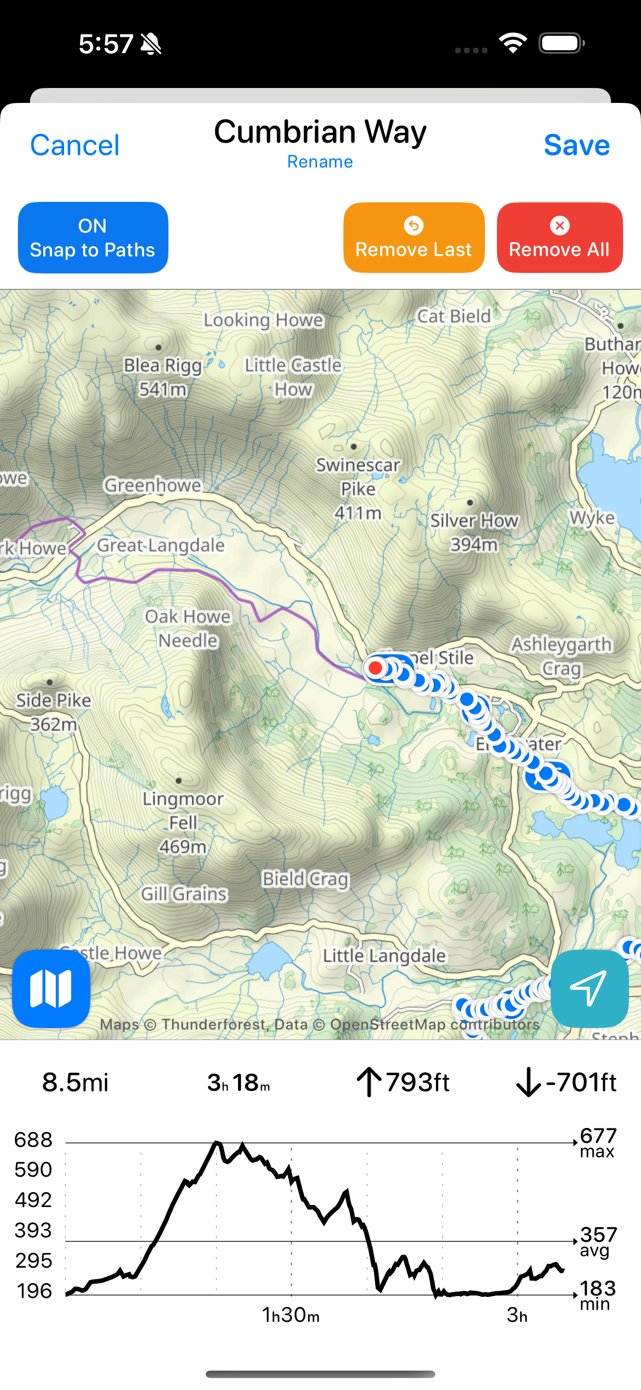
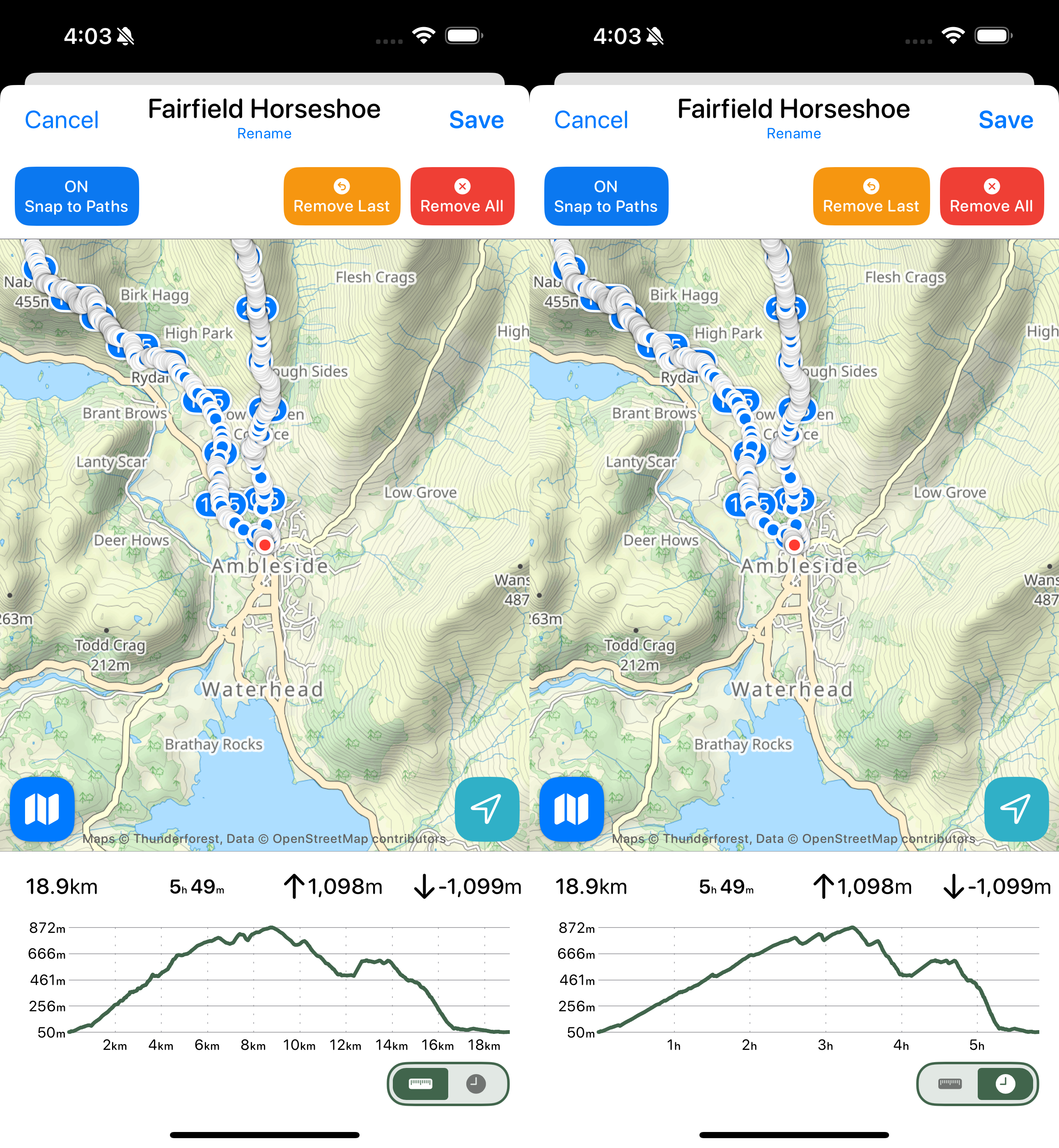
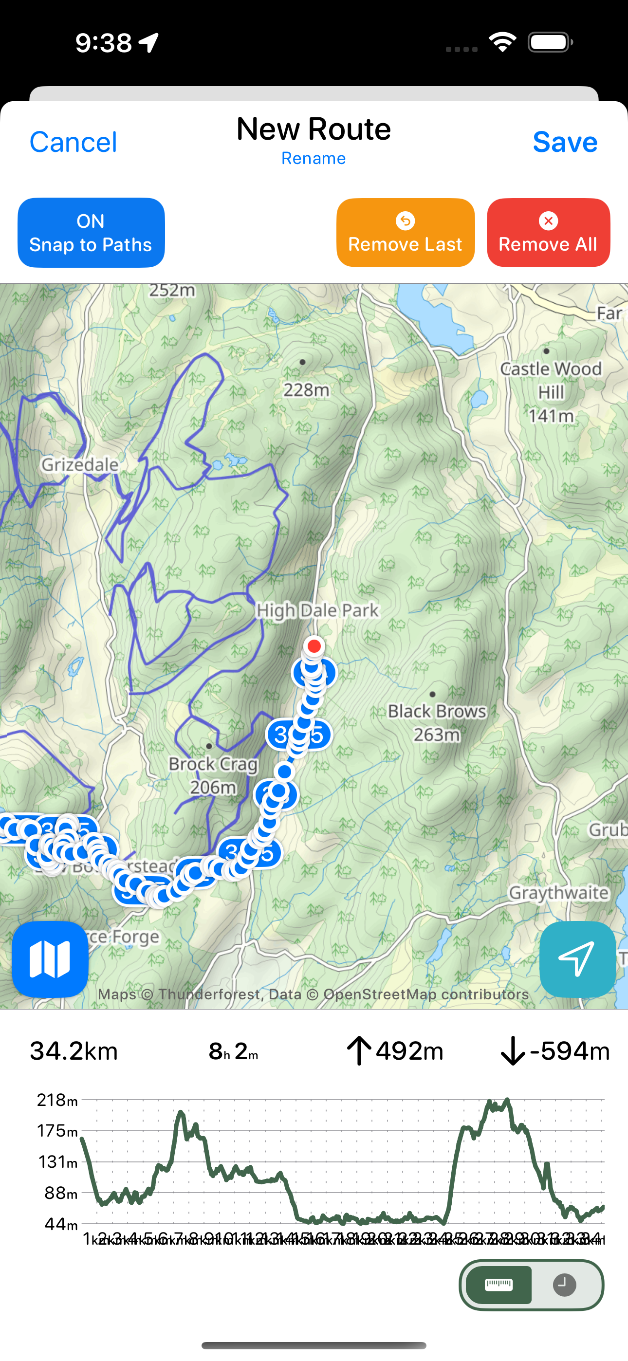
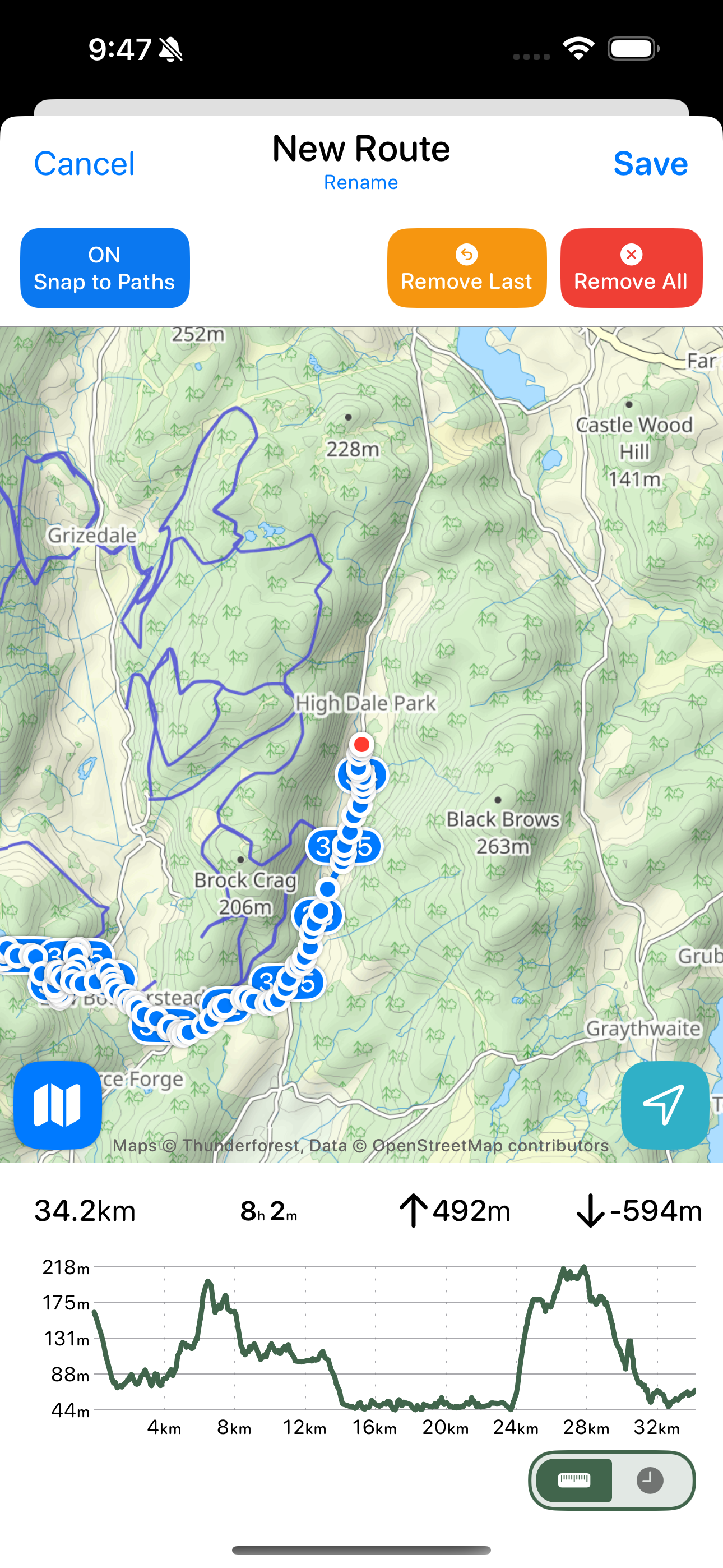
Here is a comparison of the two views on a hike which hopefully gives a sense of the utility of this. If you look at it from a distance perspective it looks like the peak is half way through the hike…which it is in terms of miles. But if you then look by time you’ll see that you should expect to reach the top until nearly 3/5ths of the way through.
The first thing I need to do is extract the current graph into its own SwiftUI view and then I can start working on the switchable graph.
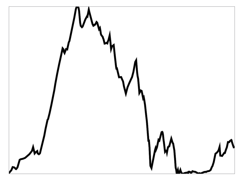
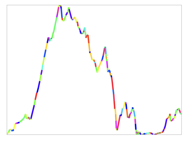
This graph is made up of lots of individual line segments. Let me color them individually to help to see this.
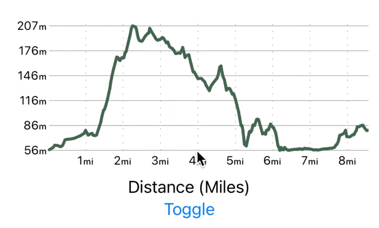
Now let’s compare the elevation plot against Time/Distance.
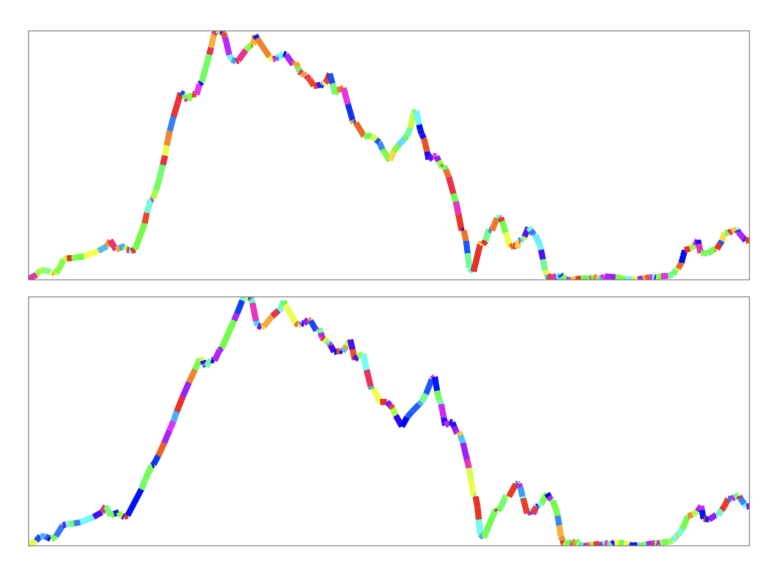
As you can see the general shape is essentially unchanged (hence my comments about this whole project being a bit silly), but if you look closely the xAxis is shifted between the two plots. This is because the steeper the terrain the slower you’ll move so that the time plot will lag behind the distance plot.
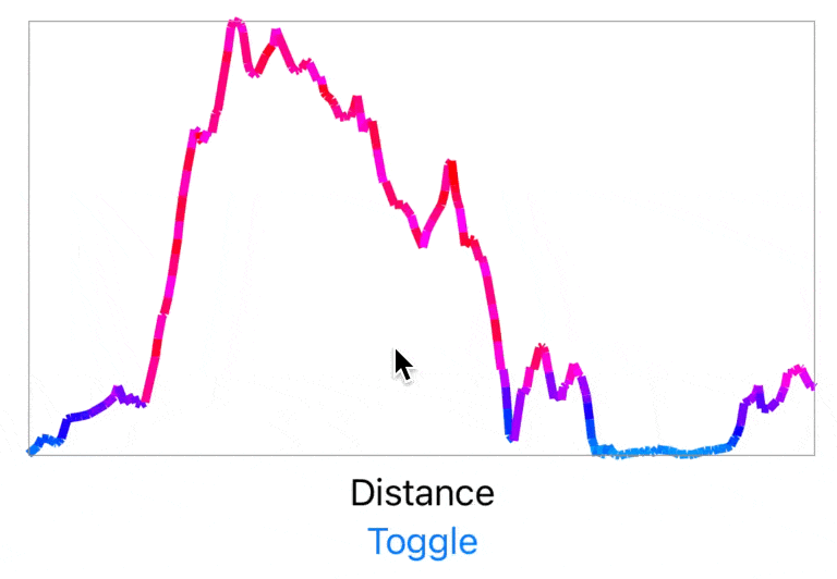
If I switch naively between the two plots you’d get this:
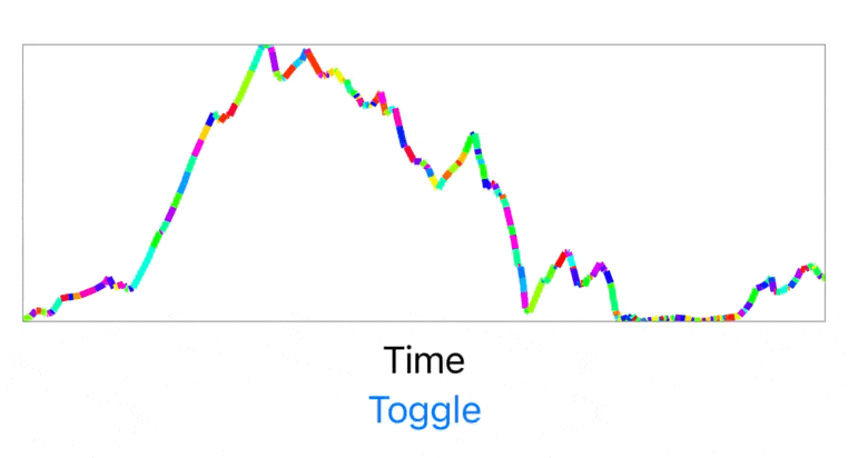
That isn’t awful, but I really don’t like the abrupt jump between rendering modes. A general rule I try to abide by in my design work is that: If the same element exists in two view states, then the transition between those two states must animate the element’s movement.
This approach is generally very helpful in making it clearer what is happening to the user, in addition to just being more visually pleasing.
So I then set out to update my graph renderer to support SwiftUI animation between the two graphs. I won’t go deeply into the technical parts of this here, but I found this blog post by Eric Callanan super helpful in how best to approach this. Here is the result:
Isn’t that nice. Not some massive, jarring animation but just a little nice touch which gives the interface a much more polished feel.
Next I need to make it show that the graph has axis labels. The most basic way to do this would be to just split the x-axis into 10 segments and then change the value for each marker based how that would correspond to the current x-axis metric.
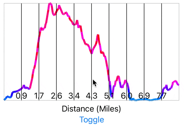
This is approach, however, violates the animation rule I stated above because it treats the two axis scales as identical. I need to show some movement in the axis between graphs to help indicate to the user that they aren’t the same.
So let’s instead make the tick marks on the axis dynamic. To start with I’ll make them at whole number increments in either miles or hours.
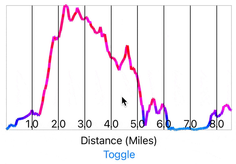
No you can clearly see that the two graphs are different and have a sense of the movement between them.
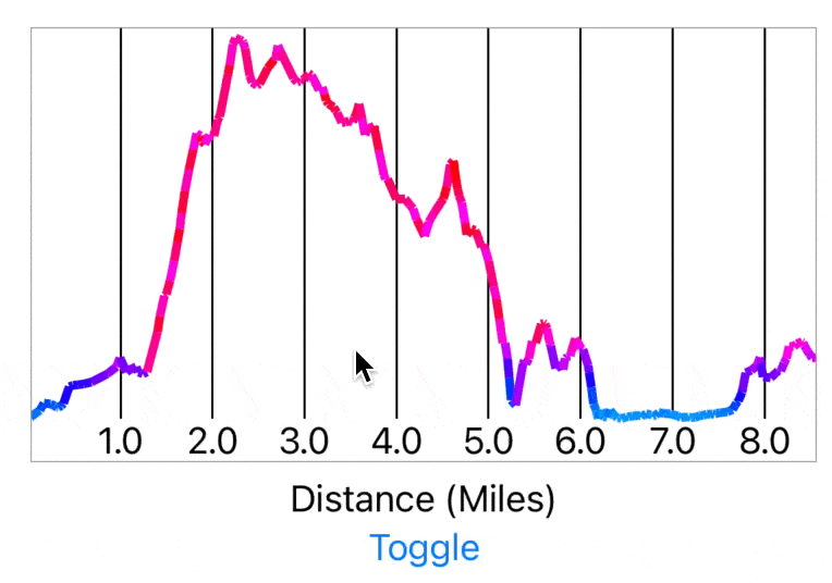
For this example dataset whole miles makes sense but it is short enough that whole hours looks funny. So let’s switch that to half hour increments.
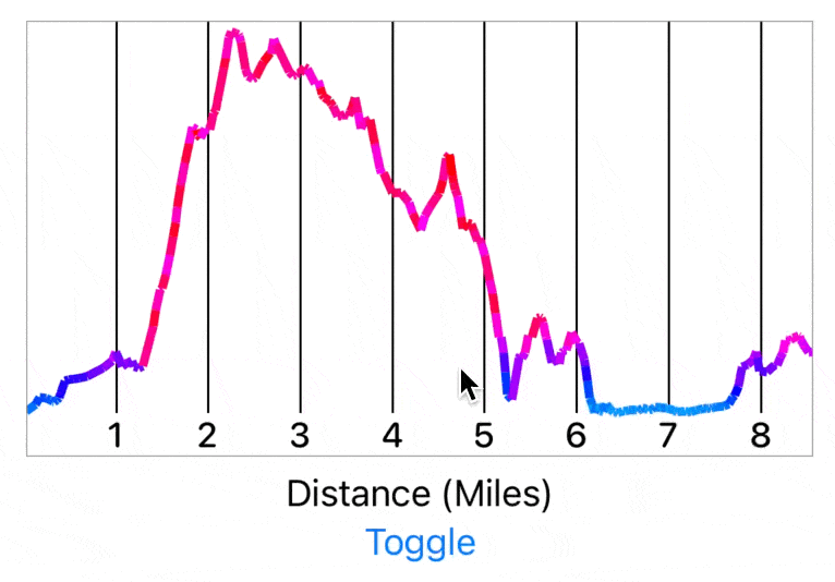
That’s better and a more consistent transition between the two. But now if you look closely you’ll notice a weird issue I’ve seen a few times with SwiftUI where you can’t easily animate a Text label between two values. So instead here the numerals just jump from one location to another. I remembered that I had solved this problem at some point in the past but couldn’t recall how…which led to a rather amusing search query:

As a brief aside, this is partly why I find it so helpful to write these kinds of articles or post technical solutions on Mastodon. So often my future self benefits from my own words.
Anyway, so I found the relevant post about how to fix this and was then able to make a label which will shift between it’s two locations smoothly.
Now let’s update the axis label’s to be nicely formatted.
I had a brief notion to try and indicate the gradient of each line segment along the rendered line:
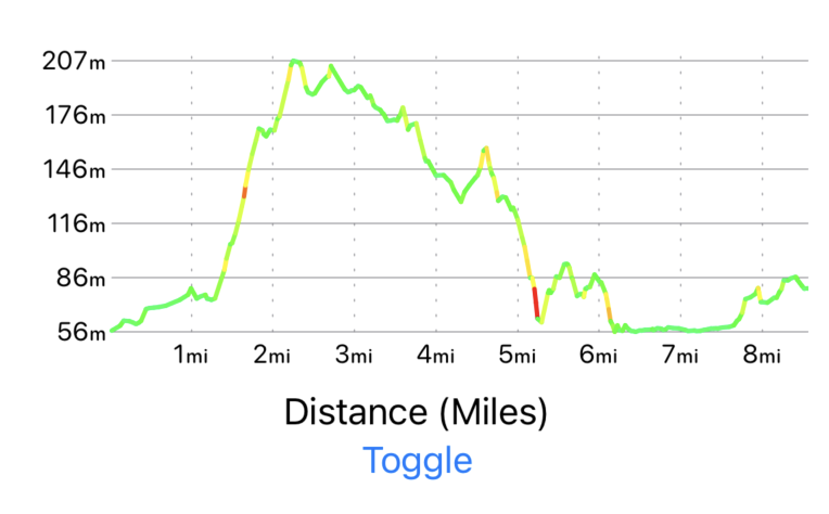
But after a bit of playing around with it I ultimately didn’t like how disjointed that made the graph’s appearance.
So I settled on this color scheme instead.
Next I wanted to add the segmented control to switch between the two render modes.
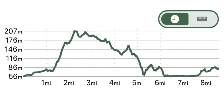
At this point I was pretty happy with the appearance of the graph and so I went to integrate it into the actual app itself.
That’s looking pretty nice, but as I explored it with more and more routes I found that I had neglected to dynamically adjust my x-axis scale to accommodate very long routes.
So I needed to add a dynamic scaling option here so that it will progressively increase each axis tick mark’s separation so that they never overlap each other.
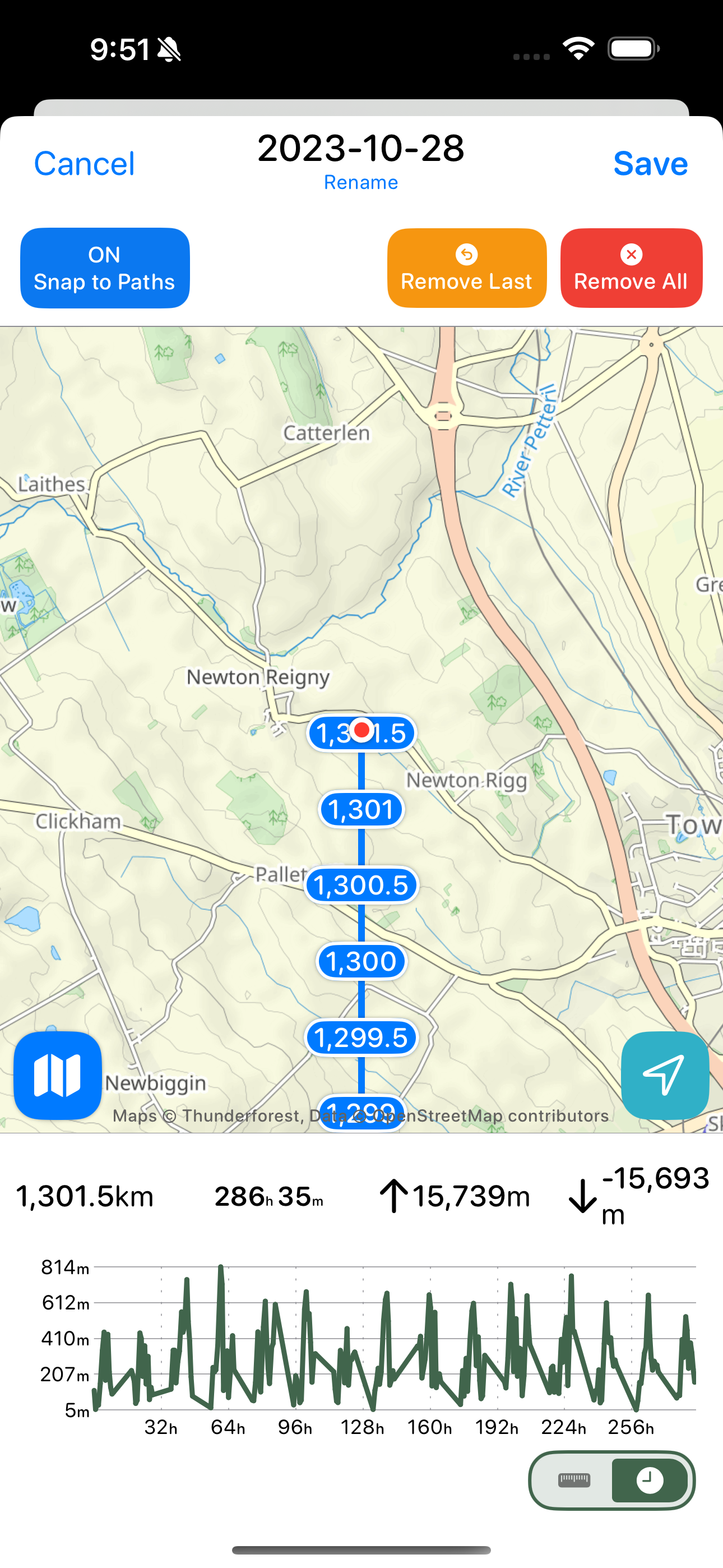
Much better. I then even tested it on a massive testing route and the logic was sound.
Here’s the final result. I’m pretty happy with how this turned out.