For the next update to Pedometer++ I’m greatly enhancing the offline maps capabilities to allow you to easily download the maps for a particular area so that when you are out exploring the wilderness you don’t have to worry about connectivity.
This is a design evolution showing my thought process in designing this feature.
Other approaches
I have a strong dislike for the offline maps systems in most other mapping apps. Typically they operate on some variant of establishing a rectangular area you want the downloaded maps to cover and then adding it to a list of offline map sets.
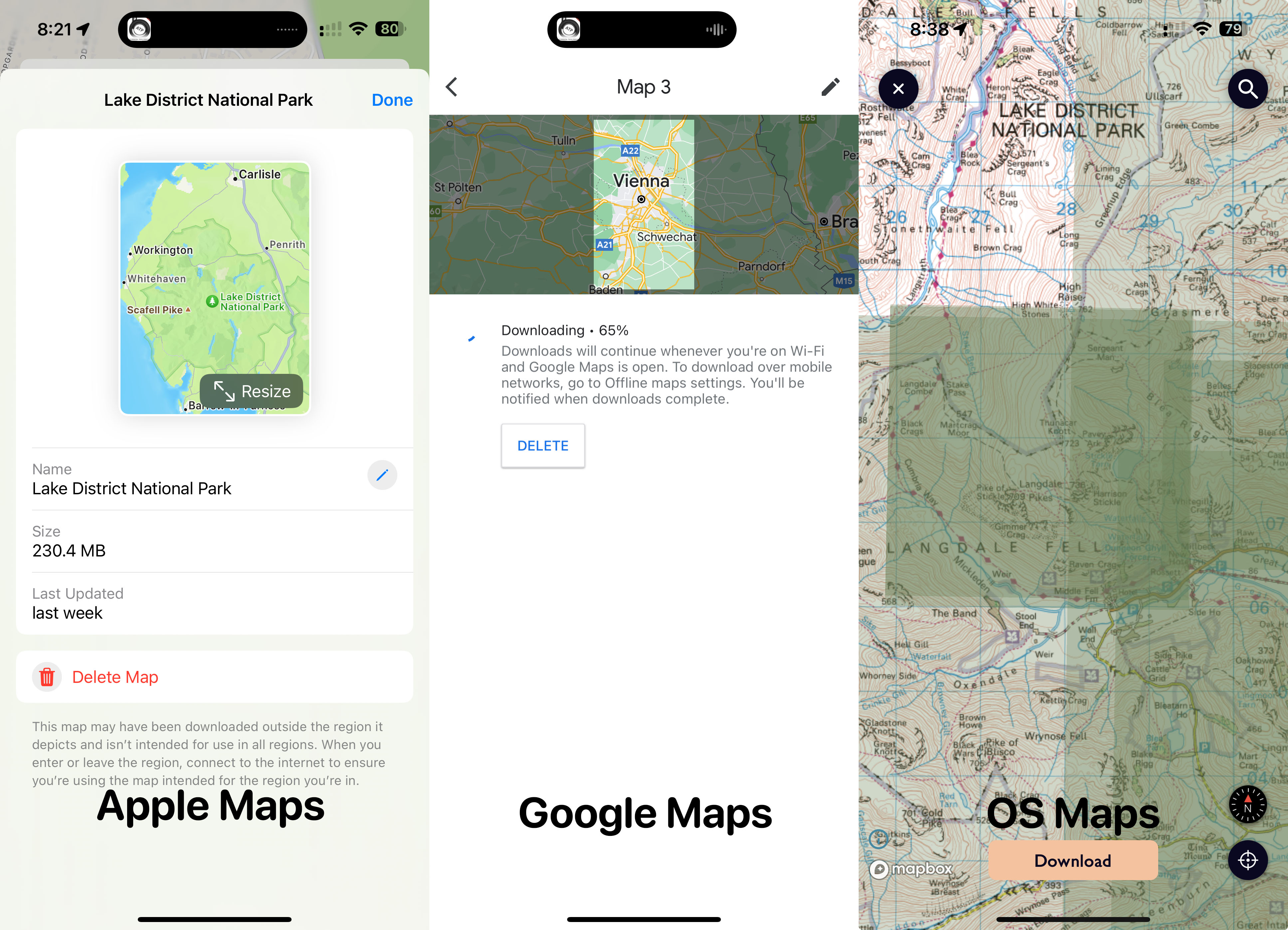
I personally find this to be really inconvenient for a hiking context. I either need to draw a way to big area for the map (which isn’t bandwidth or time efficient) or end up babysitting dozens of smaller submaps. Also it is really challenging to confidently knowing if a particular geographic area is downloaded…which is really the whole point!
I can understand there are a number of benefits to this approach. It is really important when you don’t like an approach to think why the designer to made it chose this path, because they aren’t doing that out of blind foolishness, they had their reasons. For this case here are the top benefits I came up with:
- it allows of the easy refresh/deletion of the mapping sets later on
- it lets you give the tile sets names and potentially apply different rules or options to each
- it encourages the user to draw very large rectangles which cover a vast area so you don’t often run into the edges of your download.
But I knew this wasn’t for me. In a hiking context I find that I prefer something where I am more focused into a particular area where I will be hiking and often find that the process of grabbing the offline map tiles is a good time to enhance my spatial awareness and sense of direction for the trip. It is a good thing to explore where I’m going on the map and become familiar with it before I head out, rather than more blindly grabbing a massive area.
Design Evolution
For my maps I’m using an XYZ/Slippy map system. Where the world is subdivided into progressively subdivided tiles. In this system for each increase in zoom resolution you quadruple the tile count at the lower level. This is in incredibly powerful approach to mapping and I’ve found it to be generally very straight forward to work with.
Thinking along those lines my first thought was to add an overlay to a regular map which has buttons for downloading a given map tile (and all its children tiles). The user could get browse around to wherever they want to explore and then cache or uncache whatever segments they chose.
Conceptually this works, but visually it’s a disaster. There is far too much going on and even if I removed the debugging strings it wouldn’t really indicate what the user is doing.
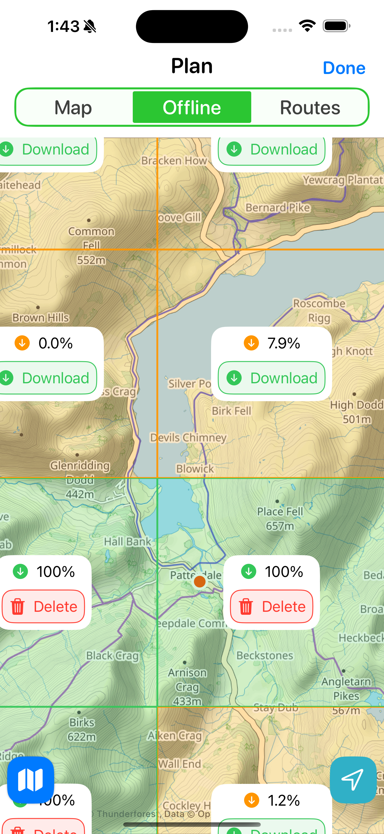
So let’s try to tidy this up by making the download controls something a bit more bounded and clear. In this case by indicating the percent the tiles is complete and then showing a download/delete button.
Logically we are getting somewhere now, but it is still really visually busy. So maybe let’s drop the percentage. I’m not sure if the user really benefits from knowing exactly how partial the download is.
That is much cleaner. I can surface the percentage to the user during the download process where it is actually useful to get a sense of how much more is waiting to complete.
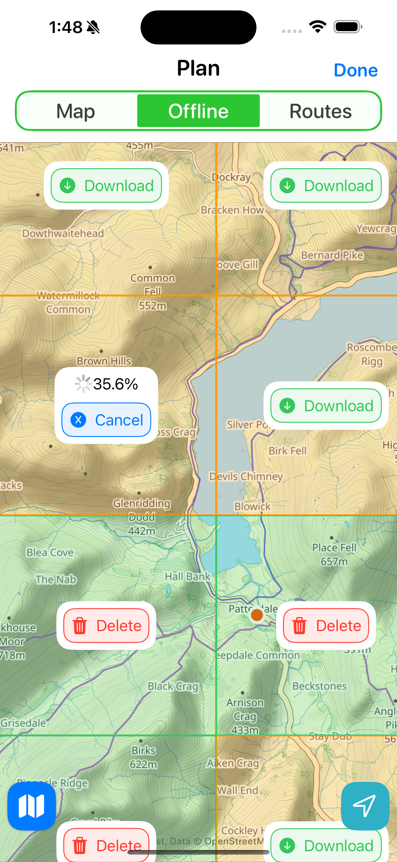
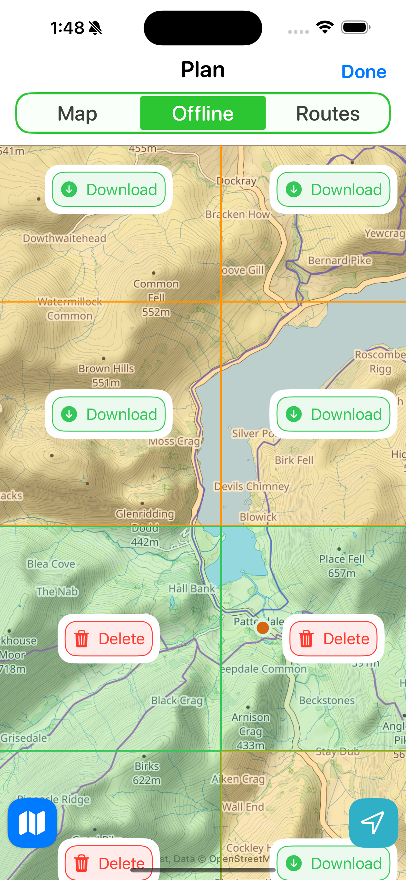
Next I want to clean up these buttons. The white borders are an artifact of the older version which persistently showed the percentage, so I removed those and made the buttons more “button shaped”.
Overall I like this approach but the more I looked at it I started to think that it was just too busy still. I find the screen overwhelming and I’m the one who made it!
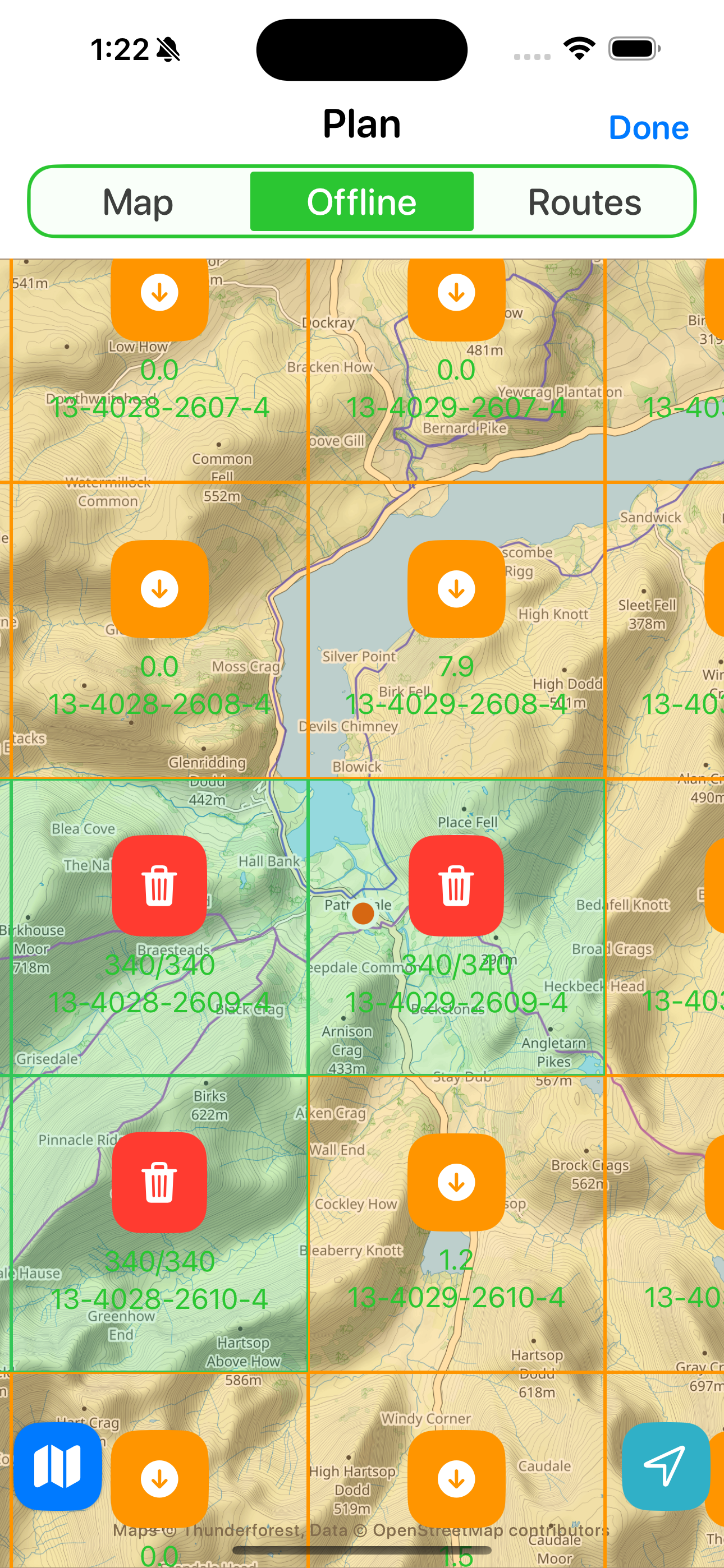
So I thought about maybe dropping the ability to clear the already downloaded tiles from this screen. I can have that in a more utility screen in Settings, but in the normal operation of the app the user shouldn’t really need to be removing tile sets. I should optimize for the “let’s hit the trail” case, not the “let’s tidy up our downloads directory” case.
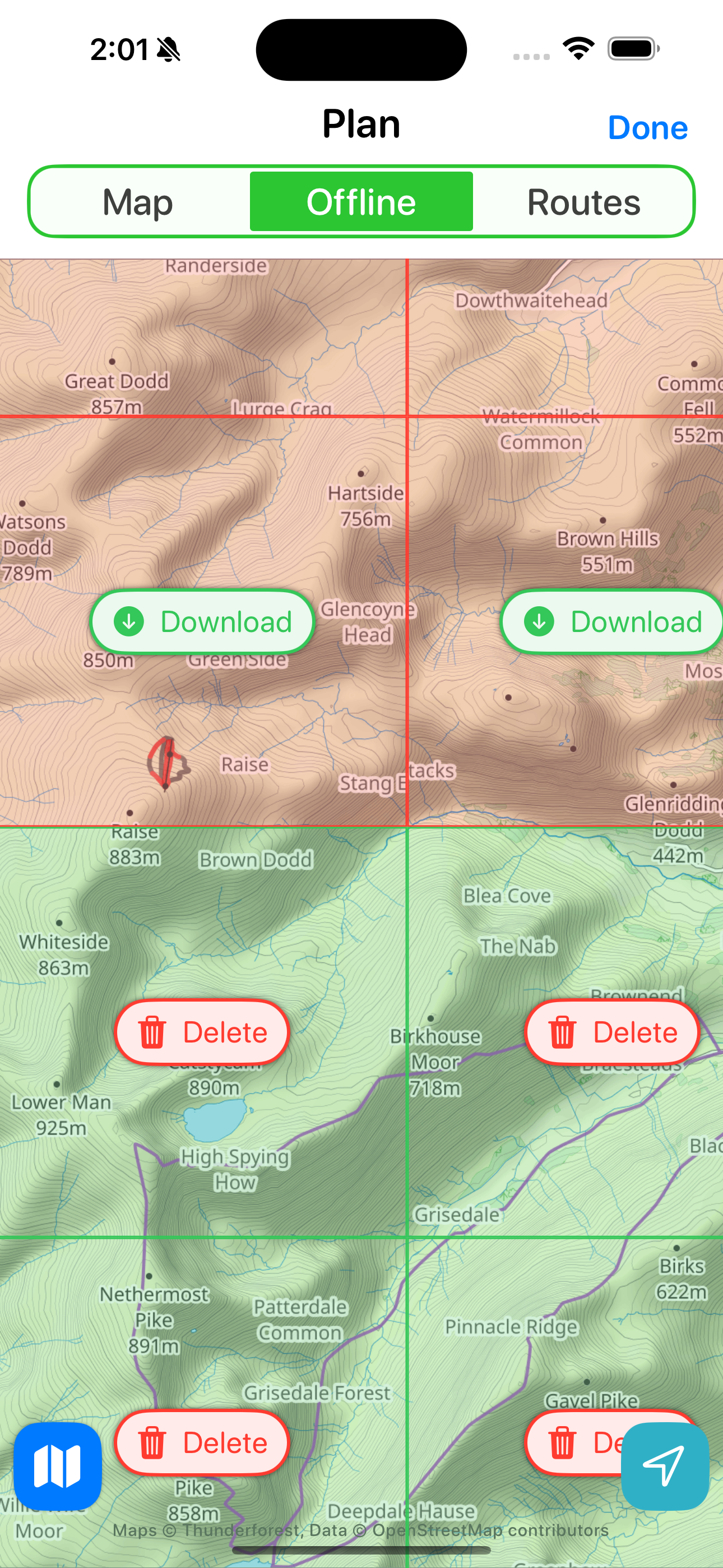
So let’s drop delete button completely for now.
That’s visually much nicer and has the strong benefit of clearly showing what area is “good to go”.
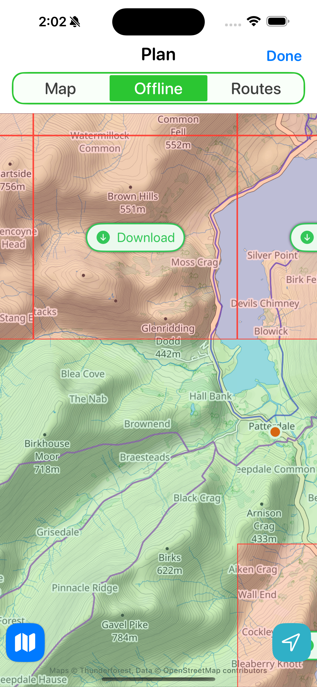
But this approach starts to fall apart when the users then zooms out a bit.
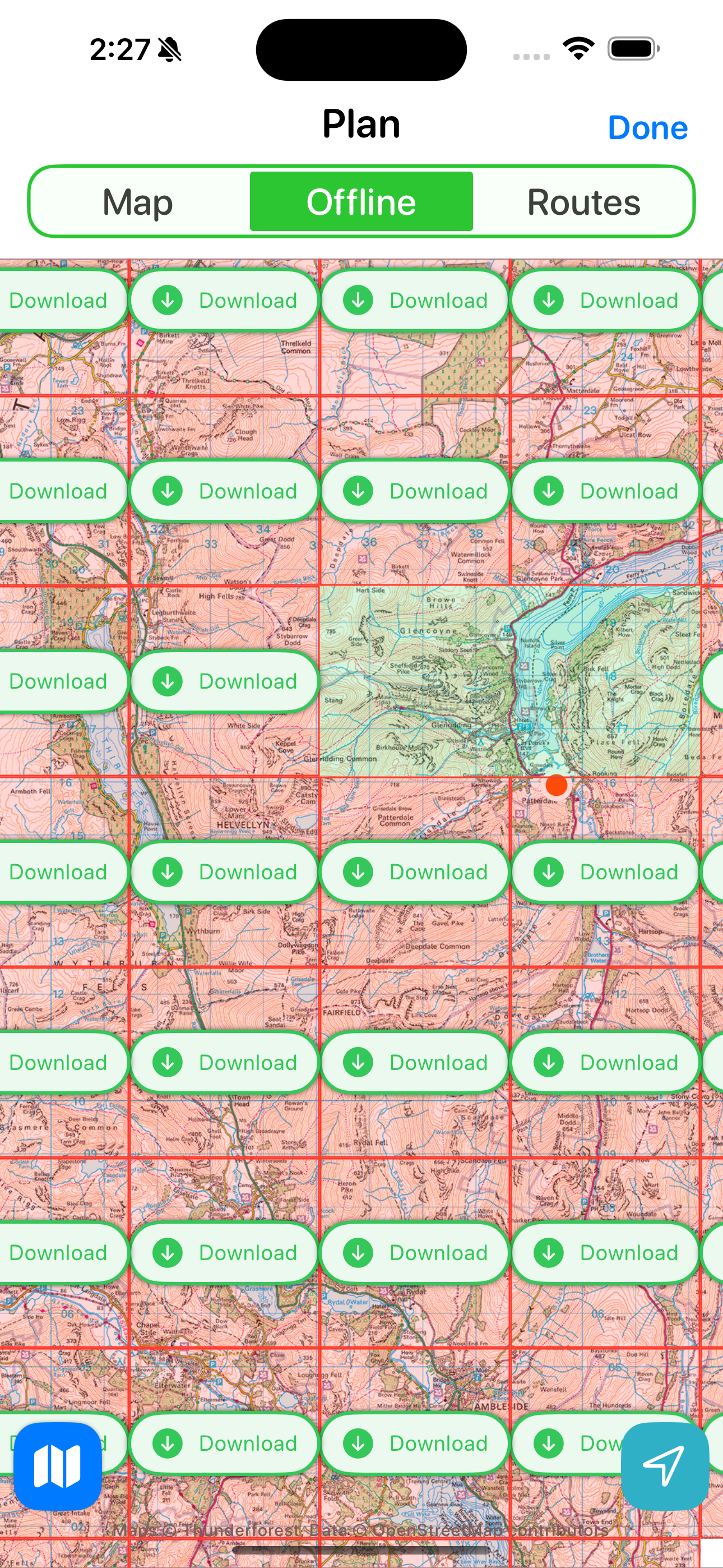
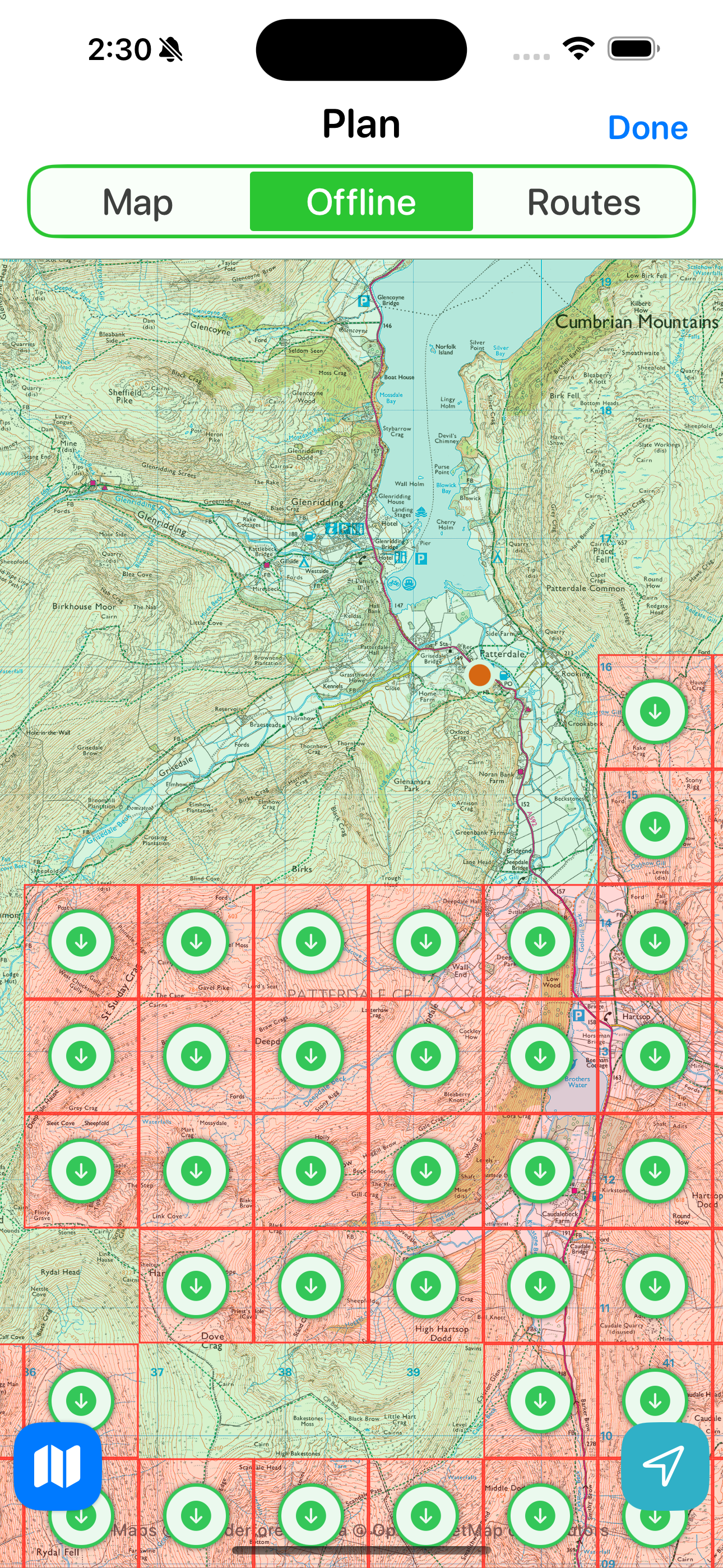
Because I’m basing the download buttons on the underlying map tile sizes these can get very small. Which leads to some really cluttered button arrays. I can sort of work around this by making the buttons smaller, like this.
But it was at this point that I had a bit of a “EUREKA” moment in my design process. I was reminded of this general rule:
It is usually a bad idea for your final design to reflect the underlying implementation details rather than the users’ needs.
I was building a system which logically made sense to how the underlying map tiles were stored but the user shouldn’t be aware of this implementation detail. I was using the map tile as the unit of download because it was straightforward for me to do so at a technical level. Instead I should move away from that and to something more user oriented.
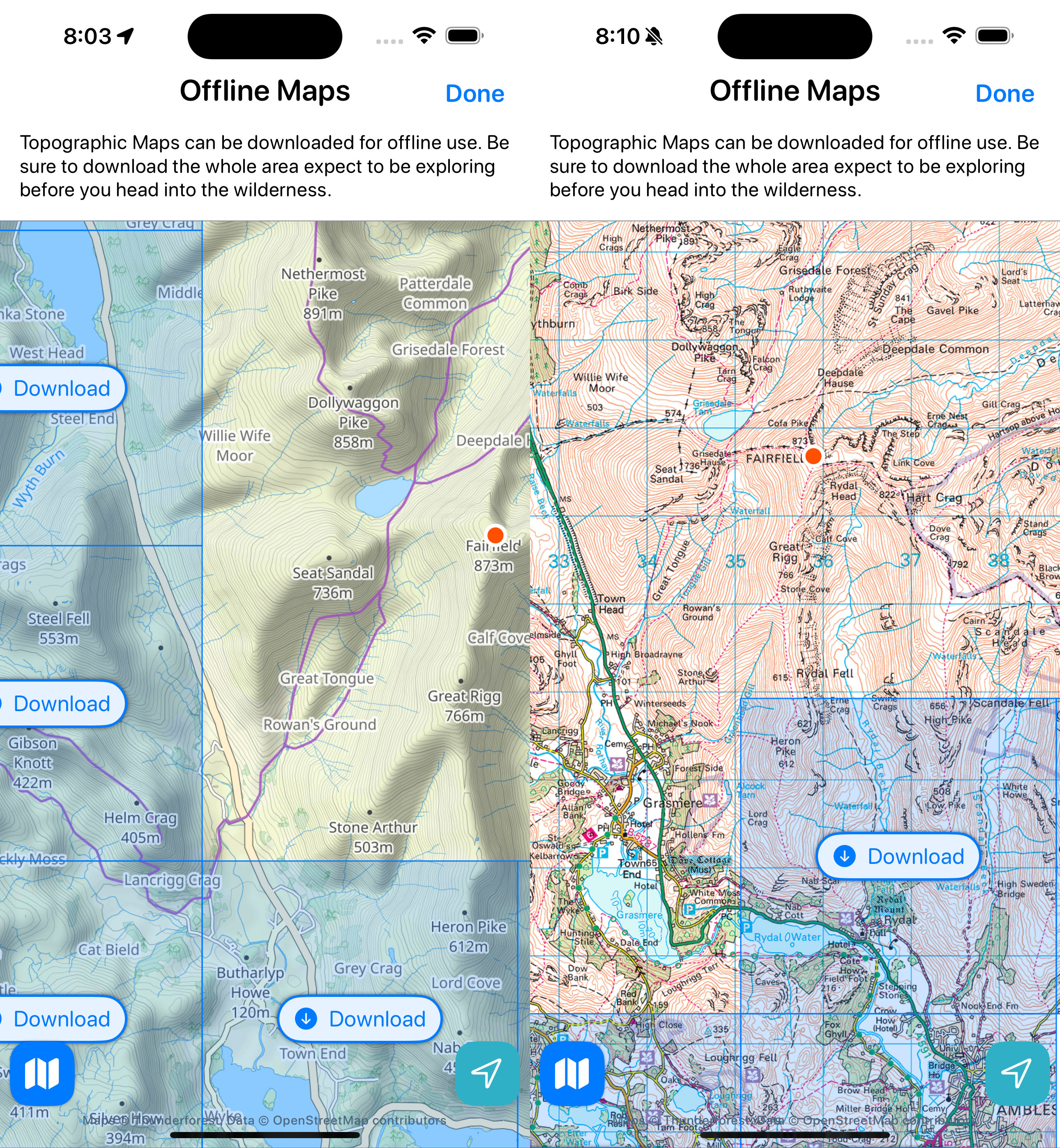
So instead of having a fully zoomable, multi-level download button system. I instead switched to a fixed geographic size block system. Where a particular download button always reflects the same area of the earth.
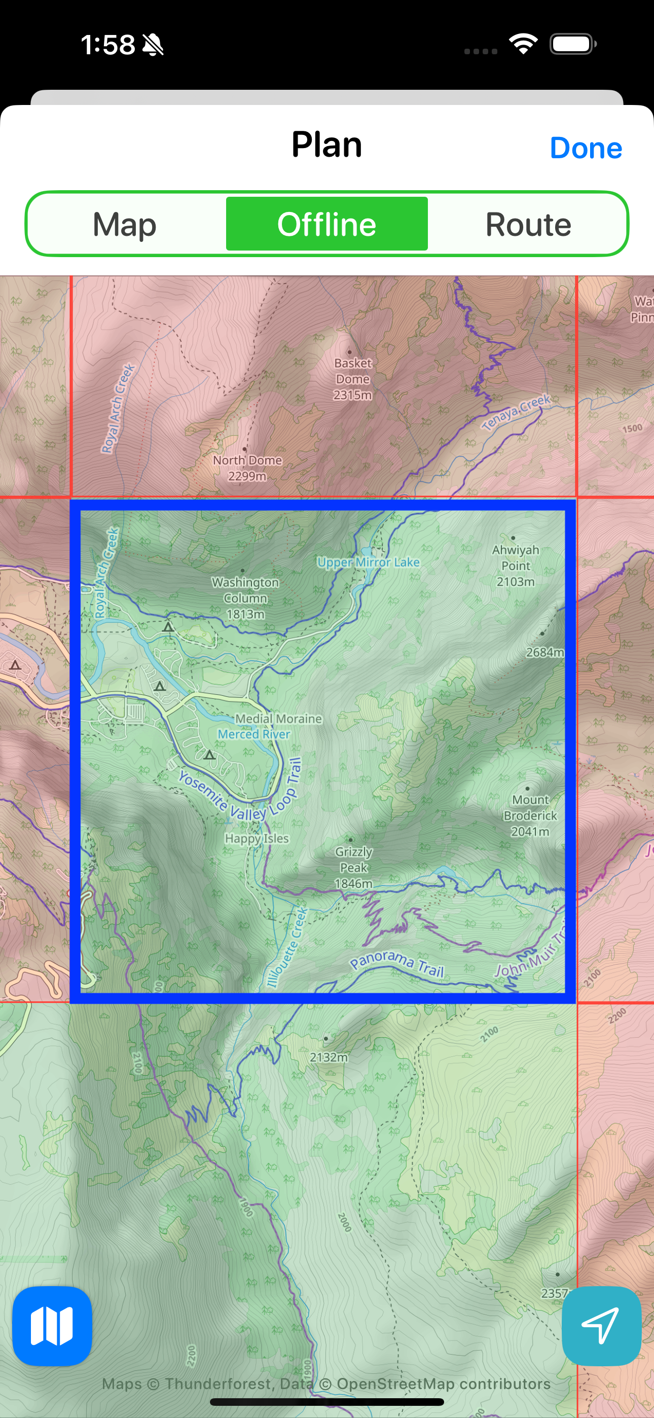
The first question I had to answer was how large this area should be. I thought a good guide would be large enough to accommodate the Mist Trail in Yosemite. This is an area of around 2,000 acres. Big enough to have a proper explore but not unwieldy so.
I explored and played with this approach a bunch and really liked it. I fixed the zoom level where the user could comfortable see the surrounding area at enough detail to know where they are.
So next I wanted to tidy up the visuals. I felt the button colors were weird and an artifact of a failed, previous design so I switched them over to blue.
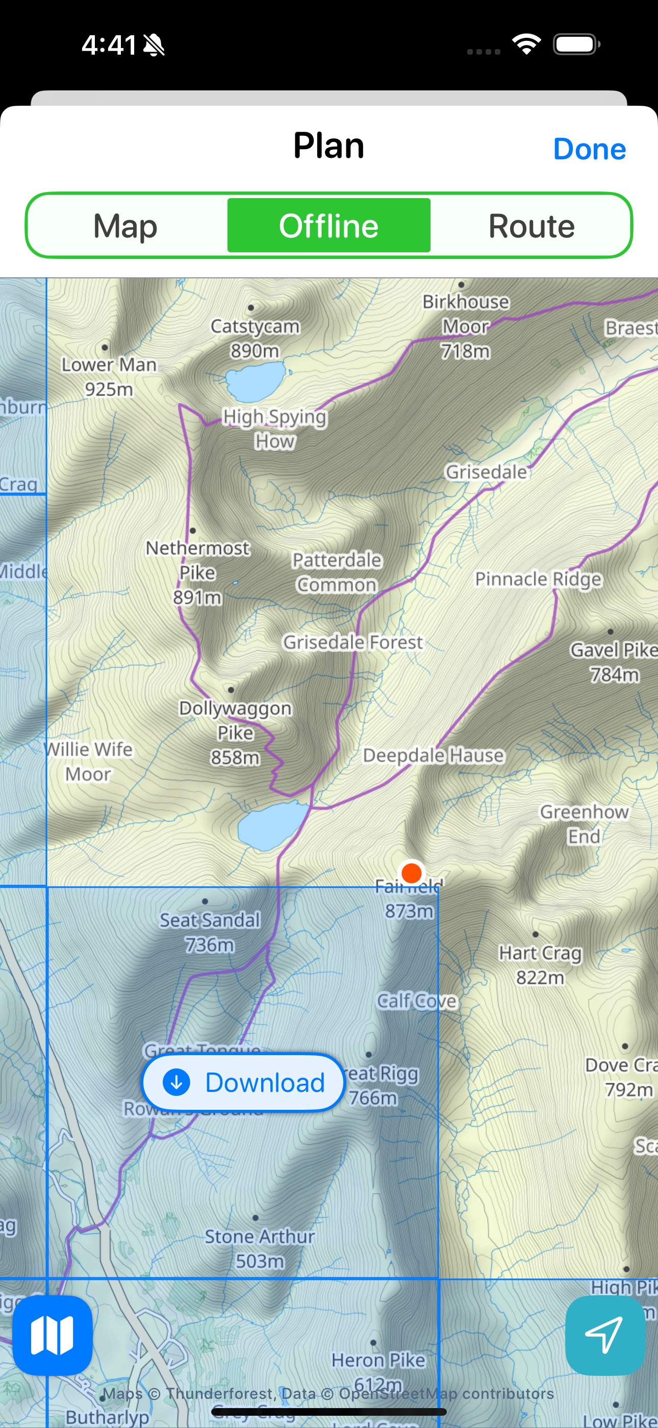
That’s much more consistent and nice, but the eagle eyed reader will notice an issue with my initial way of drawing the box boundaries.
The lines don’t blend correctly when a downloaded segment and a non-downloaded part are next to each other.
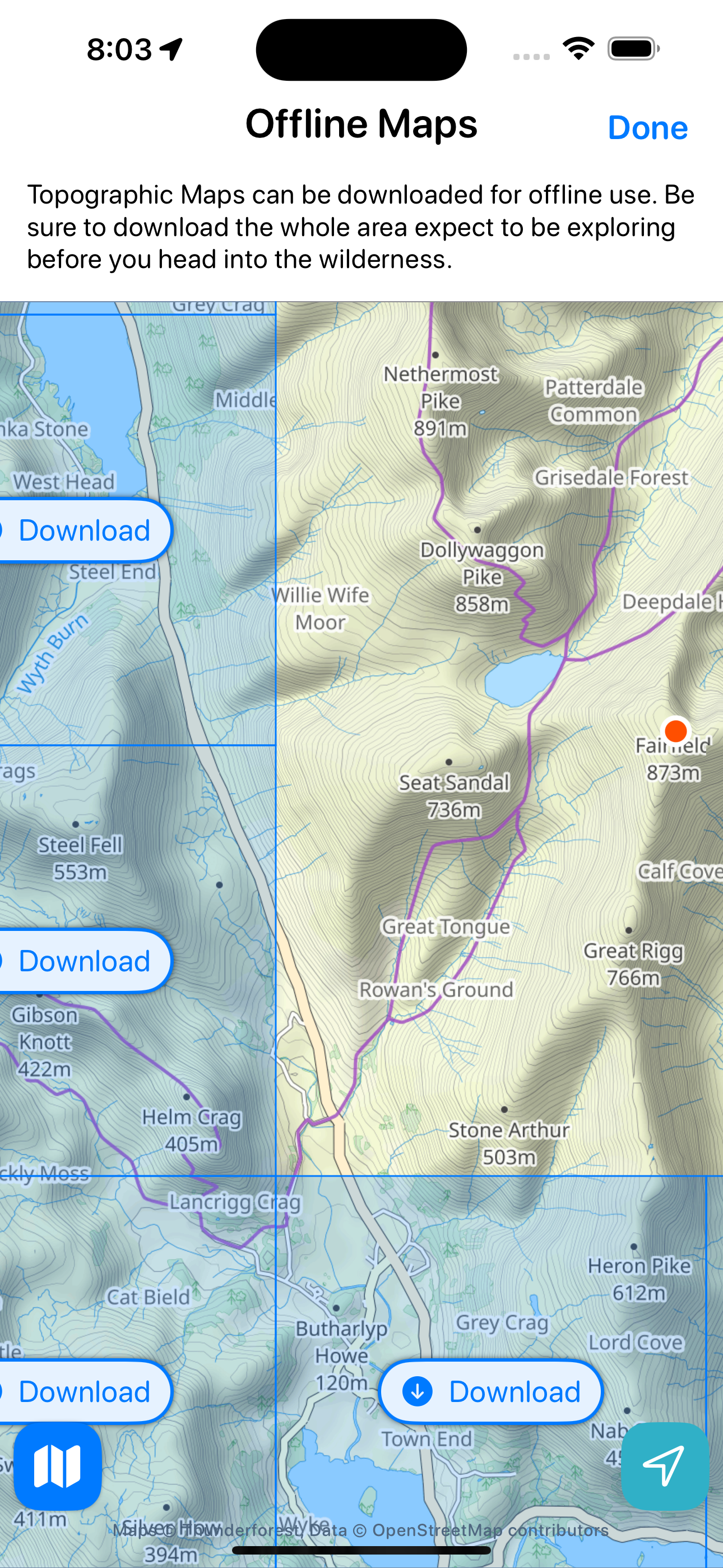
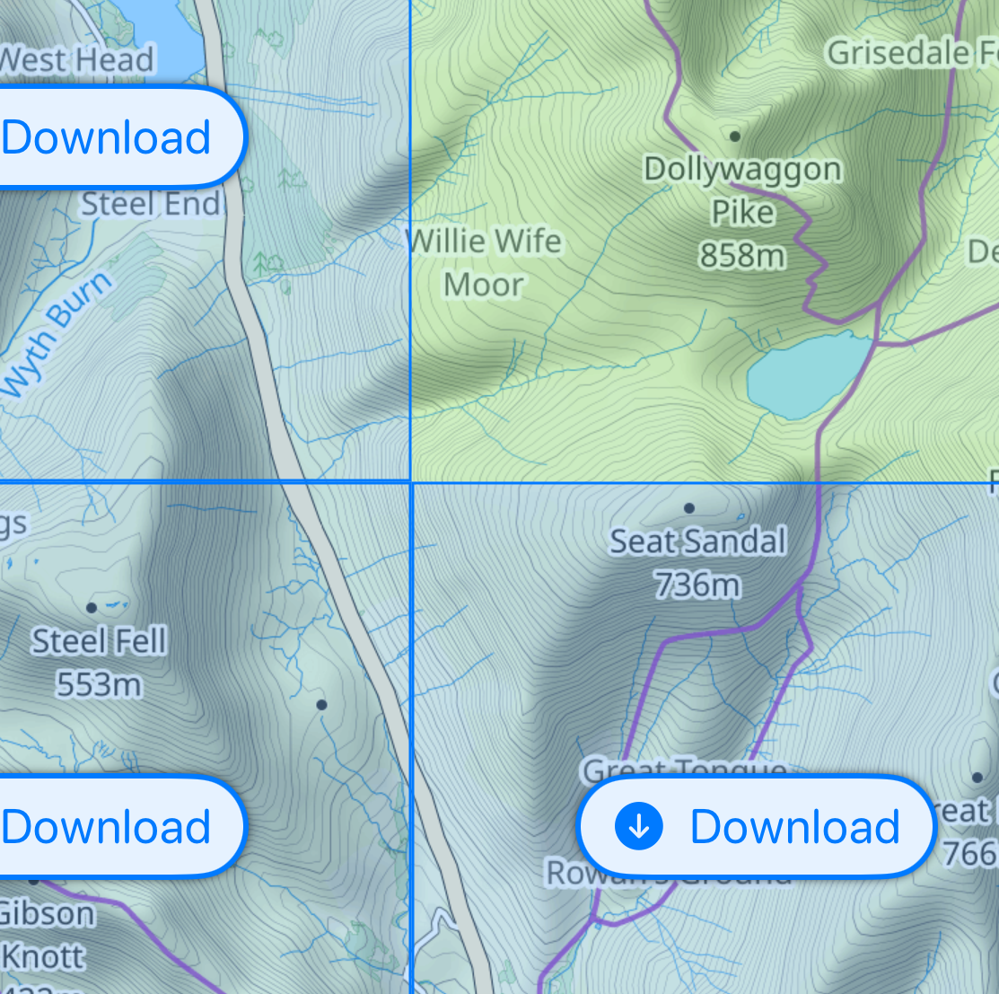
So I fixed that and moved this into its own part of the app with a bit of help text at the top.
And here is the current (but likely no where near fully final) design.
I still need to live with this for a few weeks, go out on a few hikes with it but so far my initial impressions are pretty positive. I find that is a really intuitive and straightforward way to manage the download segments which gives clear indications at a glance as to what is downloaded and what isn’t.