Owing to a variety of personal commitments I’ve not really been able to get started working like I typically would have by this point in the summer. The period directly after WWDC has often been my most productive, where I return home full of ideas and excitement for the summer ahead. Not so much this year as I’m only now really able to get stuck into work.
Marco and I discussed the feeling I now have of being “behind” on last week’s Under the Radar, if you’re interested in more detail on how to navigate this feeling.
Regardless of where I am in relation to what typically happens each year, today is the start of the period when I expect to get back to regular work and hopefully some good productivity.
Like I’ve said before, I often find it tricky to know where to start after a break in work. My mind is spinning from all the possibilities and unfocused from lack of use. As such my typical “trick” to get started again is to pick a small concrete problem to solve and work on that to warm up.
Today I decided a reasonable task for my mental warm up was to see how Widgetsmith might look in visionOS and then choose a screen to update to better fit in there.
Recompiling Widgetsmith
First off I created a branch of Widgetsmith and then spent about 30 minutes sorting through compiler errors and generally getting the project to run on visionOS. Mostly this was just cleaning up warnings about unavailable methods or restructuring the Project file to adopt a visionOS target.
After this I then was able to run Widgetsmith for the first time on visionOS (which was quite exciting to see).
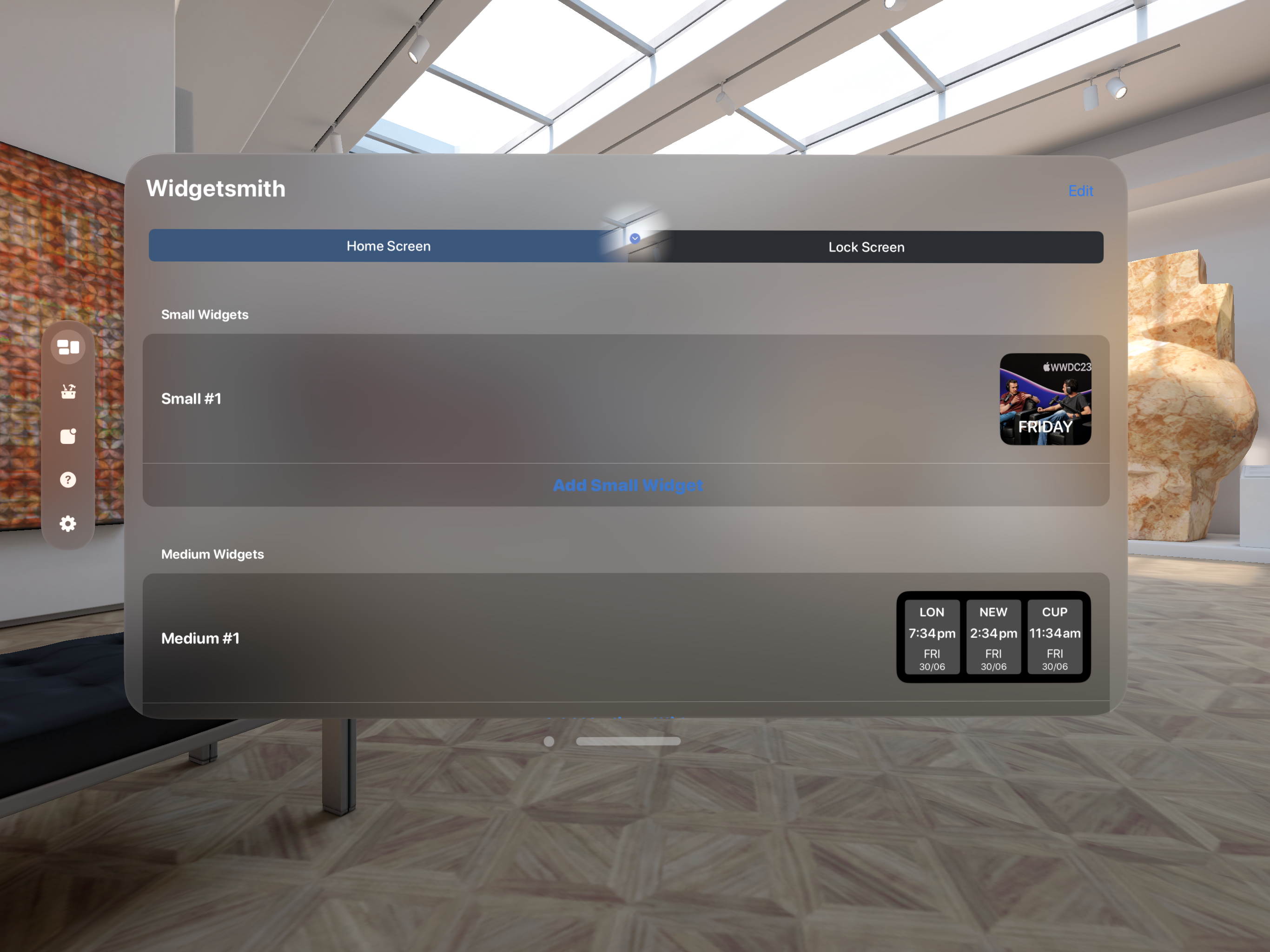
It isn’t much to look at, but it is progress. The app runs essentially as an iPad app if I don’t do anything to make it properly adopt visionOS.
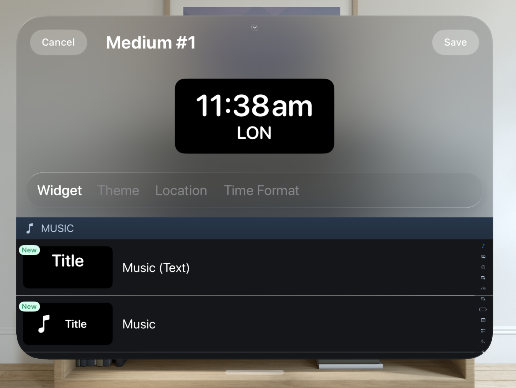
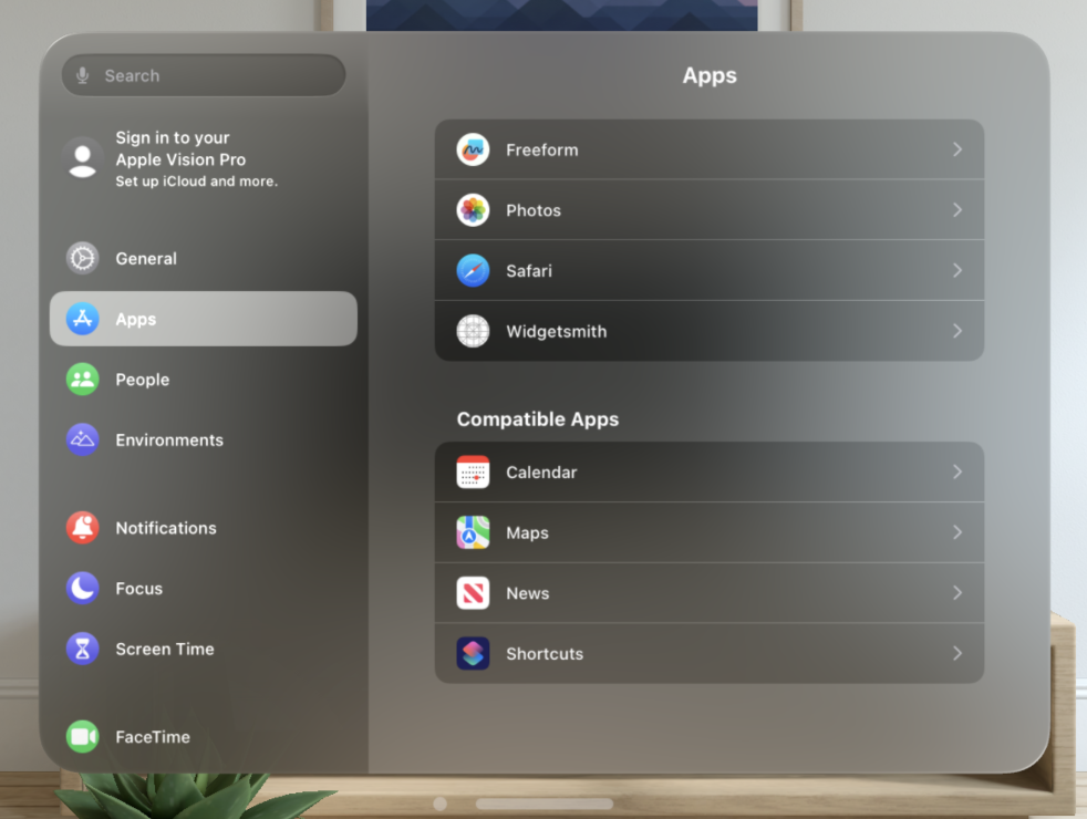
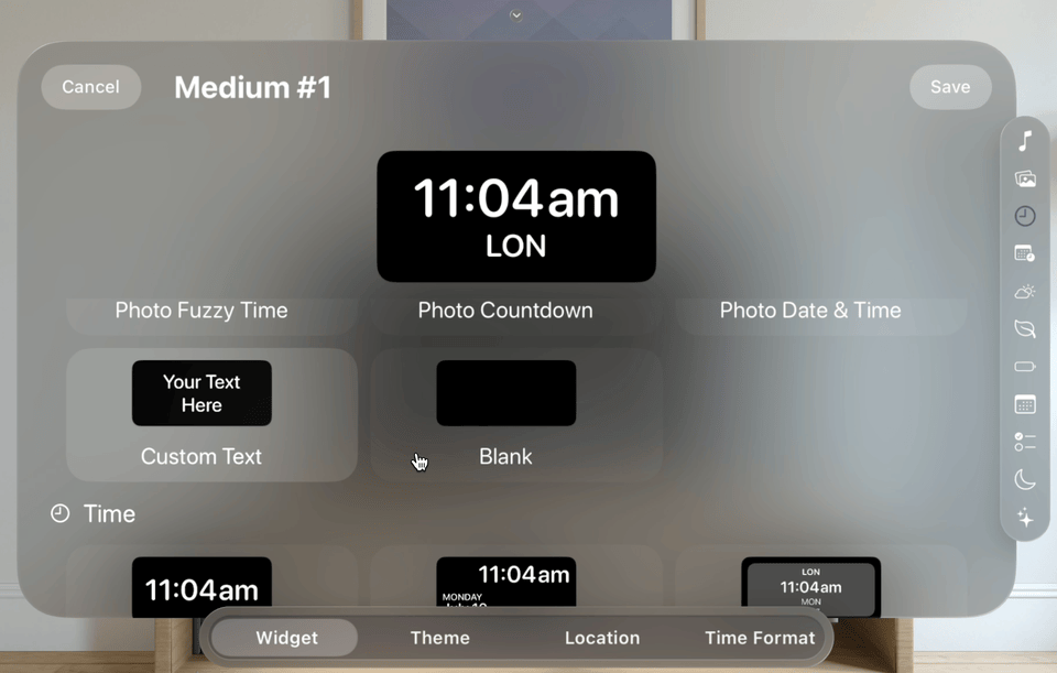
Of particular interest for today was the situation when I opened the widget editor.
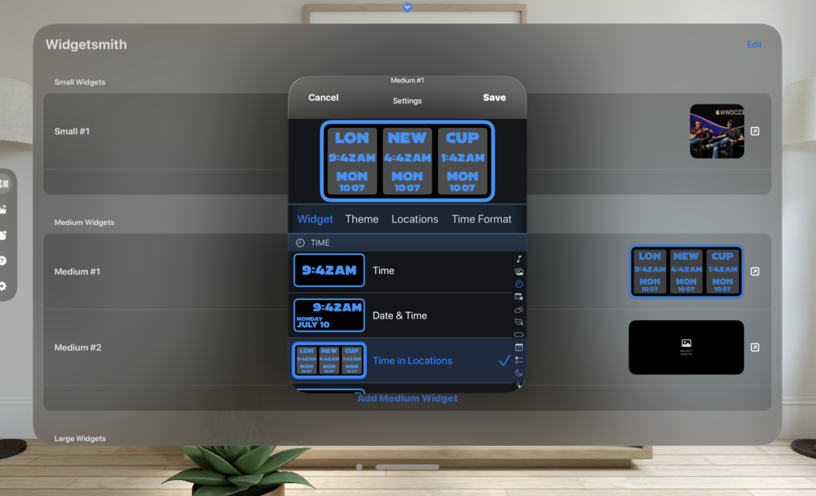
This screen is a disaster on visionOS. Essentially an iPhone window which uses none of the idioms of visionOS. So updating this screen became my project for the morning to warm up for work again.
Updating for visionOS
The first thing I need to do is to move the editor into a full width view.
visionOS tells any app running in it that it is dark mode, so all my controls appear in the darkened state. This looks good on iOS but on visionOS it is stark and very out of place.
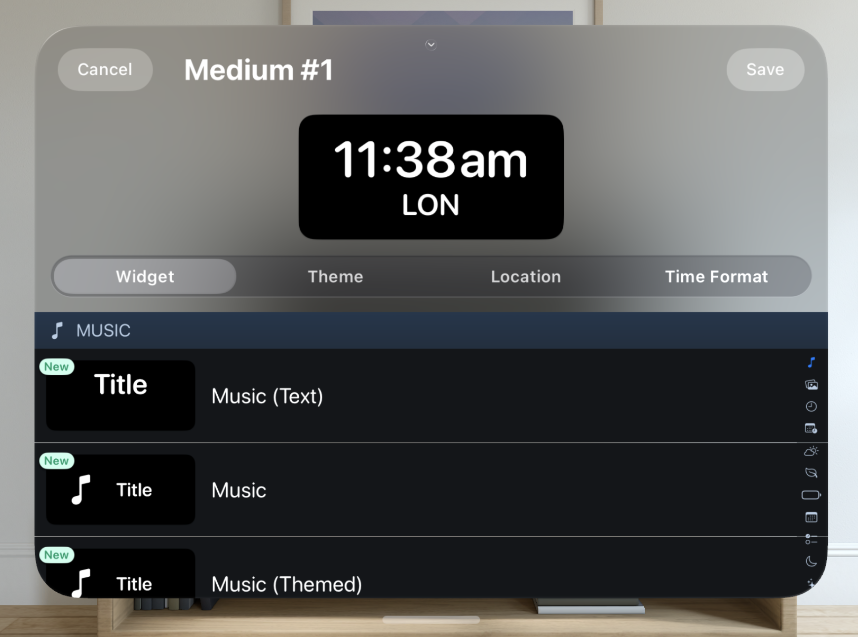
Let’s start off my removing some of the separators and generally flatten down the UI.
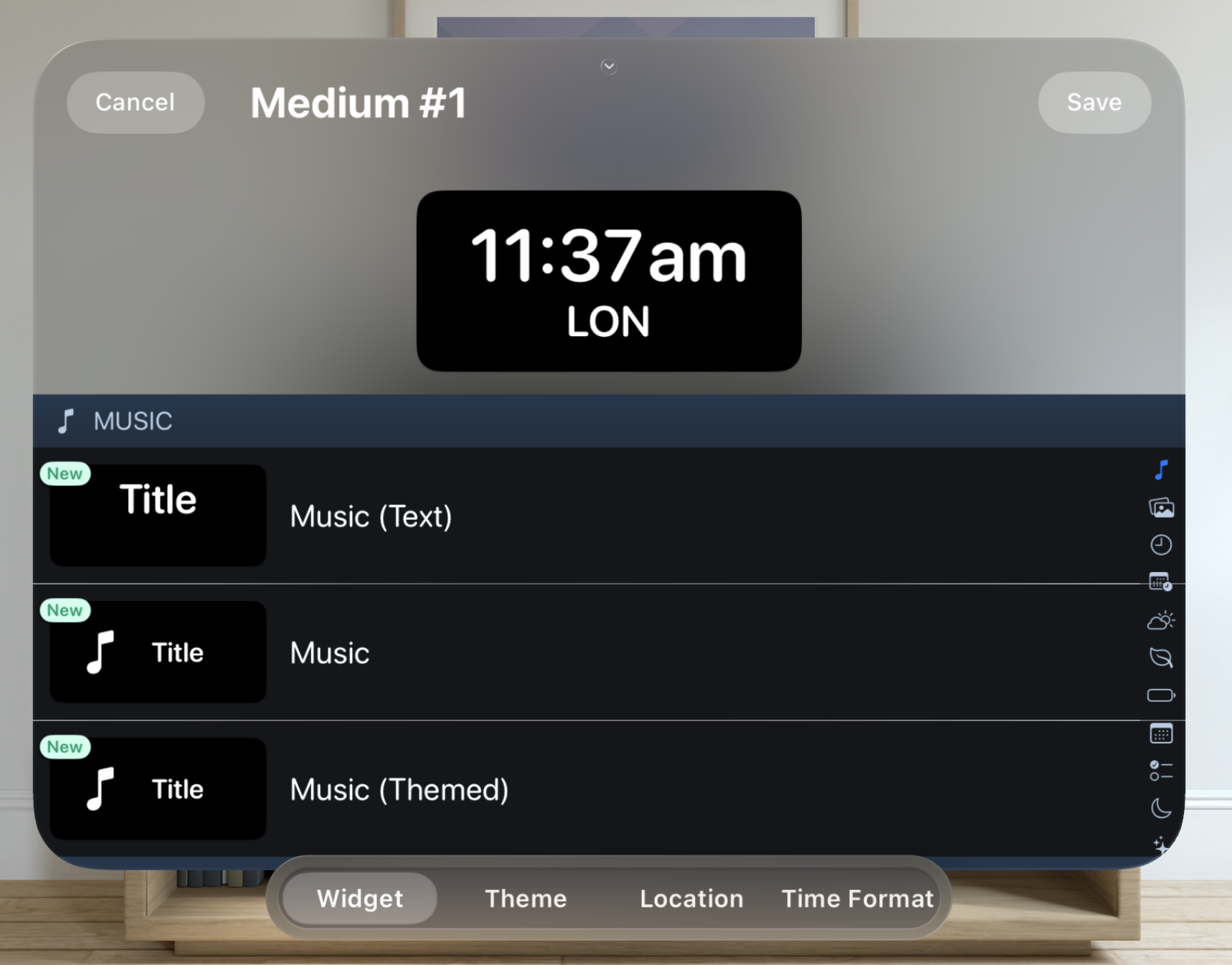
Next let’s see what we can do about that horizontal chooser in the middle. My general sense is that adopting the “Glassy” material approach is best on visionOS, so the first thing I tried was to change my horizontal selector to instead now use that.
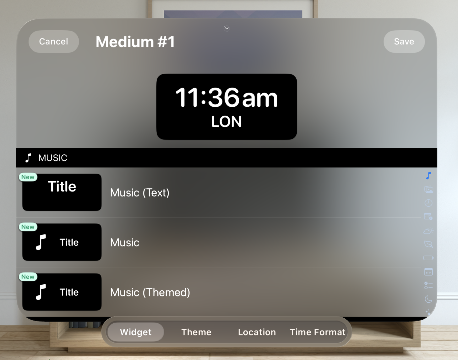
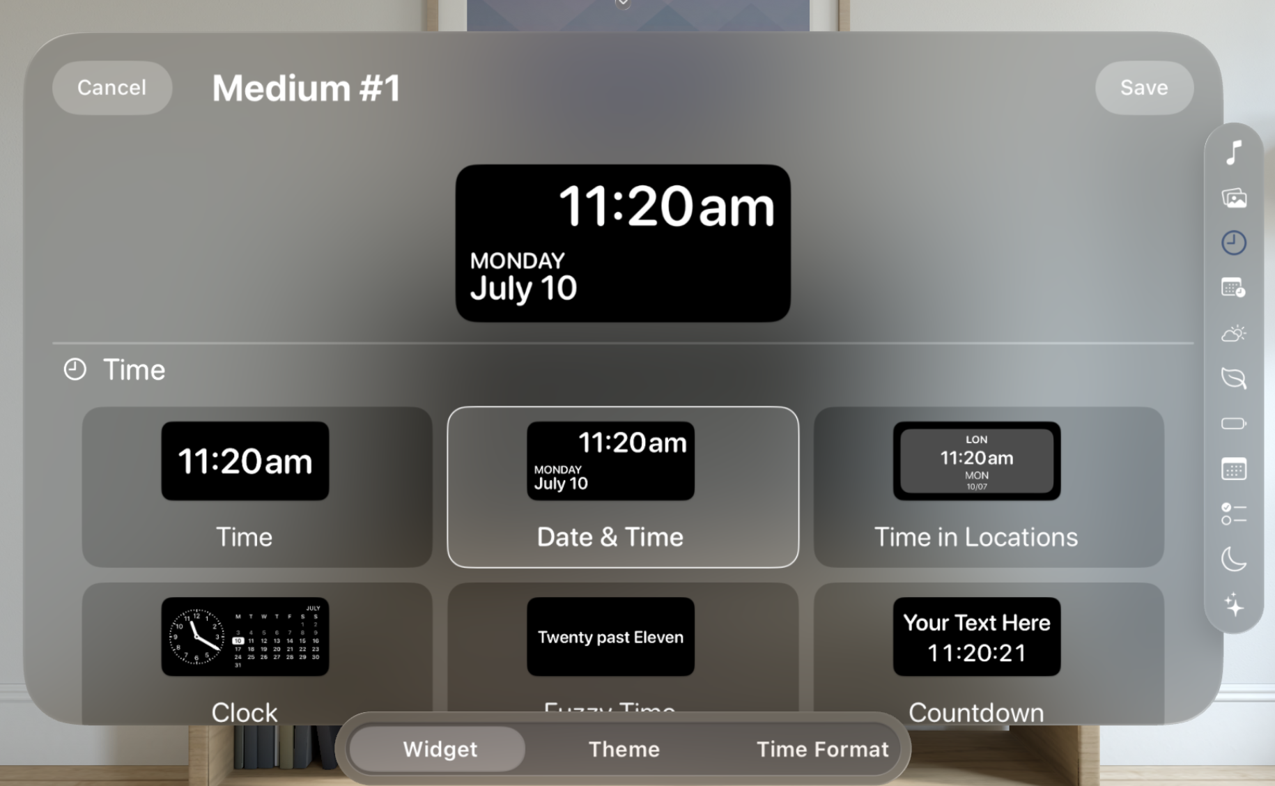
This looks better but still is a bit weird and lacks a sense of “place” in the UI. Next I try switching this from a custom horizontal picker to using a standard system picker view. This then gains a nice inset shading and rounded appearance.
Much better, but now I’m seeing how the vertical layout is very inefficient. visionOS windows are nearly always in a landscape orientation, with a roughly 4:3 ratio. As such my UI needs to be more thoughtful about how it uses vertical space to avoid the user having to scroll to see content.
From my brief experience with the visionOS hardware at WWDC I’d say that scrolling was the least natural gesture I tried. It requires the largest physical hand movement and as such was more awkward than the gestures which can be done with your hand resting in your lap.
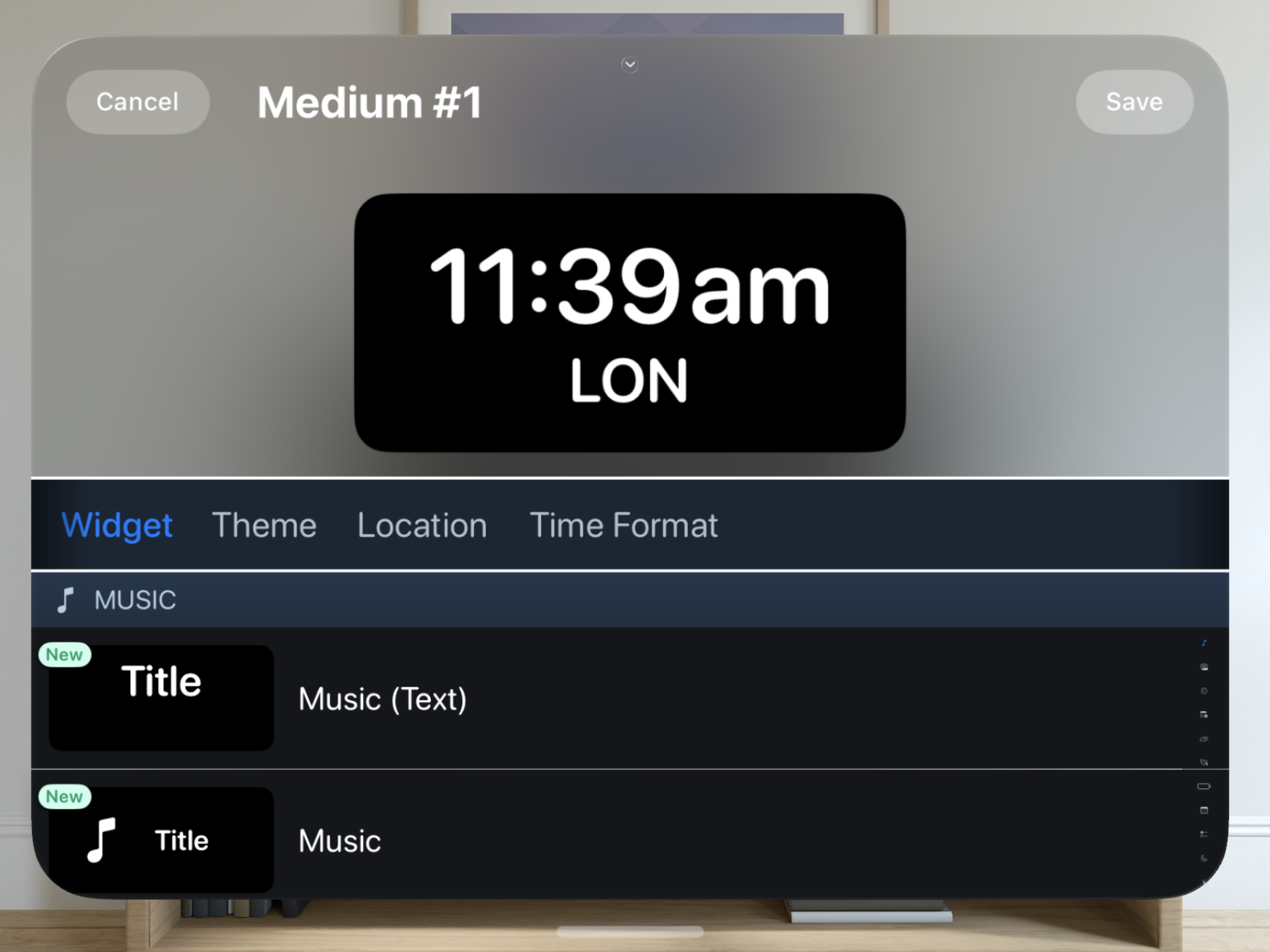
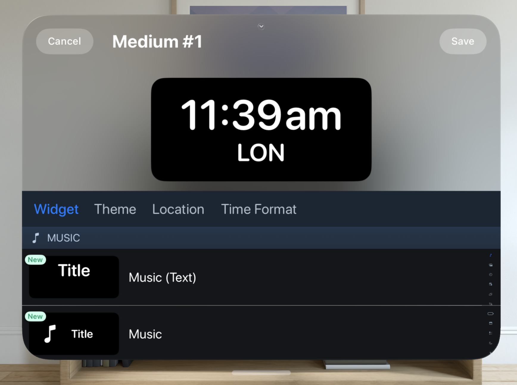
So the next thing I wanted to do was to see how much of the main window content I could remove as possible to maximize the usable space in the window. So I tried moving the picker into an ornament at the bottom of the window.
I like the general feel of this. It operates like a tab bar would but by using a segmented control I feel like can more logically show how each selection is related to the same top widget view (rather than an actual tab view which would imply separate operations in each tab).
Now to remove all the custom row coloring and make the app a bit more ‘native’ in its appearance.
That’s better, but what to do about the section separators? I want there to be a clear, logical separation of the widget categories but don’t want something big and heavy here.
Typically when I face something like this I’d go look at Apple’s own apps or the HIG to get a sense of the best practice. The simulator doesn’t have a full app experience, but all the same I could find an example of a similar UI goal in the Settings app.
The general approach seems to be to put the section headers into the base material, and then distinguish the content with an alternate material inset.
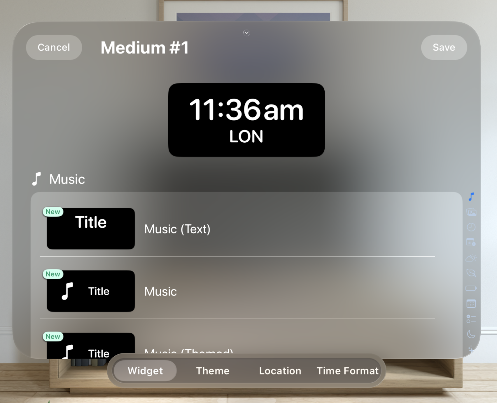
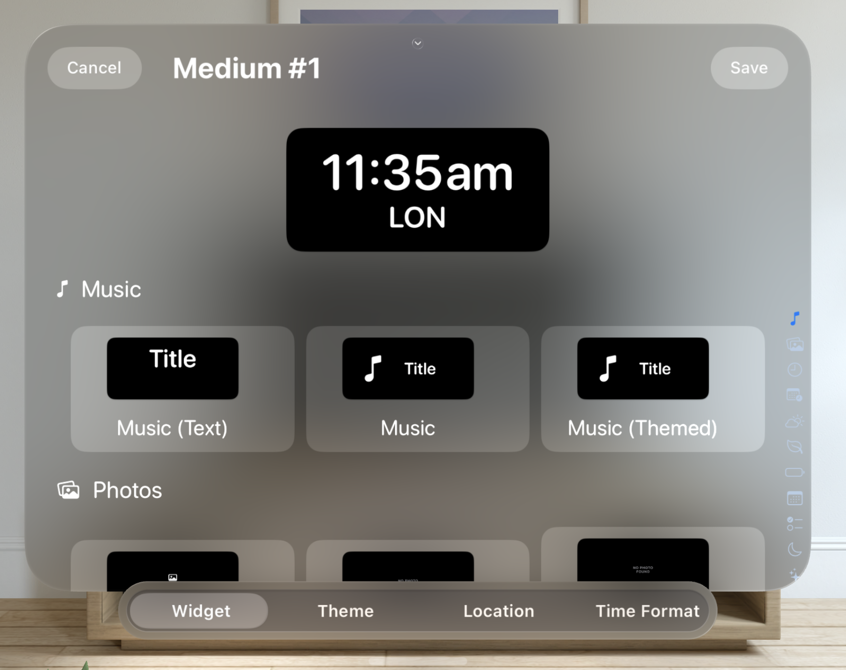
Next I want to tackle the scrolling problem again with the main contents of the view. A single row for each option seems very wasteful with my vertical space. Instead, let’s switch over to a 3-wide grid of elements.
Something I noticed when using the headset at WWDC was how because you navigate by looking at what you want to select (rather than say mousing over to it on a Mac) this kind of UI felt really efficient. I don’t need to ‘steer’ a cursor to what I want to select, I just look at it.
Now I need to do something about the index buttons along the right hand side. These let you easily jump to different categories of widgets. On iOS they fit well next to the main list, but here that feels unnecessarily constraining, and leads to some awkward layout concerns if I want to make them big enough to adopt the tap target goals of the platform.
So again let’s try to solve this by using an ornament.
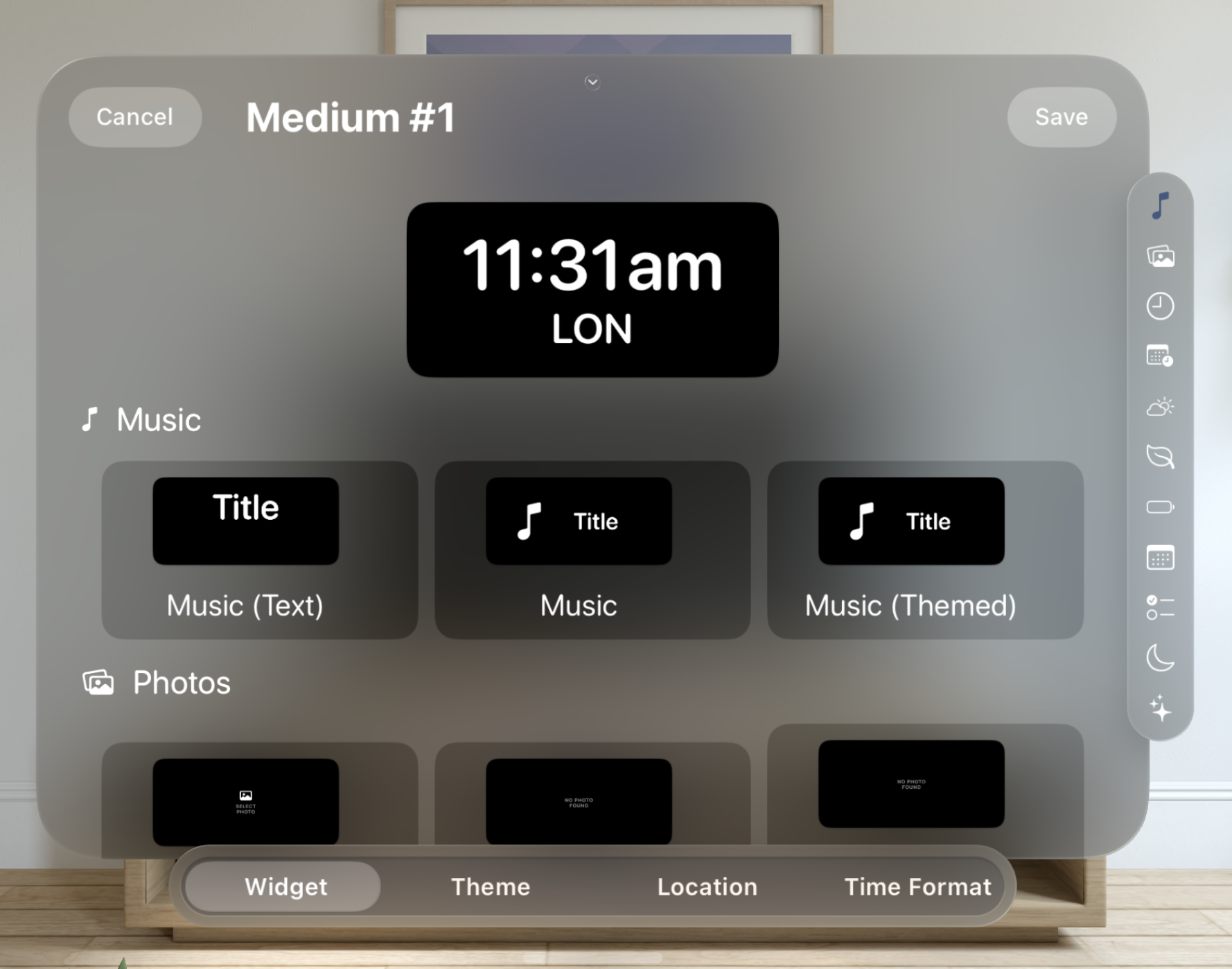
That’s actually looking pretty reasonable. I’m not totally convinced by the double ornament approach but conceptually I like it.
Next I need to hookup the hover effects on the main selection buttons so that they shimmer when you look at them. This is as easy as adding a .hoverEffect() to the relevant view and setting its contentShape.
This is then repeated for the category chooser.
Next I need to do something to make the selected item stand out in the list. For now I’m going to go with a thin border and different material background. I’m not very sure about this one, but for now it works and feels generally “native” for visionOS.
Lastly I need to add a bit of visual separation between the preview at the top and the ‘active’ portion below. They are visually quite similar but logically very different, so I don’t want to create confusion between them.
There we go, not bad for a first attempt.
I don’t really think this is a “good” design yet. It will take a ton of time to with the platform to really have a good sense of that, but it is a solid starting point and having gone through the exercise of creating it I feel much more comfortable on visionOS generally. It will likely take creating dozens of “bad” designs on the platform before I can develop an intuition for what a “good” one is.
Furthermore, it will take months of working on the platform and then (hopefully) using the device in practice to really understand it. However, starting now with the simulator and documentation should hopefully give me a good head start for when those opportunities may come later this year.