Today I was working on designing a steps focused live activity mode for Pedometer++.
In the initial version of workout tracking I focused on distanced based UI, which fit well with the overall structure of the way workout tracking functions. However, I quickly started to get lots of feedback that users would like to track their steps during their workouts…which makes a ton of sense for a step tracker!
Here is what the distance based workout mode live activity looks like:
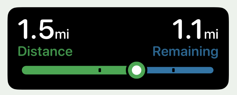
The bar underneath shows your progress towards a chosen distance goal with the markings indicating mile/km markers along the way.
I’m very happy with this overall look and design language, so I wanted to adapt it to the context of tracking users goal towards their step goal.
Design Iterations
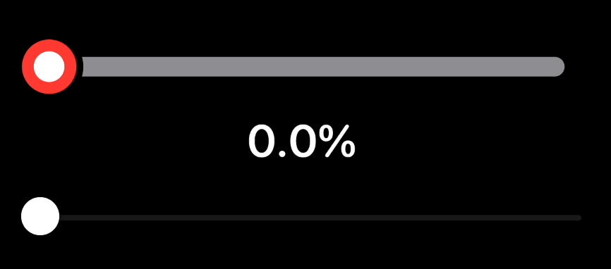
The first thing I tried was thinking through using the same two-tone colored look but using the goal based colors I used throughout the app currently: Red for below 50%, orange 50% - 100%, green above 100% (or the color blind friendly alternative colors).
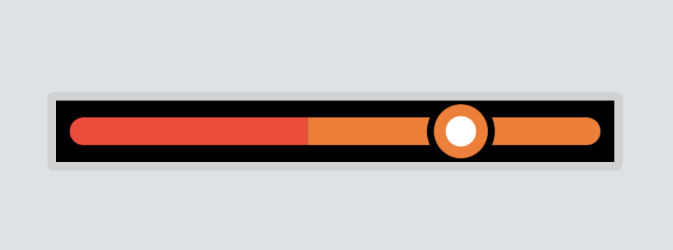
I tried this out but very quickly discarded this look. It is just weird looking, worth trying but not the winner.
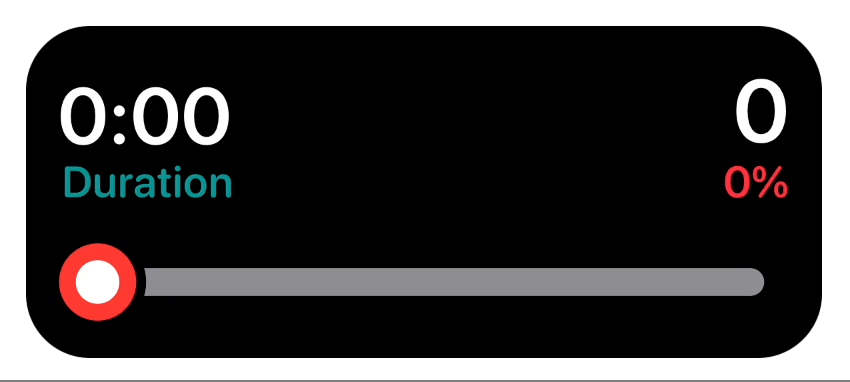
So instead I decided that I’d do something where the color of your current goal status fills the whole goal bar, with the remaining section left gray:
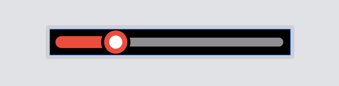
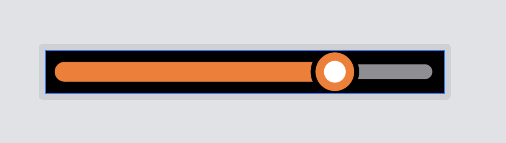
That works really well. I like how it follows the same overall look of the distance workout activity but in a way that cleanly shows your progress towards your step goal.
The question, however, remains of what to do once you reach your goal. In the distance goal case I just cap the graph at 100% and say “GOAL ACHIEVED!”. That didn’t feel like the right path here. You could easily be far exceeding your step goal and so I want to keep the live activity relevant here.
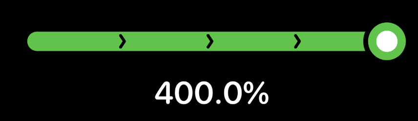
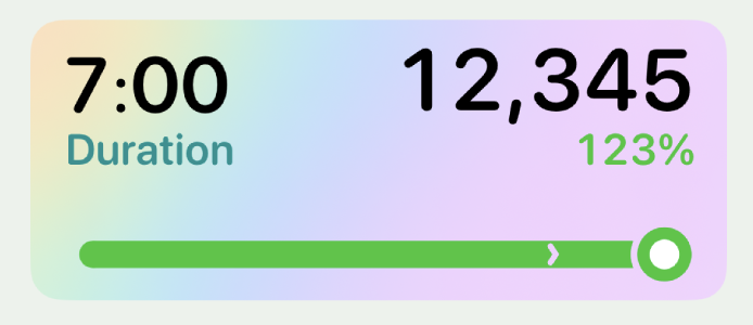
Instead I thought I could borrow the mile markers from the distance graph but here instead have them be multiples of your goal (1x, 2x, 3x, …). With the graph thumb staying pinned to the rightmost edge, but the line rescaling as you go.
I like were this is going. The graph stays relevant as it is surpassed, but it is always clear that you have reached your goal.
Something which didn’t quite feel right was reusing the rectangular markers for the milestones. In the Apple Watch app for Pedometer++ I include this screen:
In this ring display the chevron indicates how many times the user has met their goal (1x = 1 chevron, 2x = 2 chevrons, …). I wanted to mirror this feeling here, so rather than using rectangles I’m instead I tried placing chevrons at each of the milestone points.
Nice! This works really well for what I’m trying to communicate…but I very quickly hit a failure state for it. When I update the renderer to give multiple chevrons based on goal completion things can fall apart very quickly if you dramatically exceed your goal:
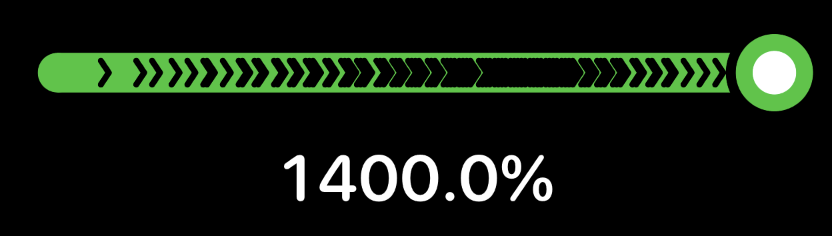
So that won’t do. Instead I shifted to swapping out chevrons for the fixed width numerical strings(“5x”, “6x”,…) once you reach a certain number of goal completions. Then switching them all once you get above 8x completions to save even more space.

Generally speaking reaching 10 times your goal would represent an extraordinary physical accomplishment (though of course users can set their goal very low, in which case it is more possible).
I feel pretty good with this setup. It is beautiful and coordinates with the Apple Watch app/complications for the typical goal completions and then has a reasonable fallback.
The next step was to incorporate it into the actual live activity UI.
I think it fits well here and is good enough to start testing with. The funny thing with doing a live activity which is step based is that it is harder to ‘simulate’ the users movement. With GPS based activity it is pretty straightforward to do in the iOS simulator, but for motion based step tracking there is no substitute for physical tracking. So I pulled out my desktop testing rig:
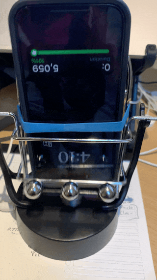
Which is always feels very fancy, if a bit silly.
Transparent Activities
The last thing I wanted to test out was how this Live Activity looks when the user chooses the “clear”/”frosted” look for their Live Activity. In this case I need to make sure that the graph bar still looks good.
All I needed to do was to switch over to using a .destinationOut blend mode when drawing the chevrons and outlining the graph thumb.
The result looks pretty good to my eye and overall I think this design works. As with all designs I’ll have to live with it for a week or so to be sure, but it is off to a promising start.