Considering Small Dynamic Type Sizes
I have a pretty solid grasp about how to layout Pedometer++ for the larger Dynamic Type sizes. Generally I just follow the rule of making everything bigger, reflowing as appropriate for a great experience.
But what has gotten me thinking today is how to handle the smaller sizes.
When I’m adopting the larger sizes my design process is guided by a desire to increase the usability of the app for an audience with lower vision acuity. I’m not really sure what the guiding principle of the smaller sizes is.
Anecdotally I’ve seen folks choose these settings when they want to see more on the screen at once. It’s a preference rather than an enabling technology. That isn’t to say that I should ignore this expressed preference my user has made, but it does feel like treating it differently.
The very first recommendation for Typography in the HIG states:
Strive to maintain a minimum font size that most people can read easily.
Generally speaking larger things are more legible than smaller things. So ensuring that I don’t go too small seems important.

When I look at my stats for how widely used these smaller sizes are it looks like around 17.5% of users prefer a smaller size (compared to 11.5% who prefer a larger). So it is a pretty meaningful proportion.
Initial explorations
In most places I’m just letting the UI shrink down following Apple’s Dynamic Type guidelines. But one spot in particular that I’m struggling with is the main graph view.
At the default Dynamic Type size this is scaled to show a seven day view. When larger sizes the bars get wider showing fewer days at a time. If I follow this same pattern for smaller sizes then you end up with something like this:
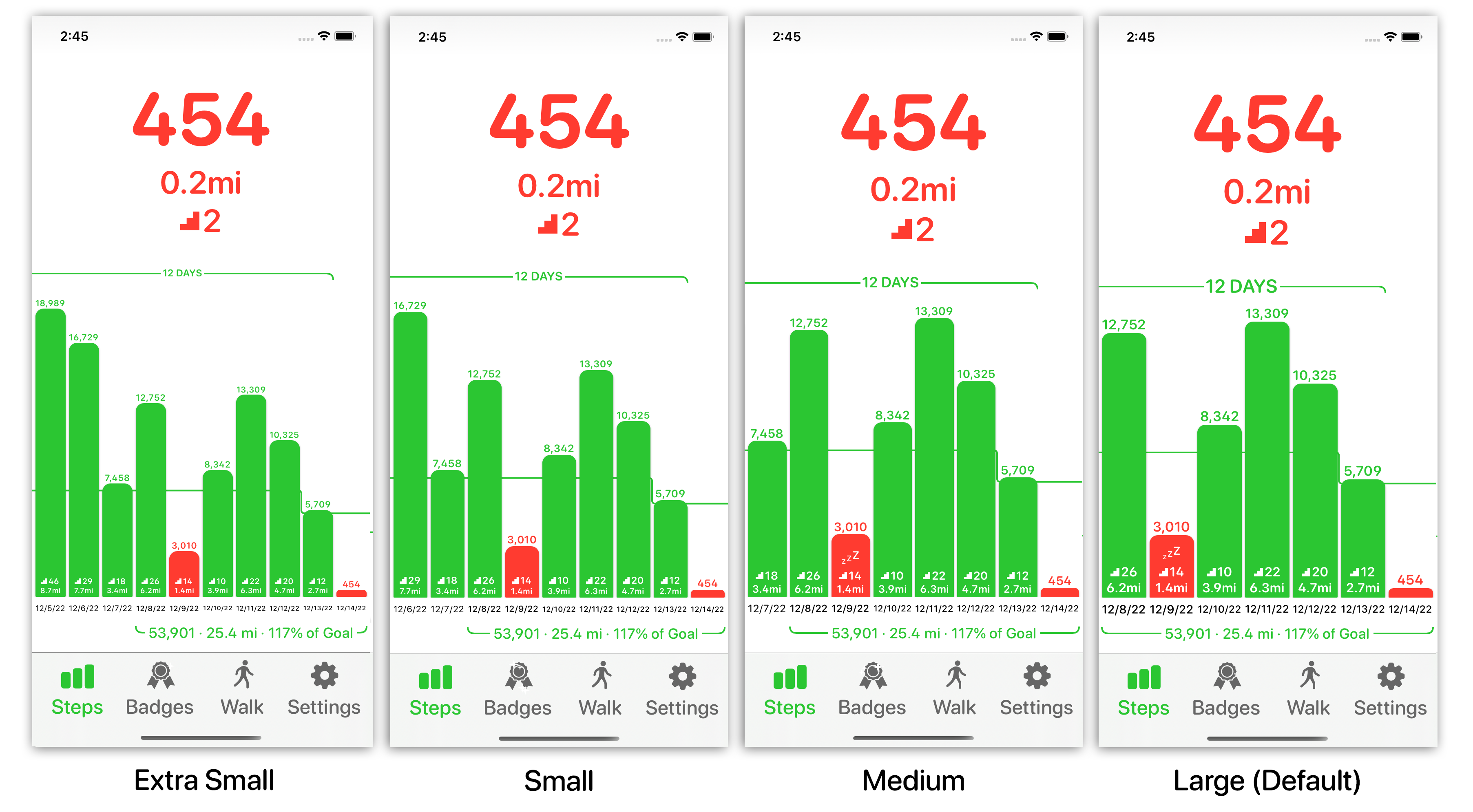
Where the Medium size shows 8 days, the Small 9 days, and the Extra Small 10 days.
This certainly accomplishes the goal of expressing the user’s preference for more data but when I look at it I just really don’t like it. It starts to feel cramped and unwieldy. My instinct is to shrink the main large text labels, but to keep the bars at the default sizing…and essentially override the user’s expressed preference.
Request for Feedback
I’m still very uncertain about this, if you are a small Dynamic Type user and have thoughts on how you’d expect/prefer this UI to adjust for you I’d really love to hear it.
The best way to reach me is on Mastodon.