Small bits of kindness in Design
In yesterday’s design work, I had said that I built my switches with red and green as their default colors:
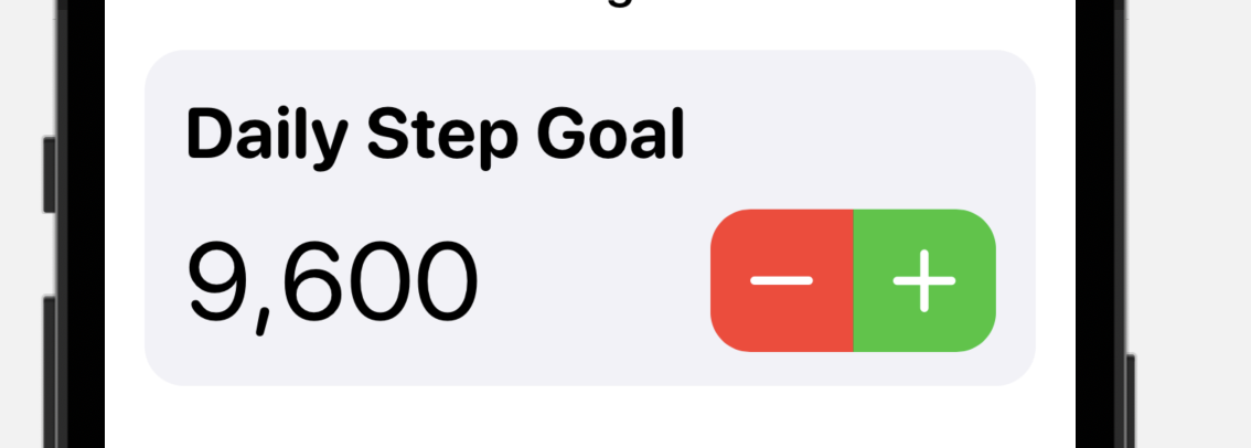
This was the obvious way to differentiate them and seemed like a reasonable way to go.
However, as I was thinking further about I realized this was actually not good at all. It is actually super mean and unkind.
What I’m subtly saying with this design choice is that good people increase their goal and bad people lower their goal. While that is probably a slight exaggeration, this is how my users would actually feel (at least subconsciously).
I don’t want to make apps that are unkind. I want apps that are encouraging and build up their users. I want to make apps that don’t make you feel bad about yourself.
So I have colored this bit of UI so that both sides of the stepper are green.
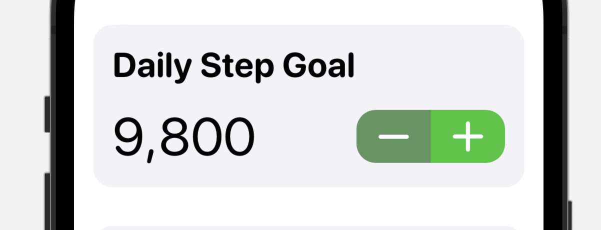
So if you are lowering your goal, that is awesome. Great job taking care of yourself. Set whatever goal best fits your current fitness goals. No judgement.
No More Switches
My old settings screen included a large number of UISwitch controls that the user would turn on and off.
I started to rebuild this screen just copying this design, and got pretty far in terms of making a UI that fits my new design language.
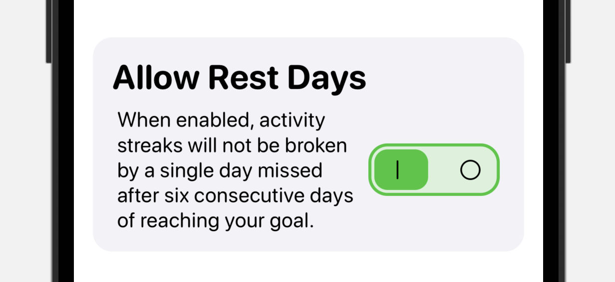
However, the more that I thought about it the less I liked using Switches. There is something about them that is inherently unfriendly. You are pressing a button without a clear explanation of what will happen. I can surround it with explanation text and hope to educate my users about what it means, but the reality is that this is entirely unnecessary.
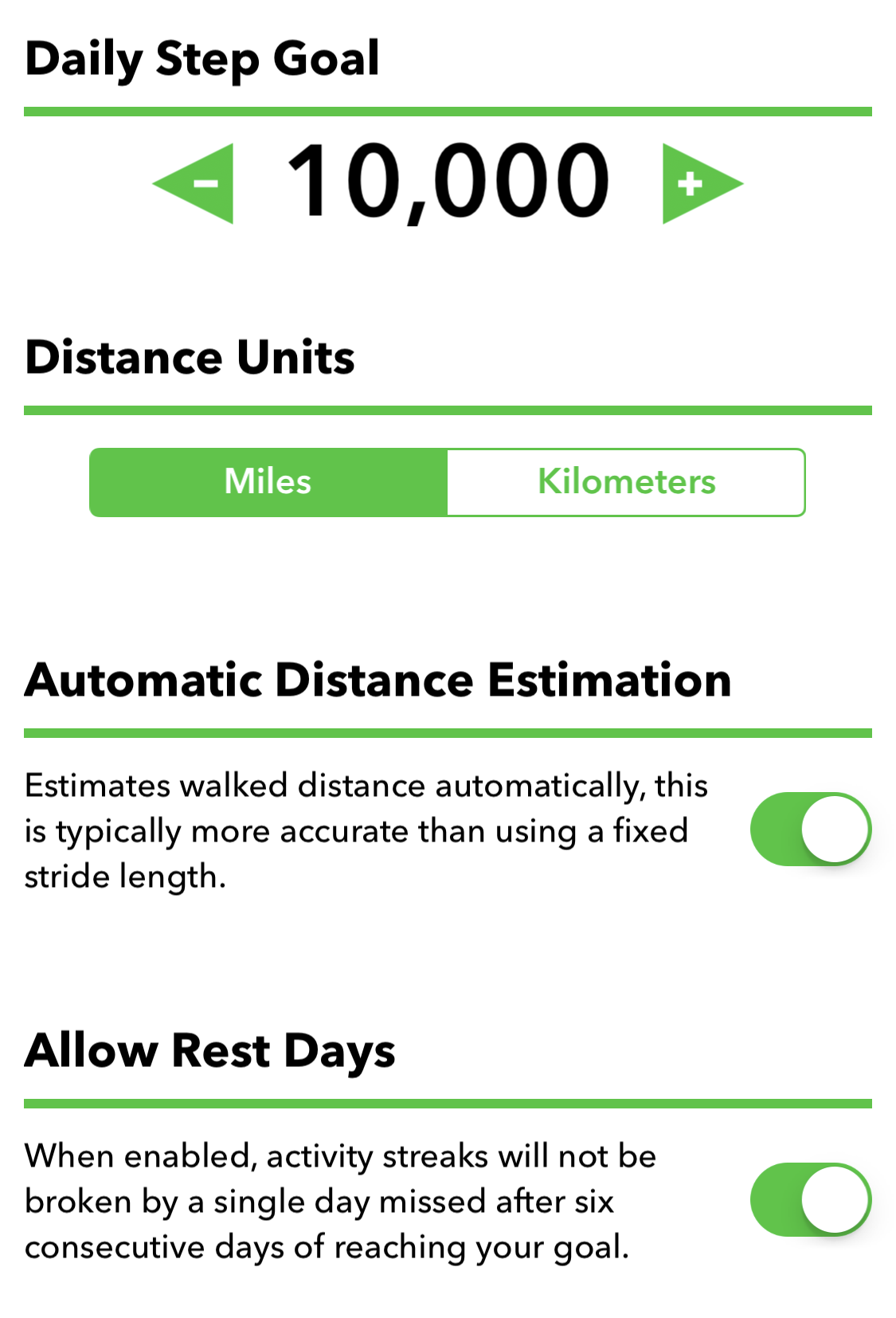
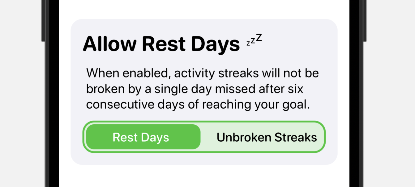
Instead, what I should do is use a segmented control with clear labels about what the two states the user is choosing between are.
In this case, they are either operating with Rest Days enabled, or they are opting to require unbroken streaks. By labeling the choices clearly I am hopefully eliminating a bit of stress about changing this setting. I never want my users to be nervous about what a button is going to do before they press it.
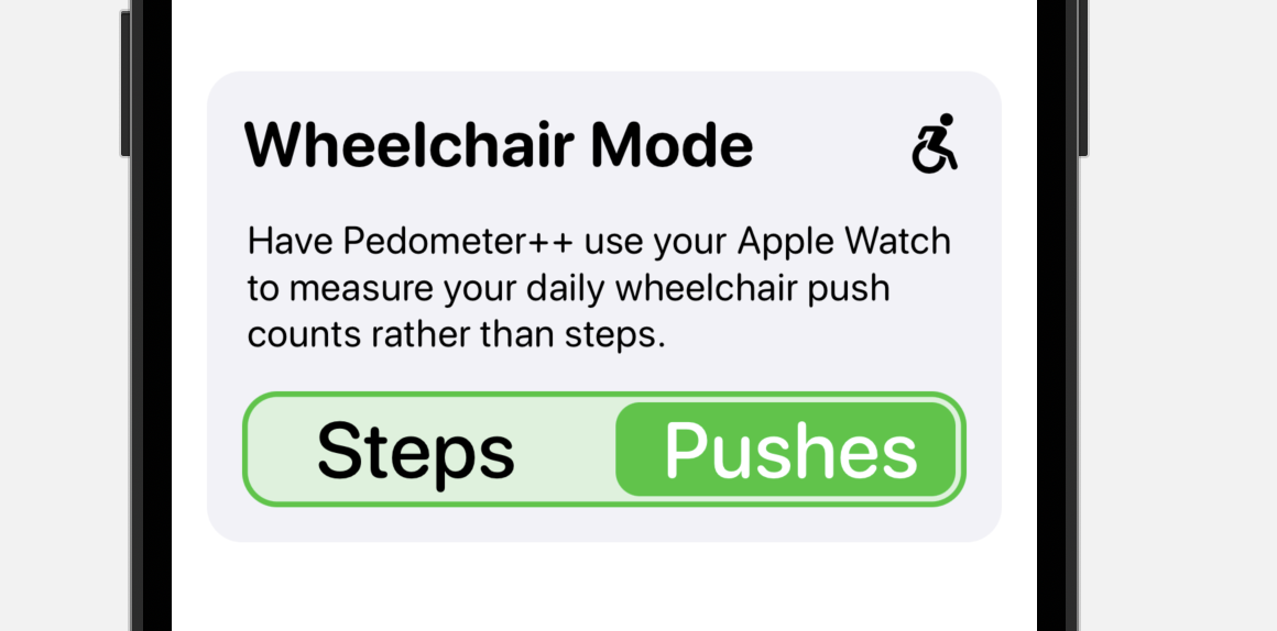
Similarly, for the Wheelchair mode in Pedometer++ where I swap to counting pushes rather than steps. I can communicate much more clearly with a segmented control. Rather than “Wheelchair Mode On/Off”.
And again, for Merge Apple Watch data I can add inline explanation that if you loose if you change this setting, that you are going to see iPhone only data. This was implied in the previous explanation text, but now it is absolutely clear.

The more I thought about it today, the more I am convinced that UISwitches are a bad idea in most designs. They are hiding things from the user in a way that is slightly hostile. Opting for compactness in screen real estate, rather than clarity.
SwiftUI is amazing
I have finished rebuilding the Settings tab from UIKit to SwiftUI, and I gotta say SwiftUI is amazing. I had kept putting off this rebuild because I thought it would take at least two weeks to get done. These settings screens are some of the most complicated and intertwined bits of UI in the app.
Instead of taking two weeks, the rebuild took 1.5 days. I was blown away with how productive SwiftUI has made me.
Even more awesome than just the raw productivity is that these new views are way more accessible with Dynamic Type and VoiceOver. In UIKit it wasn’t hard to build support for them, but it did take effort. So many more things are just automatic in SwiftUI.
It certainly doesn’t hurt either that the resulting code is like 20% of the lines of code compared to the UIKit version.
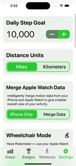
Here is a quick overview of the working state of it, not final design, but all working in practice.