8:45a Start of Month Logistics
The first day of the month always starts with a half hour of kinda boring logistics. Lots of invoices to be paid, accounts to be reconciled and bookkeeping to clean up.
9:44a Catching up on my RSS
While reading through my RSS subscriptions in FeedBin, I hit upon a new subscription. Which is always a fun event. As is often the case, I discovered this new site to follow from a link from Michael Tsai’s excellent blog (no seriously, if I were somehow forced to only read one blog, it would almost certainly be his). Anyway, he linked to a super interesting post by Alin Panaitiu about SwiftUI performance. From which I learned a ton.
10:46a Jelly Face
Many mornings I find myself struggling to get started coding. While overall I enjoy my work, that doesn’t mean that getting going with it is easy. What I’ve found recently is that doing a bit of a ‘warm-up’ is often helpful to start my day. This typically takes the form of building out a little watch face.
Watch faces are a nice quick, constrained design problem that challenge enough of the design and development parts of my brain to be useful, without getting me pulled down into a deep rabbit hole.
This morning I worked on a digital face using a “font” that the designer/developer extraordinaire Daniel Farrelly made for another watch I was working on. They are hand traced from the design of an old World War 2 watch.
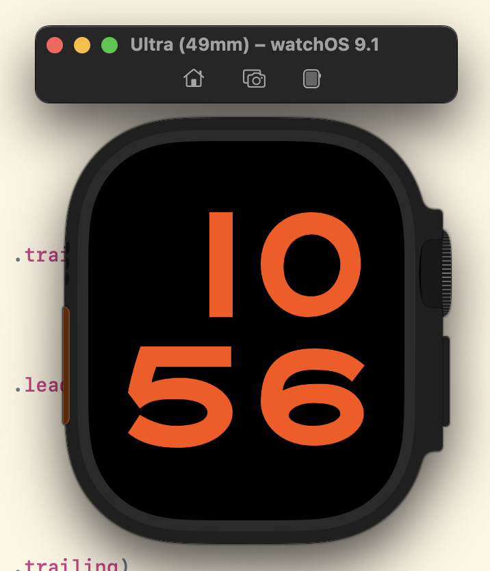
The result is quite lovely.
One day I’ll integrate all my custom watch face designs into Widgetsmith (or who knows maybe one day as actual watchOS faces). But until then this is how I get started on days I’m feeling sluggish.
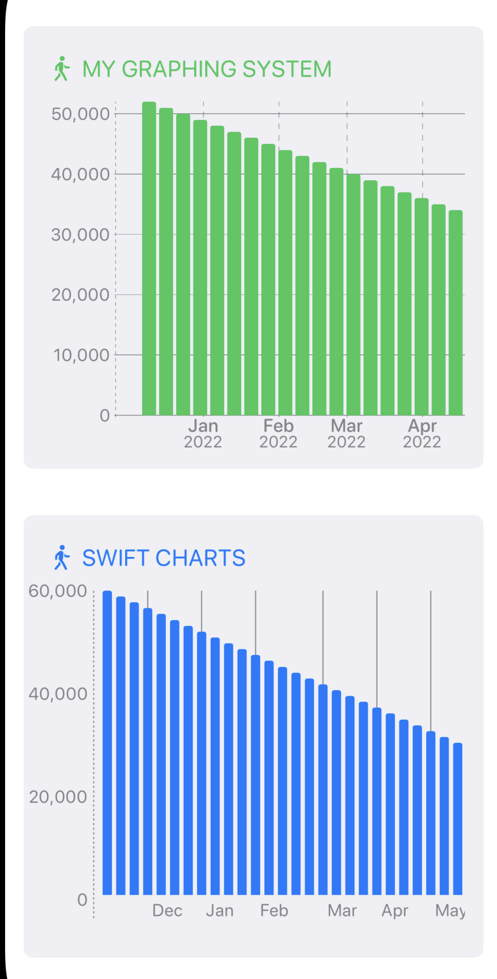
1:01p Rolling my own Chart System
Yeah, so the more I thought about using Swift Charts yesterday after I finished working for the day, the less I liked the idea. There are just too many limitations at this point and I think I’m going to end up chasing my tail way too much.
So I figured what I’d do is start my work today by seeing how quickly I could recreate the chart that I made yesterday. If it was just a few hours then I’ll drop Swift Charts for now and just use my own. That way I can easily support back to iOS 14 and customize things just how I like it.
The result was very promising. Here is the chart I made in around two hours.
The main downside with this approach is having to build my own AudioGraph system for the VoiceOver support, but that doesn’t look too bad.
Exploring performance
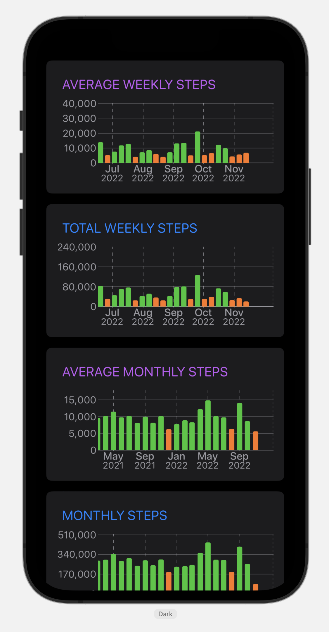
Something funny about having an app that displays user observation data is that it can only grow one day at a time. So to get a sense of if my graph approach is performant enough I need to look at how many bars could possibly be shown.
The iPhone 5S was introduced on September 20, 2013. This was the first iPhone to support step counting so is the farthest back data could exist. That was 480 weeks ago. So to performance test I loaded up my graph with 1.5x that (720 weeks) to see how it holds up. So far so good. It seems like I don’t need to build out a dynamic rendering system yet.
For the main step graph display I have had to build my own custom Lazy loading HStack system. The native SwiftUI one wasn’t reliable enough for me. I found that it did weird things with very high data point counts. We are 3359 days from the iPhone 5S launch, but when I tried putting that much data into the native LazyHStack everything fell over. Hence, I had to build my own system for layout and caching.
4:13p Better Testing Data
Something I’ve found very important while working with SwiftUI is that I need to be very thoughtful about what testing/example data I put into my Previews. If I get them wrong I’ll end up building the wrong thing or optimizing in the wrong direction.
To that end I just did a bit of work to create an easily loadable version of my own step count database (I wrote it to a big JSON blob that my previews can read). This goes back to nearly the launch of Pedometer++ and so is a good varied example of what a high usage user would look like.
4:41p Dark Mode Stats
I also just remembered that I added Dark Mode reporting in the last Widgetsmith update. It looks like Dark Mode is much more popular than light mode.
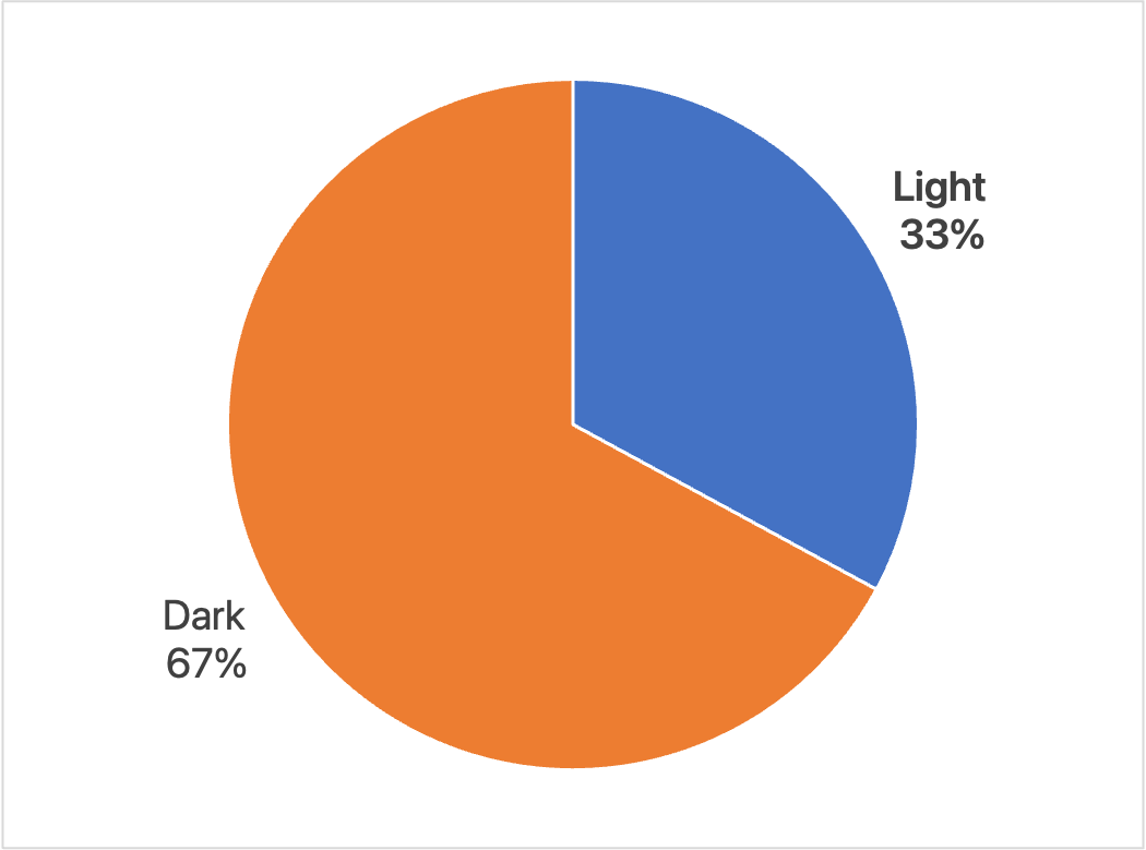
This is session based so it could also mean more folks have automatic switching turned on and use the app in the evening, rather than having their phone in Dark Mode all the time. Though it amounts to the same thing, I need to make sure things look real good in Dark Mode as it is the dominant appearance people use my app in.