Having just pushed out Watchsmith 2.0, I wanted to take a moment to mention some of the interesting technical challenges I ran into while building this update.
1. Getting photos to the Wrist
I did a whole episode on Under the Radar about this, but the process of getting the photos for the photo complication turned out to be a giant headache. It has to rely to Watch Connectivity in order to work in all contexts which led to a number of challenges.
You’ve heard of Belt-and-Suspender development, well this turned out to be Belt-and-Suspender-and-DuctTape.
File Transfer methods turned out to be very unreliable, so I ended up needing to package them up as Data items and then send them in a dictionary.
I ended up finding the most reliable approach is to package them up and send them via UserInfo whenever they are first saved. Then if the Watch ever receives a complication configuration it doesn’t have the photo for it fires up the Messaging API and tries to wake the iPhone app and asks for the missing photo. Then failing that the main app UI will show the user instructions on how to ensure the messaging system gets connected. This works…but phew…it was rough.
2. Complication Descriptors
I really wish I could provide actual previews for my complications in the Watch’s complication chooser, but sadly this isn’t possible because whatever preview I provide isn’t ever refreshed, so if you change your configuration I can’t force the editor to reflect the change. I tried changing the configuration ID every time a change was sent, which worked but ultimately made ClockKit very, very, very upset.
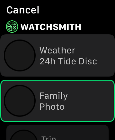
Instead I worked out that the descriptors could be multi-line and so now show the Complication type along with its name in the description. This lets me sneak in more detail to the user.
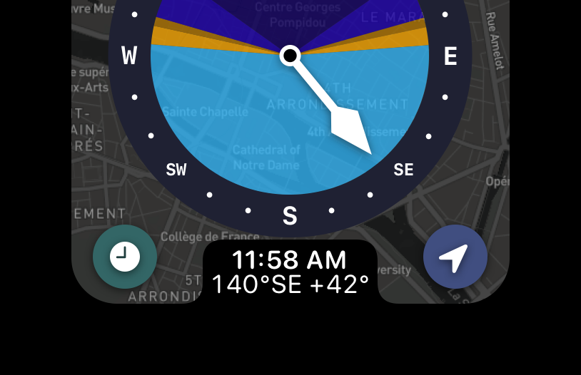
3. Maps
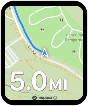
The maps shown within Watchsmith are entirely custom. The built-in Apple Maps system that was added to SwiftUI just isn’t configurable enough. So I ended up building my own tiled maps system in SwiftUI with pan and zoom. This ended up being really helpful when it came to sharing the components between the iPhone and Watch. Since I’m not relying on the system components I got around all kinds of little availability gotchas between the two platforms. It is one of those rare cases where going it my own way, and not using a library or built-in approach, actually paid off.
4. Golden Hour Curve
This little bit of UI is my favorite part of the whole app. While it is a bit self-serving I nevertheless wanted to point it out. The smooth curve from the outside of the Apple Watch’s screen into the curve of the notch on the bottom of my UI just flows so nicely. Then, insetting the buttons within the curve of the screen just finished it off beautifully. The map in the background doesn’t serve too much of a utility but adding it in gave a lovely bit of context. 💙
I wanted to point it out because often I found myself annoyed that the bottom corners of my UI get clipped on the 40/44mm watches, but if you can learn to embrace them you can end up with some very cool UIs.
5. Accessible Button Style
For this update I wanted to give the configurator a bit more visual interest. Not quite going all the way back to the good-old-days of Skeuomorphism but heading definitively in that direction. This was where I ended up. I nice bit of depth but still clean. My early attempts at this ended up having nowhere near enough contrast but I really like the end result here.
Additionally, because this was all bundled up in a SwiftUI ButtonStyle it was really easy to make it respond cleanly to the Accessibility Button Shapes option. When that is turned on then the whole thing gets a much bolder border, that is still visually clean but much more present.
6. Saving SwiftUI Views to PNGs
Something I found myself using time and time again in this project was a little utility I wrote for exporting SwiftUI views to PNGs. In UIKit we have this behavior built-in but for SwiftUI sadly there isn’t any direct methods. The trick here was to instantiate a new UIWindow, throw my view into a UIHostingController and then use the UIKit render in context methods on the resulting UIView. This works and let me generate screenshots for marketing tools or for testing purposes. Sadly it doesn’t work on the Watch target, but since SwiftUI is pretty similar on both platforms I could usually just package up the code and get it working well enough on the iPhone to get a screenshot taken.
7. Random Border Trick
Something I often ran into with SwiftUI is a situation where something wasn’t working correctly with my refresh logic. Either it was happening way to often (sometimes even in an infinite loop!), or it would never happen on a view that I though should be refreshed.
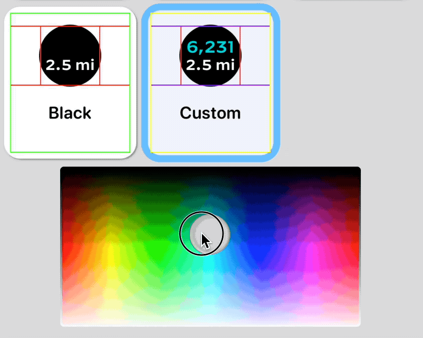
A little trick I found super useful was to set the border of each of the various views involved to a random color [.border(Color(hue: Double.random(in: 0...1), saturation: 1.0, brightness: 1.0))] and then it see what borders change whenever the view rebuilds. This helped me countless times to determine where in the view tree the problem was.
8. UUID() considered harmful
It is easy to “fix” some SwiftUI data flow problems by adding .id(UUID()) to your child view. This forces the view to always redraw, regardless of whether the view system thinks it should be. I caught myself doing this many times, and then always regretted it. This is helpful as a quick patch during debugging, but never, never, never let that say in your code. It leads to all manner of weird issues later on.
Similarly, I was tempted a few times to just add a var id:UUID = UUID() to some of my model objects to make them conform to Identifiable. This was always a bad idea, and often lead to every SwiftUI developers worst nightmare…the dreaded AttributeGraph precondition failure: crash. The id you provide should be stable and consistent to the item being modeled.
9. San Francisco Rounded everywhere
The earlier versions of Watchsmith used the Decimal font in most of the UI. I love the font and still have it available in many places in the app, but ultimately found that it just didn’t work on the Apple Watch as a UI font. It is great for complications but in the end Apple knows what they are doing with SF Rounded and so I’ve moved over to that. It just ‘feels’ Apple Watch-ey in a way nothing else does.