
Today I’m proud to unveil Audiobooks 5.0. Audiobooks is an iOS application for listening to audiobooks on your iPhone or iPad.
Today’s launch represents a near complete overhaul of the app’s appearance as well as a major update to both the content and functionality of the app. I’ll talk about the update a bit more at the end of this article but to start with I thought it might be interesting to trace its history.
Interface
Audiobooks was my first ‘complicated’ application, I started working on it in March of 2009. Previously, all my apps consisted of only a handful of view controllers and were entirely static in their dataset.
Audiobooks lets you browse and listen to any of a library of thousands of audiobooks (most taken from the LibriVox Project). Presenting and managing that much content presented a variety of challenges both in terms of performance and usability. It was initially created to work with iPhone OS 2.2.1. Back then many of the conveniences and abilities of iOS that I take for granted now didn’t exist. The initial interface was bare, spartan and generally native.
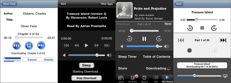
The above graphic shows the progression of the main player screen over the years with 1.0 on the left and 5.0 on the right. Over the years I have updated its appearance along with the fashions of the time. The most recent version sought to clean up and simplify the interface. Over time it had grown cluttered and visually noisy.
One of the challenges of being a developer who dabbles in design is fighting the tendency to use every last hip new thing you see in other apps. The previous version really suffered from this. There were gaussian noise textures, rounded corners and drop shadows galore.
As I have grown more confident in my design sense I have found that generally speaking the simpler my design aesthetic the better. The less I try to be ‘fancy’ the more likely I am to succeed. In order to pull off a visually stunning interface requires skills that I simply don’t have and so I’m better served to stick to a simple, minimalistic design.
Icon

Perhaps the most important visual component of an app is its icon. This is the first impression you make on your customer. Audiobooks has had three icons over its life.
The first icon (which I am rather embarrassed about now) was just me taking a clipart speaker and then mucking about in Photoshop playing with blending options. It is hideous to my eye now but served the app for its first year. When I launched version 2.0 I commissioned a designer to come up with an updated icon. This kept with the initial structure but replaced the gaudy appearance with a cleaner, more polished look.
While I liked the icon it never really had the ‘pop’ I wanted, nor the visual appeal needed to really grab attention. I reached out to the great designers at the Iconfactory for the 5.0 update. They were a delight to work with and the result I think speaks for itself. The app now has a graphically rich icon that I think will really catch customer’s eyes when browsing the App Store.
Sales
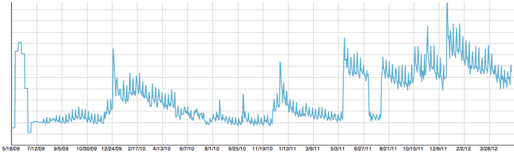
In its 3 year lifespan it has been downloaded around 4.7M times between both the free and paid versions. That number still is staggering to me every time I think about it. It is a number that speaks to the reach of the App Store far more than to the quality of the app. There is something marvelous about a platform where a single developer in his basement can create something that then reaches out to millions of people.
The road to here has been nothing if not variable. The life of an app developer is one of constant flux. I have had daily fluctuations in sales of more than 8x. Over time you just grow used to the cyclical nature of the Store and embrace the ride.
The only consistent pattern I’ve ever seen in the store is a weekly surge in sales over the weekend (seen every 7 days below) and a major spike in sales on Christmas. Otherwise, sales are a fickle thing.
New in 5.0
Version 5.0 includes a lot of behind the scenes improvements and changes that users will never see but will hopefully improve their experience. I wanted to get back to basics and refactor and improve the underlying code that had grown stale with 3 years of use. I am dropping support for iOS 3.x with this update which means I am able to finally make use of many of the great design patterns permitted when using blocks.
Every screen in the app was overhauled visually. I removed all of the textures and over wrought colors in the app. Instead, it is now clean, simple and works within a palette of grays. Since the app is focused on an audio experience rather than a visual one I wanted to strip down anything that cluttered the interface and make it as straightforward as possible to find, download and enjoy an audiobook.
This is my first app to make use of iCloud extensively. For iOS 5.x users their library and bookmarks will now sync between all their devices. So you can now start a book on your iPad at home, get in your car and pickup right where you left off on your iPhone.
I also introduced variable playback speed. You can listen to audiobooks at either 1.5X or 2X speed.
Finally, I added 133 new Plus books (430 total now) as well as 613 new Free books (4,382 total now).
If you’d like to check it out you can get it in the App Store here. Enjoy.