Developing for WatchKit has a fundamentally tricky problem. The screen I’m trying to fit my interface on is tiny—really tiny. On the smaller 38mm model the display is only 136pts by 170pts. While I’ve been pleasantly surprised by how much I can fit in that tiny space, I always want more.
This has lead me to a frustration while I design my apps. I can’t hide the status bar in WatchKit apps. So the top 19 points of the screen feels wasted.
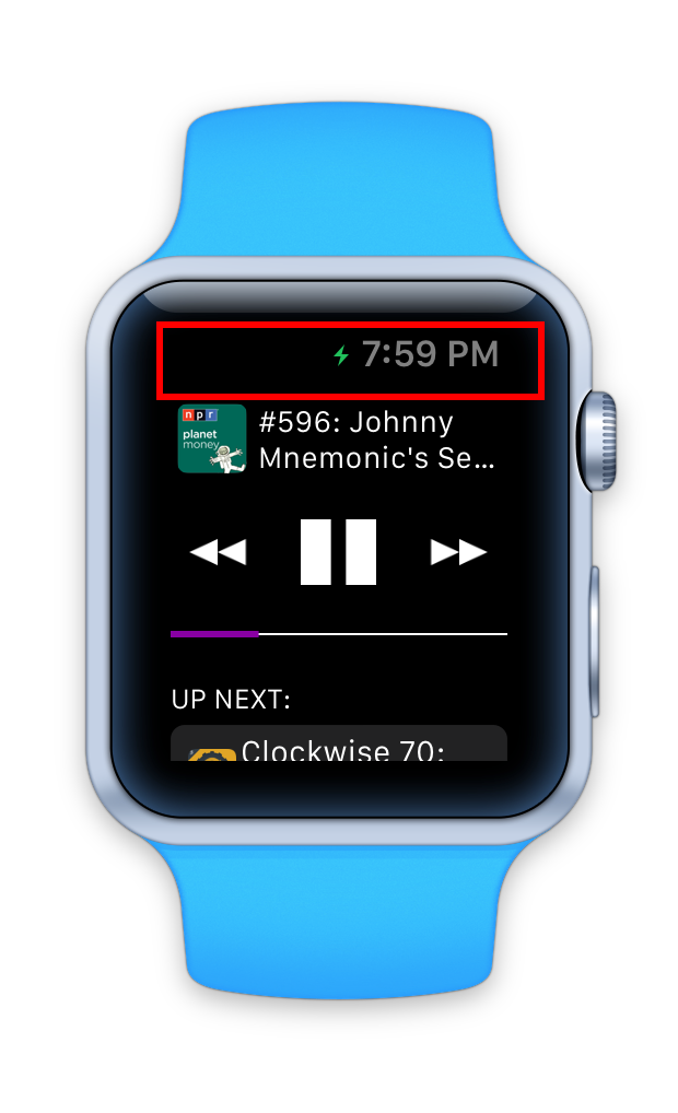
I kept yearning for those pixels, to fit just that little bit extra onto the screen. That is, until today.
I was working out while wearing my Microsoft Band. It has a quite useful mode that tracks your heart rate and calories burned. I was squeezing in the workout just before an important appointment so it was important I didn’t over-run.
Half way through my workout I glanced down at my wrist to check the time. I saw this:
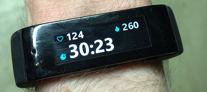
It is hard to describe just how frustrating it is to look at a watch and not be able to see the time. That might seem superficially obvious but it was clearly not something that Microsoft prioritized in their design. Apple has. I now understand why we can’t hide the status bar.
Little details like this in the design the Apple Watch make me increasingly confident that Apple is on the right track.
P.S. I am aware that a few screens in the Apple Watch product overview don’t show the time, my point is less that it is 100% there and more that they have prioritized it to be usually there.